For me, working in editorial design also means working on a lot of branding, either as part of a team or working solo on mastheads and logos. Here are a selection:

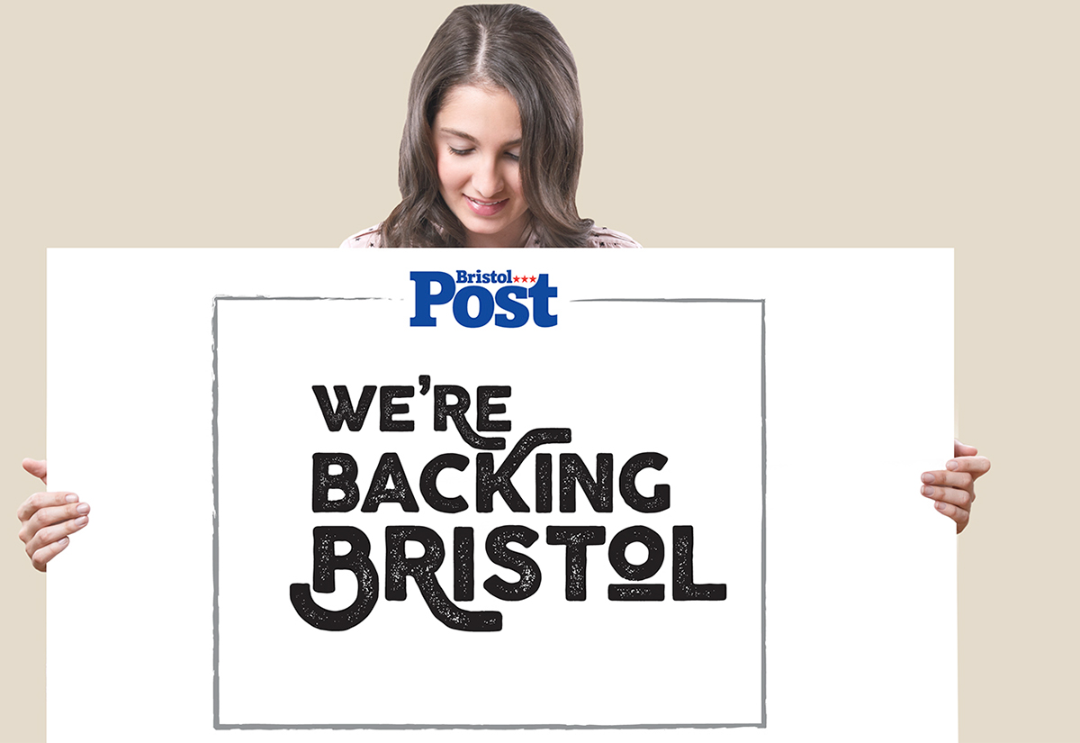
Back in 2011 we changed over the Bristol Post from an old Bodoni masthead to a fresher more modern slab serif. Here it is in action, not in paper (you can see plenty of those examples in other Behance entries) but as a brand


When Weekend magazine had its 100th issue redesign, I changed the masthead from a heavy slab serif to a more elegant script. Again, here it is in action, not as it appears in print (see plenty of other examples on this site) but as a brand identity.


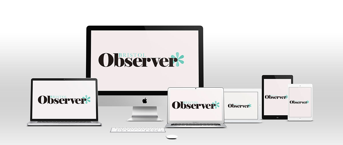
In 2016 I redesigned the Observer with Sian David. I changed the masthead (which I'd designed five years previously) from a heavy sans to a more elegant fat face to suit the direction the paper was taking. Here it is as a brand but you can see it in print here


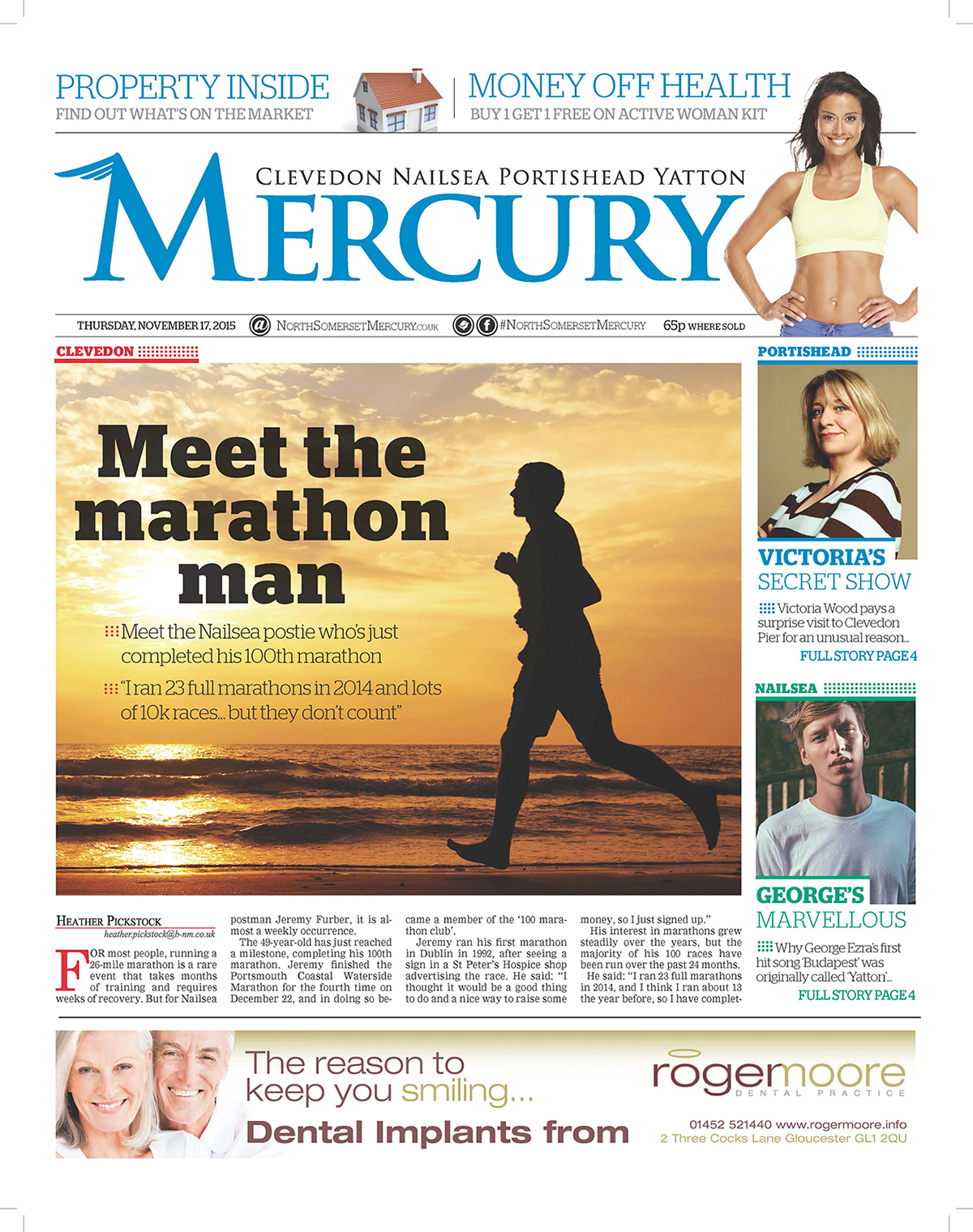
The North Somerset Mercury was a paper which had been closed down and the brief was to reinvent it and bring it back to life. I designed the paper, a new masthead and a new logo, which captures a hint of mythology.


This logo could then be adapted to other sections of the paper...

My branding work also involves logos for campaigns, this is one of the most recent: