Discaimer: This Personal Project does not reflect the views or plans of Trivago.
Logo Relaunch
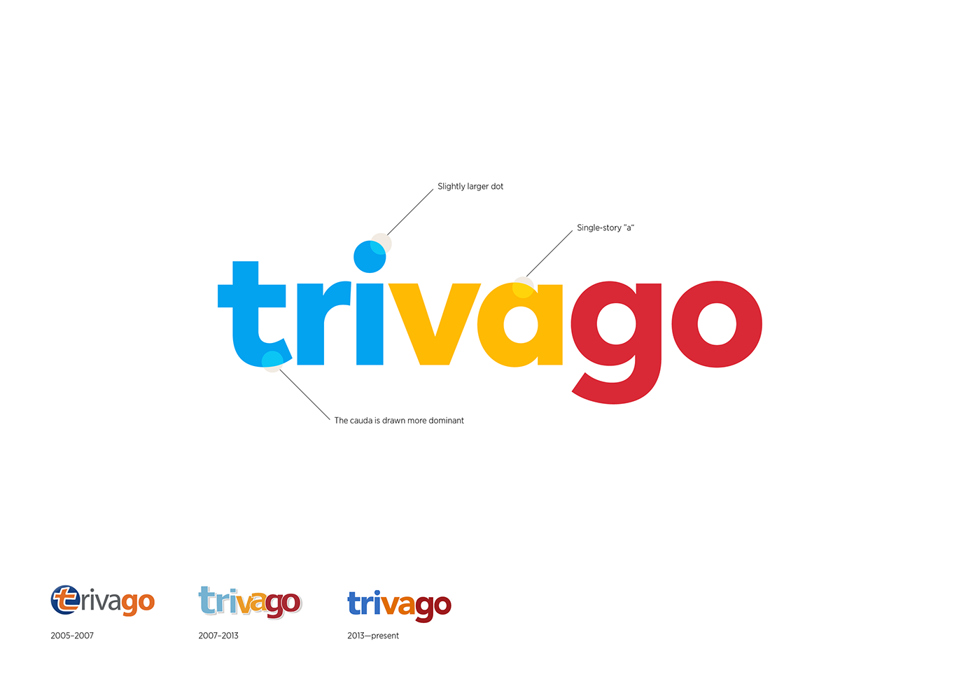
Over the years Trivago’s logo design matured while keeping up with the times. The current logo forms a good sign: It’s shape is simple yet memorable and the iconic coloring provides pregnance.
Nevertheless there is still room for improvements while keeping the consitutive elements (i.e. it’s basic shape and colouring). The first thing to change is the colouring into a more vivid one to reflect the brand’s empowering and active character.
Although Avenir does a good job the logo would benefit from a more unique typography. Therefore the letters ”t“ and ”a“ are redrawn. The ”a“ incorporates the shapes of ”g“ and ”o“ while the ”t“ is drawn wider to give the first syllable more width against the other ones with their mainly round characters. Additionally to it the bow of the ”t“ is drawn wider to follows the one of the ”g“ better.

Font Choice
The Brand’s Visual Voice
Avenir marks an all time classic in typography since it release in 1988. Due to the comeback of humanist and geometric sans serif fonts (think of Apercu, Proxima Nova, Circular, Campton etc.) Avenir still appears fresh and up to date—and will probably do so in 2018.
While Trivago’s current logo is set in Avenir there is a missing font concept that spans across different touchpoints. Instead system fonts are used in the web and mobile applications . As a corporate font I recommend Avenir Next that represents a redesign of Adrian Frutigers classic Avenir he did in 2003. It features reworked characters and a larger amout of styles making it perfectly usable for complex typographical applications like branding.

Colouring
Color Palette
Trivago’s current colour palette did a great job by creating an iconic triad of blue, yellow and red. Since one can easily identify the brand solely by it’s color, changing them would be a bad idea. Instead I suppose to blow off the dust and get to a more vibrant and bolt tonality to correlate better with the brands tonality.

Engaging, emotional and human
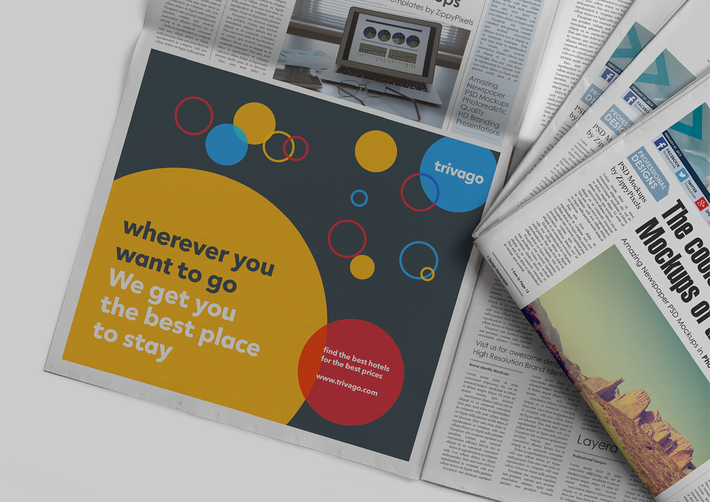
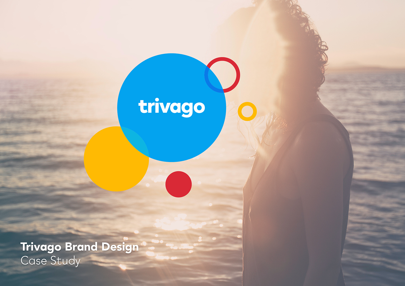
The imagery is one of the most emotional elements of a brand design. To support trivago’s approach to empower people to get more out of ther lifes, imagery mainly shows people in emotional, active situations. This reflects Situations that encouraged people to get more out of their lifes (perhaps with the help of trivago). Thematically images are connected to the activities trivago provides the base for like traveling, holidays or business trips.

Visual Constants
The Brand’s Look and Feel
In order to support trivago’s 2018 mission to becoming a holistic brand it is important for me to not stick to trivago only as a service that provides support finding the best hotel deals but as a brand that helps you to get more out of life. This is not necessarily limited to hotel search. In my brand design approach trivago will become a more wide-ranging company but with traveling and accomodation still in it’s heart.
The visual constants of the brand design are formed by circles derived from the letter counters of the word mark. The circles symbolise trivago and it’s stakeholders: the client, the host and trivago as search engine and portal. The shapes represent in a dynamic way the ever-changing interplay of these instances. In order to design a more diverse appeareance circels appear in filled as well as outlined form.

Slogan
We get you there
The claim is guided by trivago’s vision “empowering people to get more out of life.” It includes both the meaning to get to a new destination as well as— in a metaphorical sense—to achieve one’s aim. It’s meaning hint at trivago’s service to help finding a place to stay at the destination desired. Set in imperative it serves as an invitaion to stand up and get more out of life.
The claim serves as a base for further communication by keeping the stem and adding words to the beginning and end.
In combination with the logo the claim is placed as a subline at the end of the word mark to lead the eye “into the distance” the in direction of reading.

Possible Brand Architecture
Family brand strategy
The current logo for trivago’s products causes confusion as it is used as a figurative mark for both “trivago hotel manager” and “trivago Community” and as an favicon for trivago’s website.
I recommend to build up a brand arcitecture in the form of a family brand strategy. Thus the sublogos of trivago products will get a distinct logo while keeping a strong connection to the main brand. By changing size and overlappings the pictural mark provides an indication of the product.
Design Application