

ABOUT
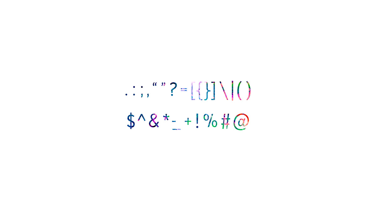
Segnaletica was born with the intention to make something that wasn’t unemotional like geometric faces or simply a humanist typeface. It’s a blend of a humanist influence and a desire for a functional typeface that guided you through your day.
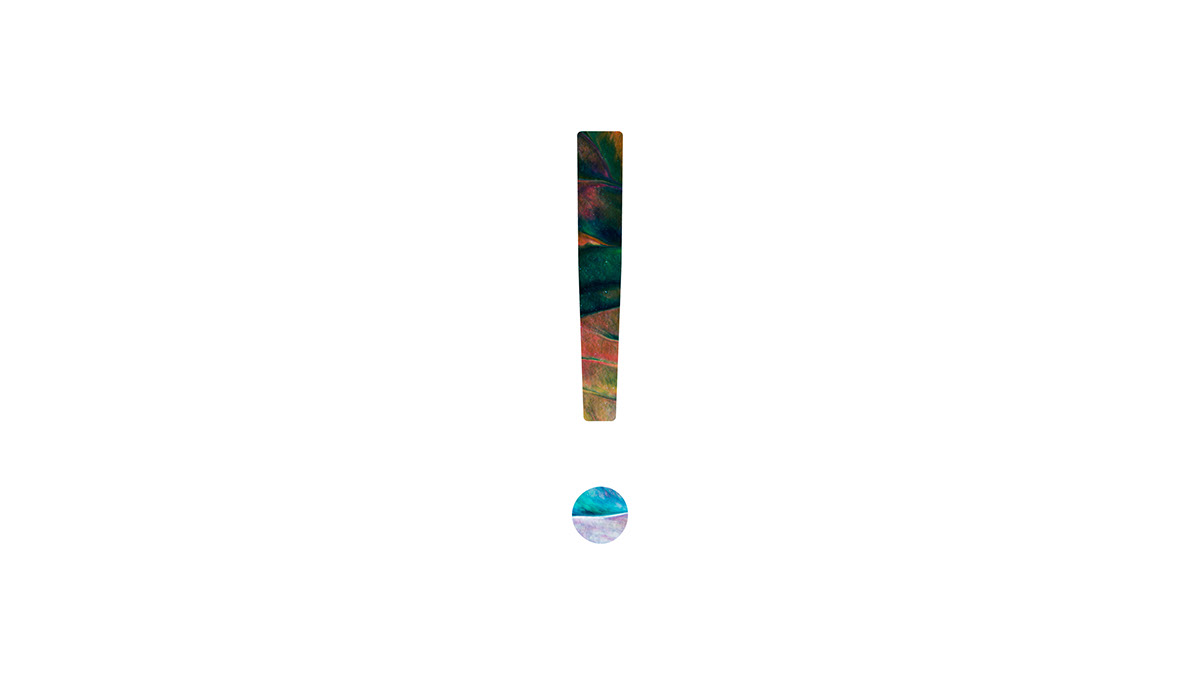
Characteristics include stroke curves at the terminals of ascenders and descenders that echo handwriting. Tiniest details are adjusted to craft an optically balanced piece. Such as the taper on the top of the capital “I” or the slight ink traps built into the letter “M” and “A”

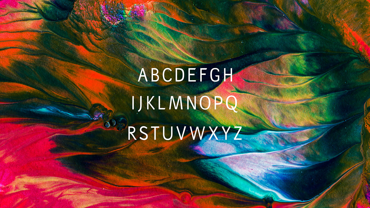
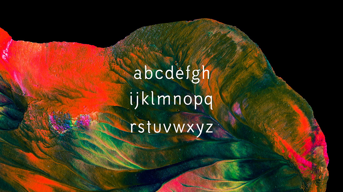

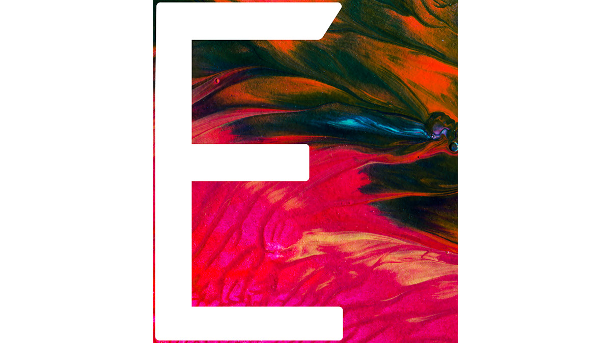
The top left of the stem is slightly indented to give an optical balance, not have it looking very blocky.
This is Segnaletic, I hope it provided some visual comfort.
Please leave behind a note or share this work with your world. I'd love to hear from you!


