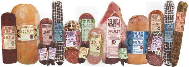
During my time at IMV Design in Providence as a graphic designer, I worked on branding & packaging for Daniele, Inc's new line of locally grown meat.

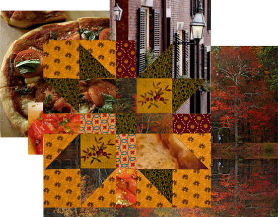
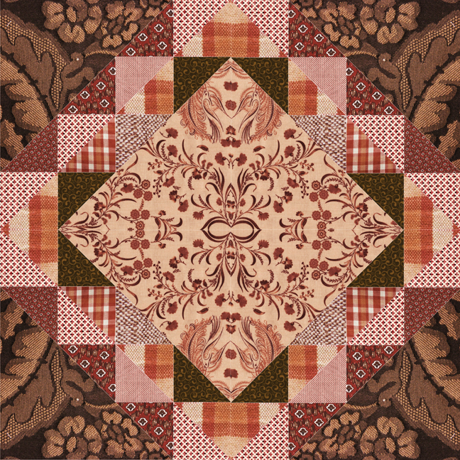
Quilting, both as an art form and social hobby, shares ideas of heritage, culture, and overall antiqued quality. Its roots in New England have become wide spread but it continues to act as basis for design and passion in the area. The passionate Daniele family businessalso has a cultural ideology of quality crafted materials that have been passed down for many years.

The company chose my tactile quilt design based on the New England landscape, & I was able to direct peers in collaborating for the product label & logo update.

The design on the left maintains the purist & most recognizable quilt form. Its heritage remains in the coloration, textile choice, & overall cultural connections to the pastime. Type was treated with a very “American” touch, reflecting 19th century playbills & posters. It helps support the geometry of the quilted items but also leads the viewer’s eye to focus on the locality of the product.
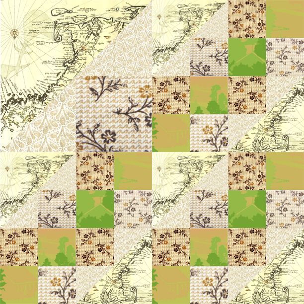
The middle design focuses on the simplification of forms & an essence of high quality through photography & color. The type has a modern touch that uses white space for a visual sense of calmness for the buyer. This label also uses a variety of softer tones & imagery reflective of the target audience.
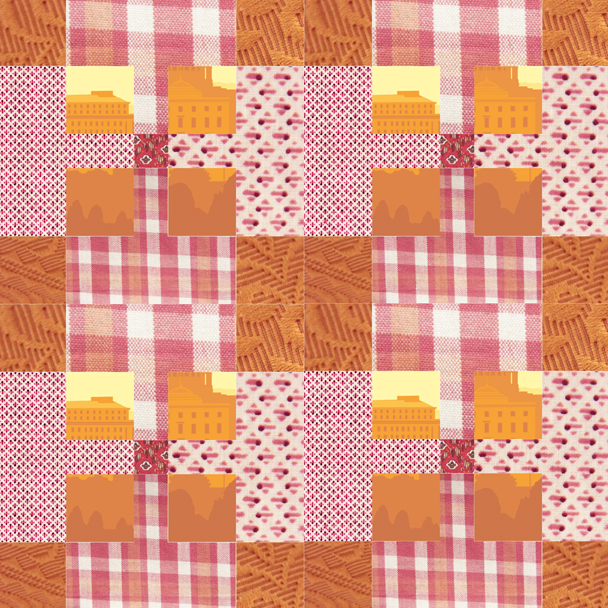
The design on the right utilizes the tactile quality of quilting in a way that creates a new surface for the packaging. The richer tones connect with the original textiles without an overbearing presence.
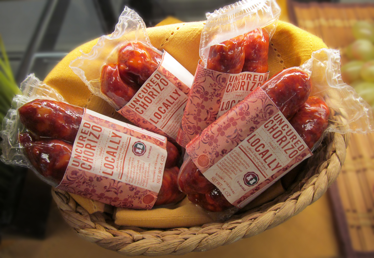
Here is the product line, finally on the market! The design is altered depending on the shape & origin on the product. The company foresees this packaging theme working well for other regions in the future.

On the left is the original logo for Daniele, Inc. Our group also suggested a refined, modernized logo for the company. We felt that the logo on the right would be a simplified but vivid update which could better express their high-quality products.
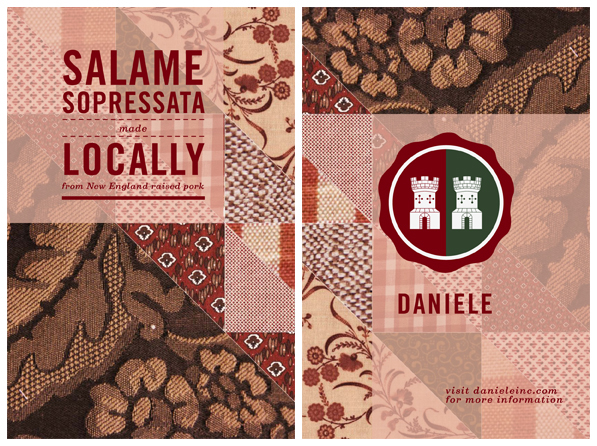
The front & back of promotional cards that are passed out along with the product.


