

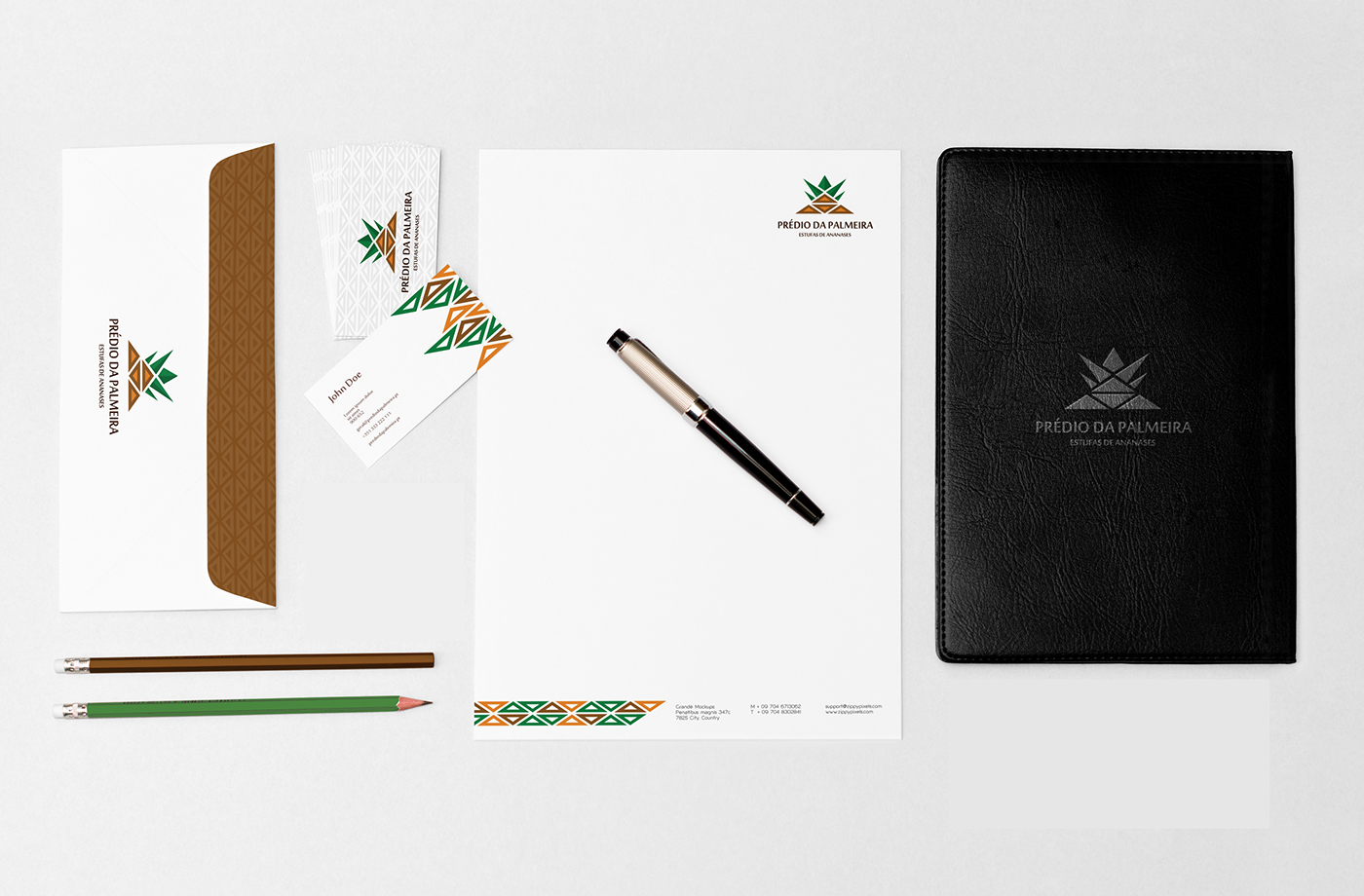
This brand was made for a logo presented represents the shape of a pineapple, but in a different way. It represents tradition, colors that refer to a more exotic context and variety (the 4 inner triangles represent the 4 main areas (pineapple greenhouses, vegetables, beehives and solar panels).
At the same time, the idea of the palm tree is also present from a perspective as if we were looking at it from below.
The triangle, in addition to reflecting balance and support, is also in this case representative of the greenhouse, due to its shape (shape of the greenhouse roof).
Triangular shapes become a very interesting pattern for building your company's image, making it easily identifiable.
