I created these prints in linocut and letterpress basics workshops
at Signal Return Press in Detroit, Michigan, U.S.A.
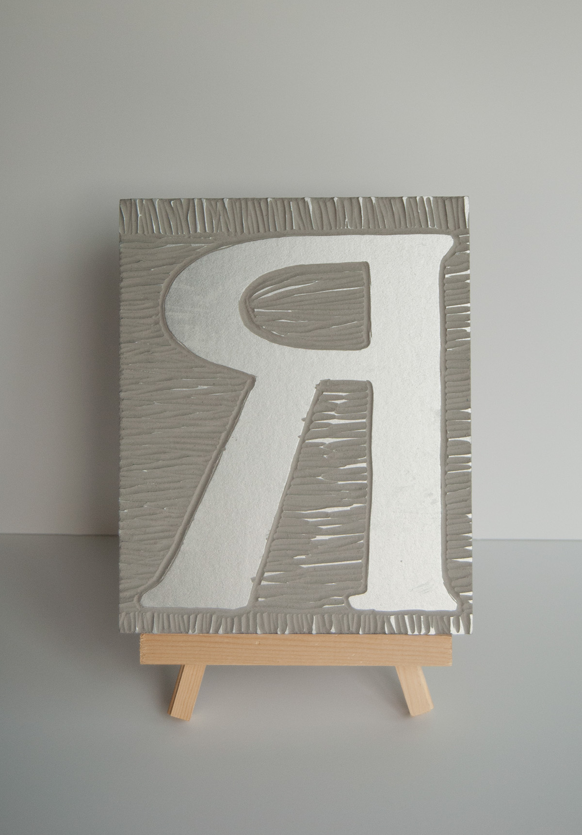
I left the lines called chatter, to create a pattern in the background. Chatter is created when you don't carve deep enough around your design and the ridges pick up ink.

Everyone in the workshop chose a few ink colours to use on the two presses available to us. I went with metallic silver, which turned out beautifully!

We had to choose a letter or make our own design. Once it was printed, we taped it to blue transfer paper and went over the printed design with a pencil. Then you cut around your design.
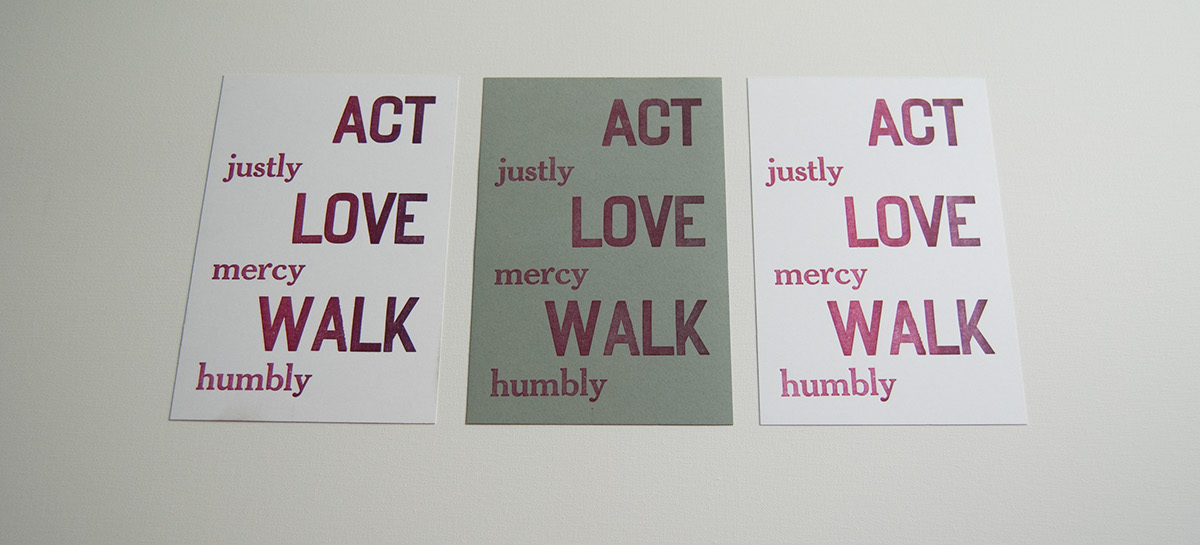
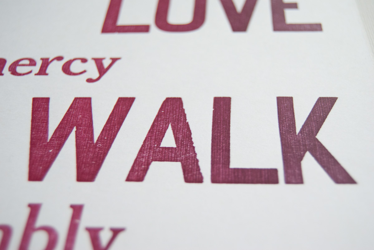
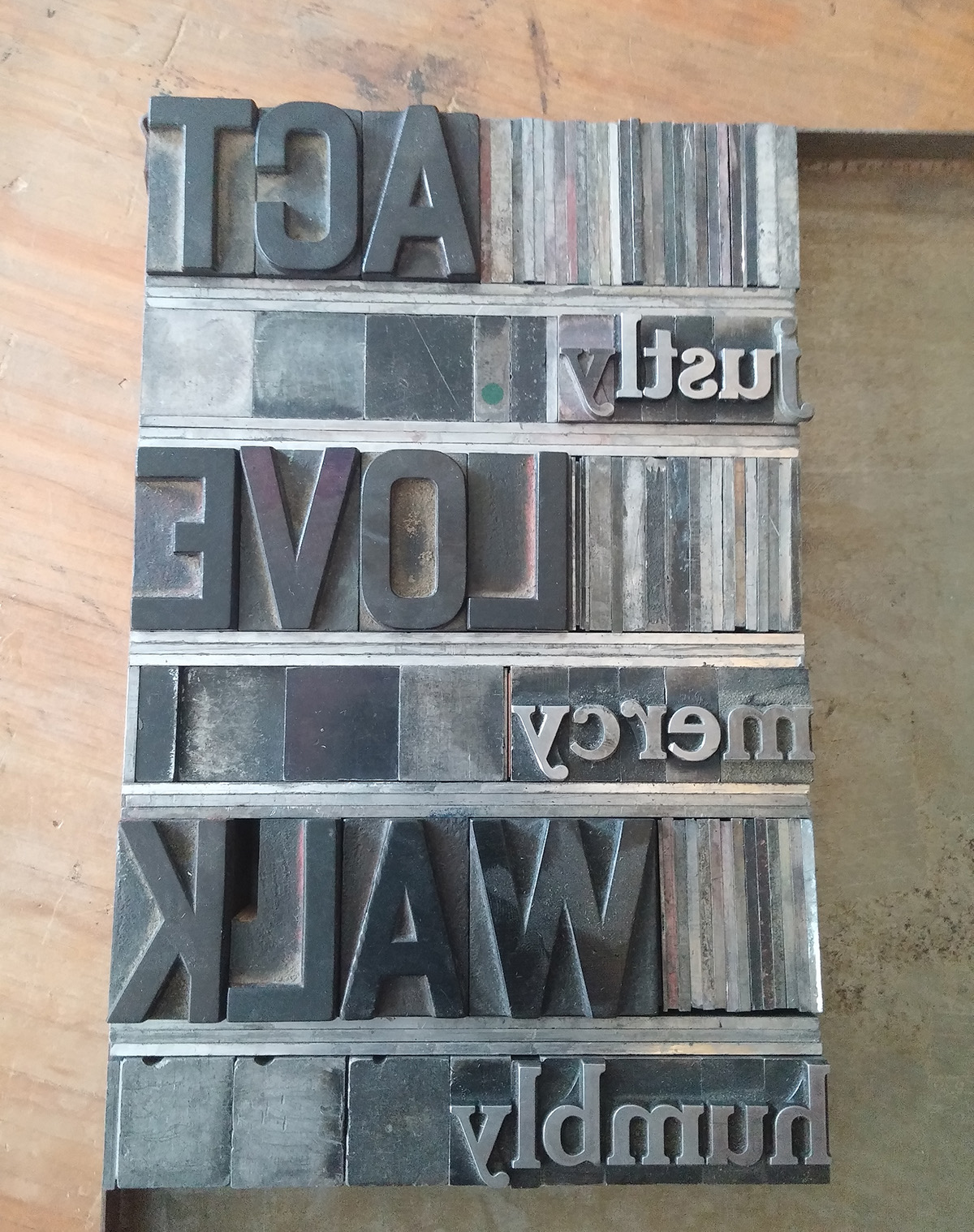
These are the prints from my second workshop, Letterpress Basics: Mottos, Mantras, and Moveable Type. The text is from Micah 6:8. It's a combination of wood and metal type (60 pt Cheltenham Bold). The wood type created an unexpected gradient effect and its grain created extra texture.
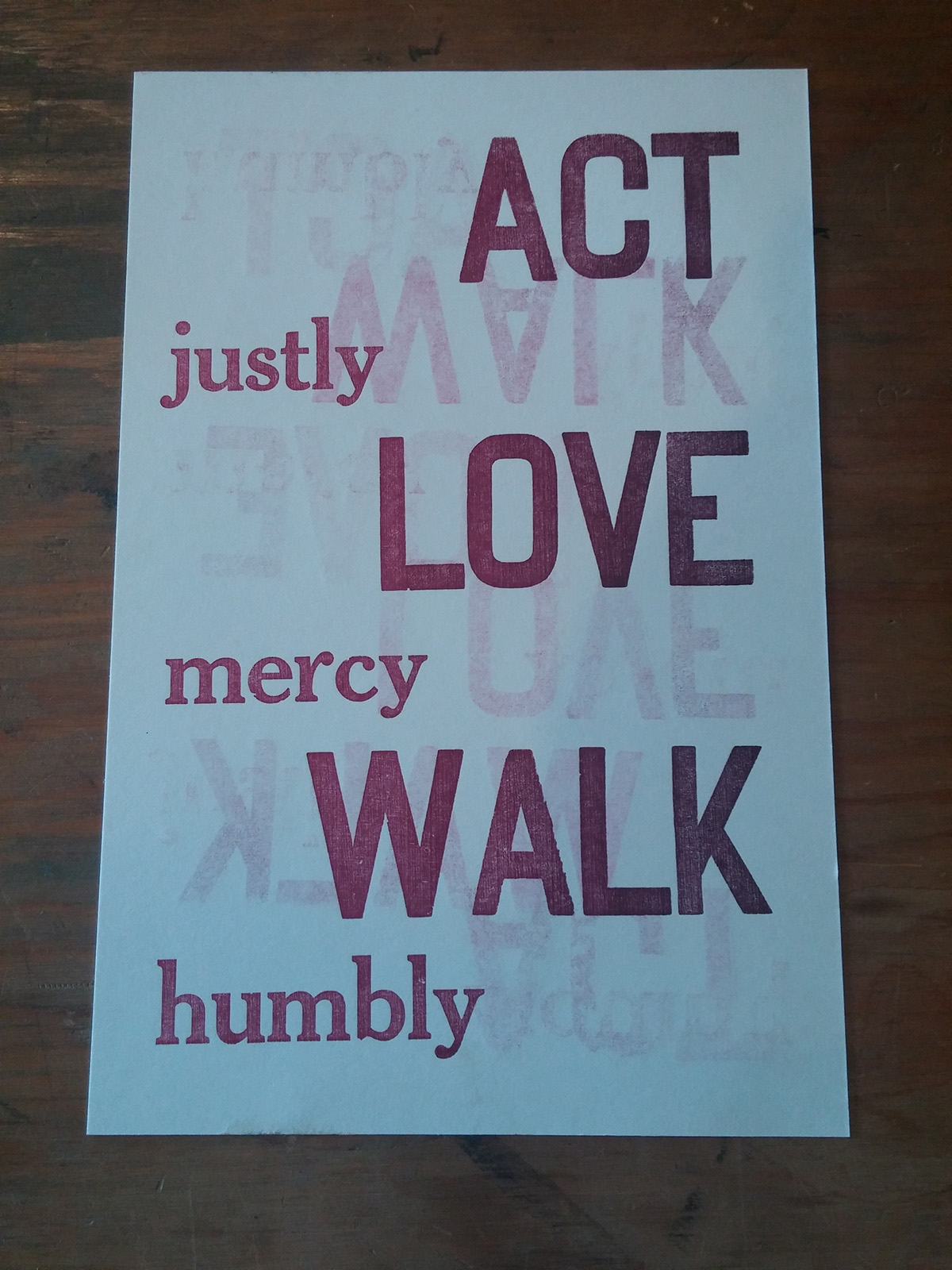
I used this page to pad the paper and get an impression. It picked up ink from the cylinder over multiple runs and I decided to print on it.

All my type, along with a pica ruler. The ruler was needed to measure line length and wood type's height, which doesn't come in standard point sizes.
My set type, complete with leading and spacing.
