


Cash Through is an app that is being developed by Triman.ch focusing solely on
one thing - making the experience of lending and borrowing money simple,
easy and friendly - just like it should be.

I was approached to develop a visual identity that would communicate the dynamics as well as immediacy and ease of the experience provided by the app.

The focus on the letter H instead of initials came for two main reasons.
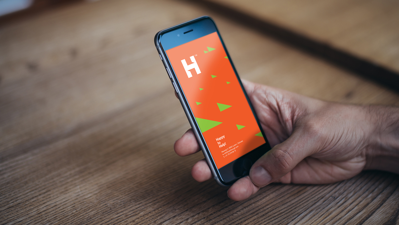
The symbolism of a direct horizontal link between two vertical strokes of the letter H and
the slogan "Happy to Help!" which was actually defined while still conceptualizing the overall visual identity.


Inner white space of the logo-mark, with those cuts, forms the shape of speech bubbles which creates a conversation and gives a human touch to the overall identity.

These cuts also turned out to be an inspiring element that opened up a whole new playground for further elaboration and exploration of the visual identity.


Thanx for watching!


