Today I want to tell you a story about one of my projects. As you could guess from the title, we will talk about one logo, that was thrown in the trashbin. So, it's not about an happy end, but about some work, that we've done as designers, which was outside view.
Well, first of all, I need to tell you about a project. AppsPress is an company that recomend user some apps and news, based on his preferences. More it provides apps an opportunity to promote yourself, but main accent goes on a users, news and recomendations.
Brif is clear, I'm inspired — let's go!
… and stop, because in my head there were only sucked shitty ideas.

But the time is running out, and I choose those, which sucking less:

Not good enough, so I tried to do the right thing — make an mind map to aggregate all the ideas in one place.

On that phase, I choose to go away from banal shapes and images, and make something abstract. Two ideas were born:
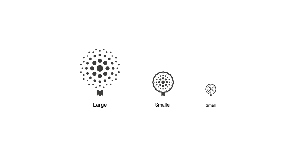
— first is «dandelion», as a great symbol what the company does: spread an news about apps and services,
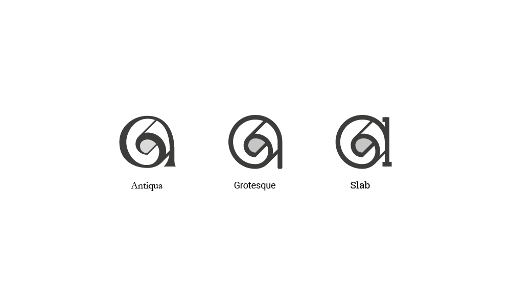
— second is type «a» as twisted paper, as a symbol of news.

That's more like it! I feel, like I broke the wall and made something really good.
As you can see, I made black and white logo to concentrate on form better than color, and adapt it on every size.

And here comes my favourite. I worked for it almost half of the time to make it looks great: try to get right font, kerning and form…

… golden ratio and proportions…

… different types, inspired by Jan Tschichold's books…
… and guess what: stakeholder liked the variant I made in 15 minutes, just for
«full stack of 3 logos».

I'm so disappointed, but hey… nevermind. Other good stuff goes to the trash, and we have what we have:

To conclude this «Branding section» I want to give an advise: show to the stakeholder only those logos, you really like. Otherwise you risk to be where I'm now: looking on a really good symbol, and realising, that it's going into the table. What a pity… But, there is still some work to view :)
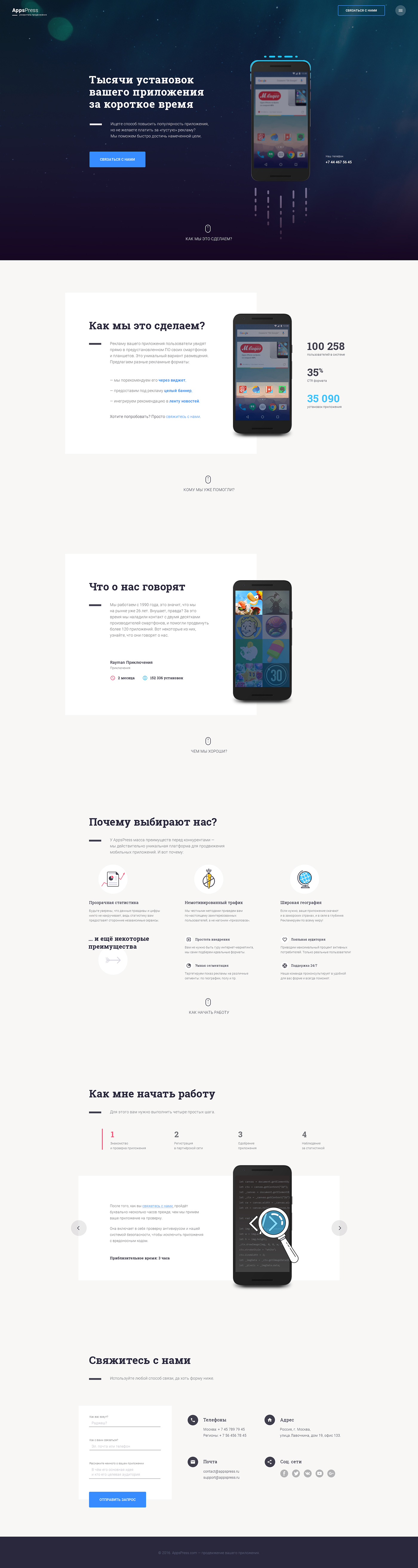
The landing was made BEFORE the brand logo. It's not my wish, but we work with all we have: first was a task on landing, then customer wants a brand — so be it.
If you want to view all transitions — see the prototype.
Here is how pop-up window looks like:
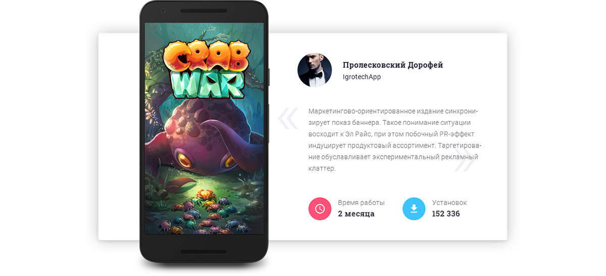
And here is some mobile adaptation of the landing page.
If you'll be not satisfied with those screens, here is a link to the prototype.

Thanks for watching, folks, and remember: there is no senseless work — every task teaches you something, but try to learn on others mistakes :)
The end