Fortus
— Brand Identity
CPS (a supplies parts for any earth-moving machine, anywhere in Australia) rebranded to Fortus, conjures imagery associated with the word ‘fort’-solid, protective, a sense of integrity. But by appending ‘-us’, we create a new word with a classical, Latin-sounding solidity to it.
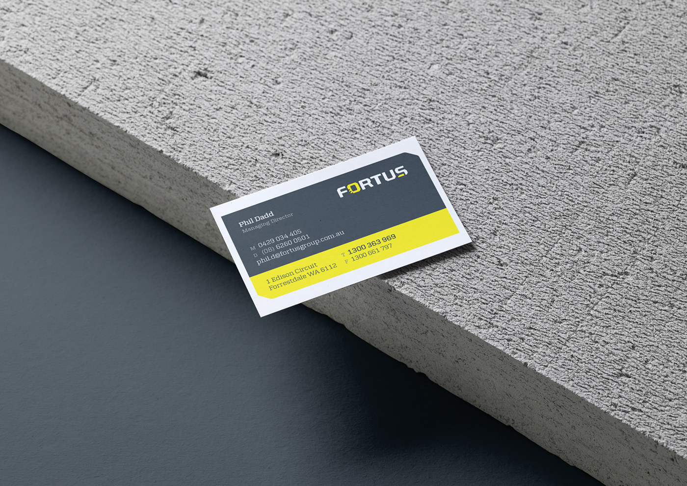
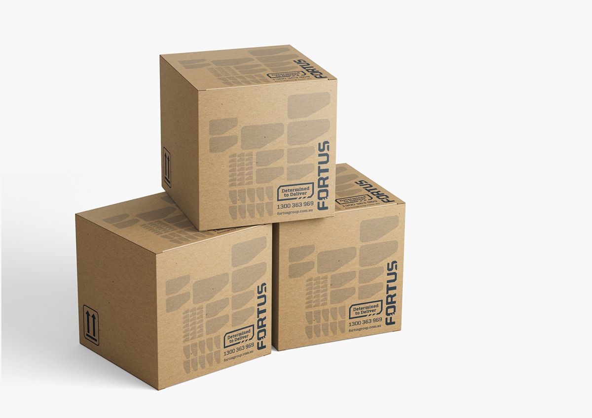
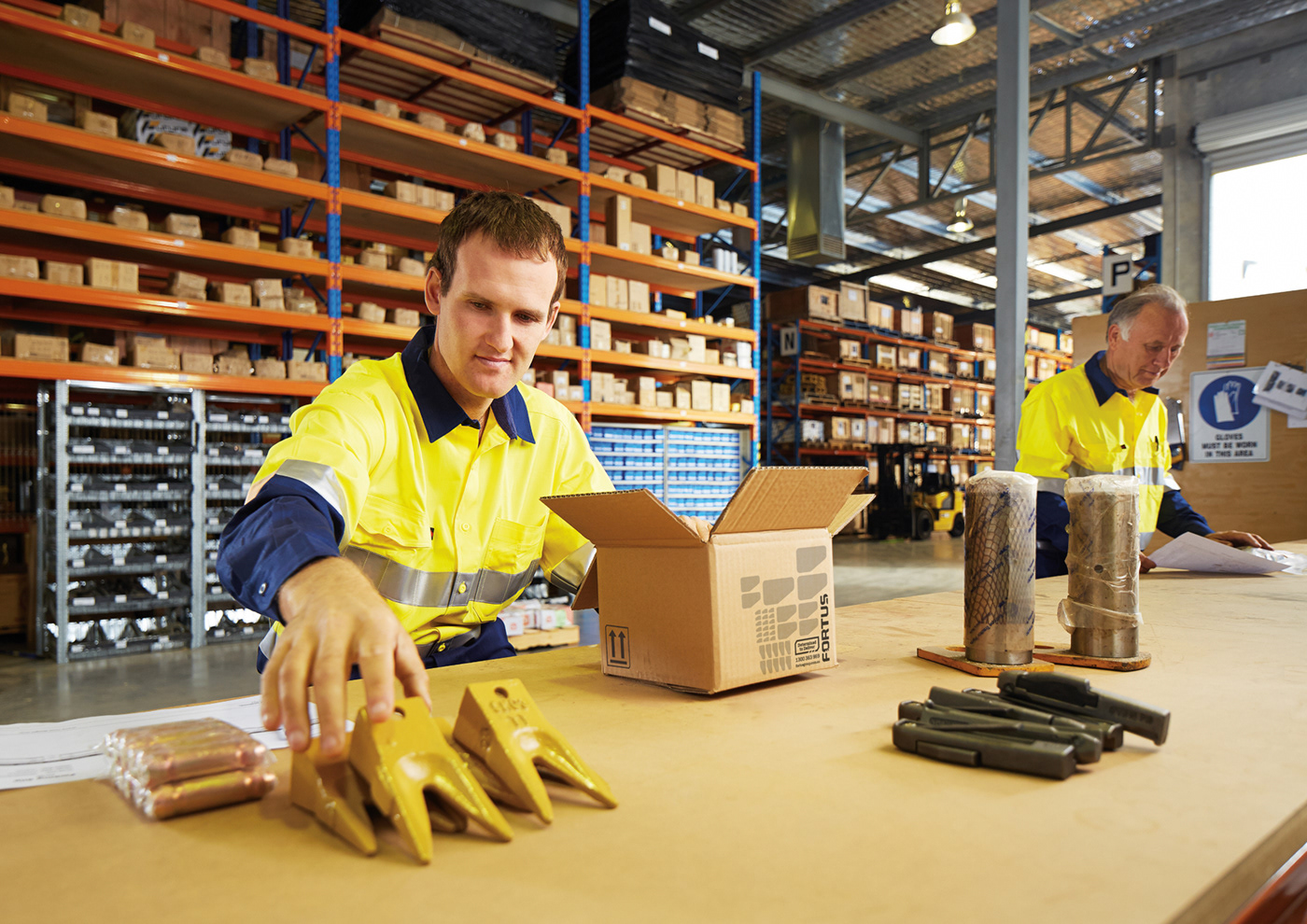
The client wanted a crips, clean, easy to read, dynamic, fresh, solid and global brand. The logo needed to work as a moulding or casting for products, stencilling on crates and silk-screening on promo items.
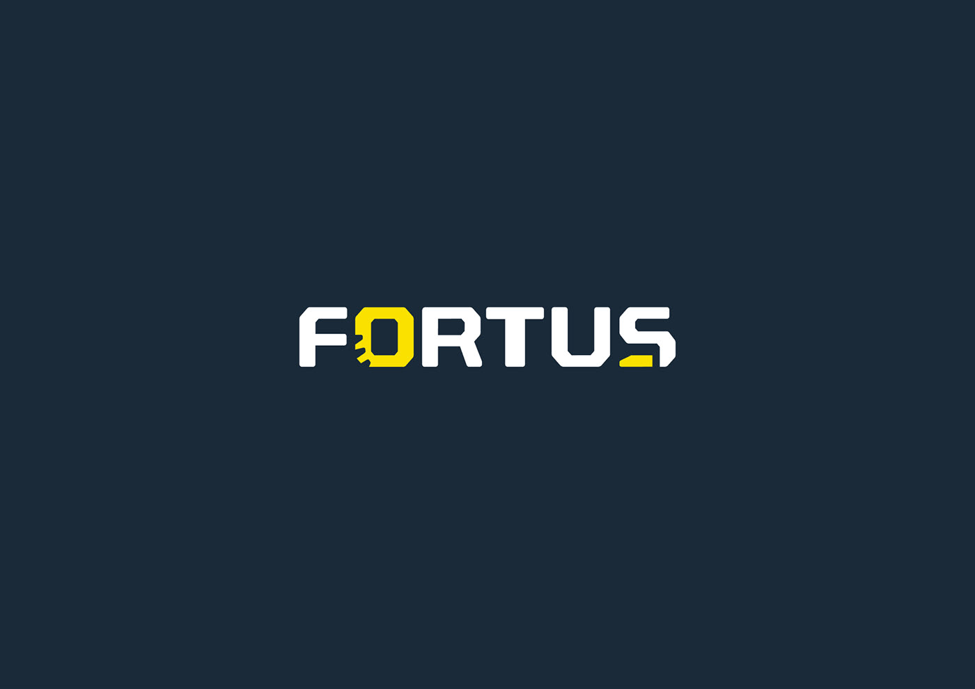
The new logotype for Fortus incorporated elements of bucket teeth and rubber tracks, tooth/boot-like foot and the custom letterforms are bold, strong, solid, fort-like and unique. A bright yellow was used for a brighter and more eye-catching industrial ‘tool-like’ feel and the dark grey gives a sense of professionalism. Solidness and a ‘metal-like’ feel.
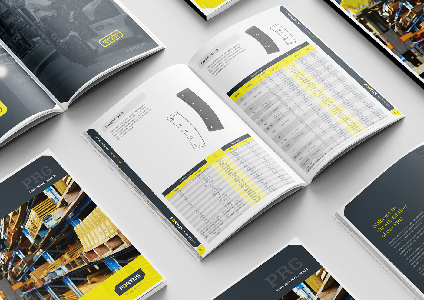
A series of custom-designed graphics developed to support the logo and convey more of the essence of the brand, rather than a ‘rubber stamp’ approach. The theme ensures strong consistency across all applications (from stationery and marketing material through to advertising and the website) and also enables flexibility so the viewer doesn’t get bored - and creates stronger brand recognition.
The client wanted a crips, clean, easy to read, dynamic, fresh, solid and global brand. The logo needed to work as a moulding or casting for products, stencilling on crates and silk-screening on promo items.
The new logotype for Fortus incorporated elements of bucket teeth and rubber tracks, tooth/boot-like foot and the custom letterforms are bold, strong, solid, fort-like and unique. A bright yellow was used for a brighter and more eye-catching industrial ‘tool-like’ feel and the dark grey gives a sense of professionalism. Solidness and a ‘metal-like’ feel.
A series of custom-designed graphics developed to support the logo and convey more of the essence of the brand, rather than a ‘rubber stamp’ approach. The theme ensures strong consistency across all applications (from stationery and marketing material through to advertising and the website) and also enables flexibility so the viewer doesn’t get bored - and creates stronger brand recognition.
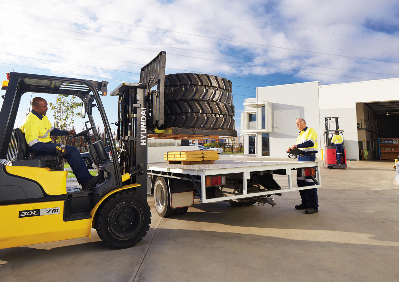
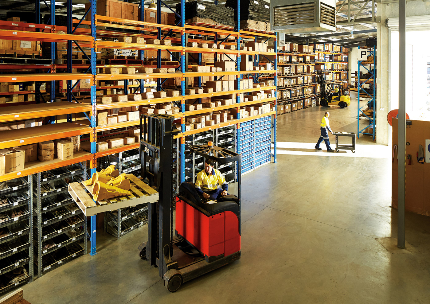
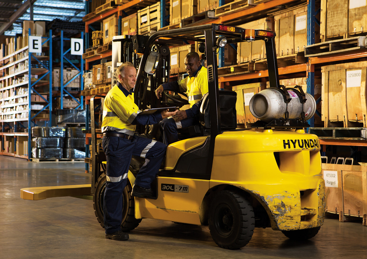
Brand Touchpoints: Logo & Brand Personality, Collateral, Signage, Uniforms, Website Design, Photography


Branding, Design & Art Direction Luminosity
Photography Rob Frith
Client Fortus