
Kampala Capital City Authority Football Club, abbreviated as KCCA FC, is a Ugandan football club from Kampala, the largest city and capital of Uganda. Established in 1963 as Kasasiro Boys, KCCA FC is now the most admired and prestigious local football club in the country.
The club has found a big name for its self through a series of victories. As of 2015, the club has won nine league championship titles and eight Ugandan Cup titles, along with a CECAFA Clubs Cup win at the regional level.
The club has found a big name for its self through a series of victories. As of 2015, the club has won nine league championship titles and eight Ugandan Cup titles, along with a CECAFA Clubs Cup win at the regional level.
Untill the end of 2015. something was lacking in the club. The Club needed to re-imagine its image to the public. It needed to enforce its core values through its brand.
The project was to redesign the clubs identity and give it a fresh, modern new look from. The components to be re-imagined included the logo, jerseys, stationery, training attire, social media campaign images, the website, sports promotional items, signage, and many more graphical elements including a detailed brand manual for the club's new visual system.

The Core brand values of the club:
Excellency
Unity
Professionalism
Team work
Innovation
Transparency
Honesty
Class
Unity
Professionalism
Team work
Innovation
Transparency
Honesty
Class
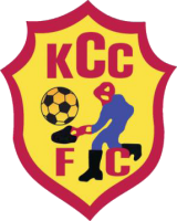
THE CLUB'S OLD LOGO
Until the launch of the re-branding project in January this year, the club's logo was a literal interpretation of its historical background. "A man in boots with a spade dumping trash into something". The club needed a fresh, new and modern feel, given its transformation from "KCC FC" to "KCCA FC".
UPON RECEIPT OF THE BRIEF...it was time to do what we do best. Ideate.
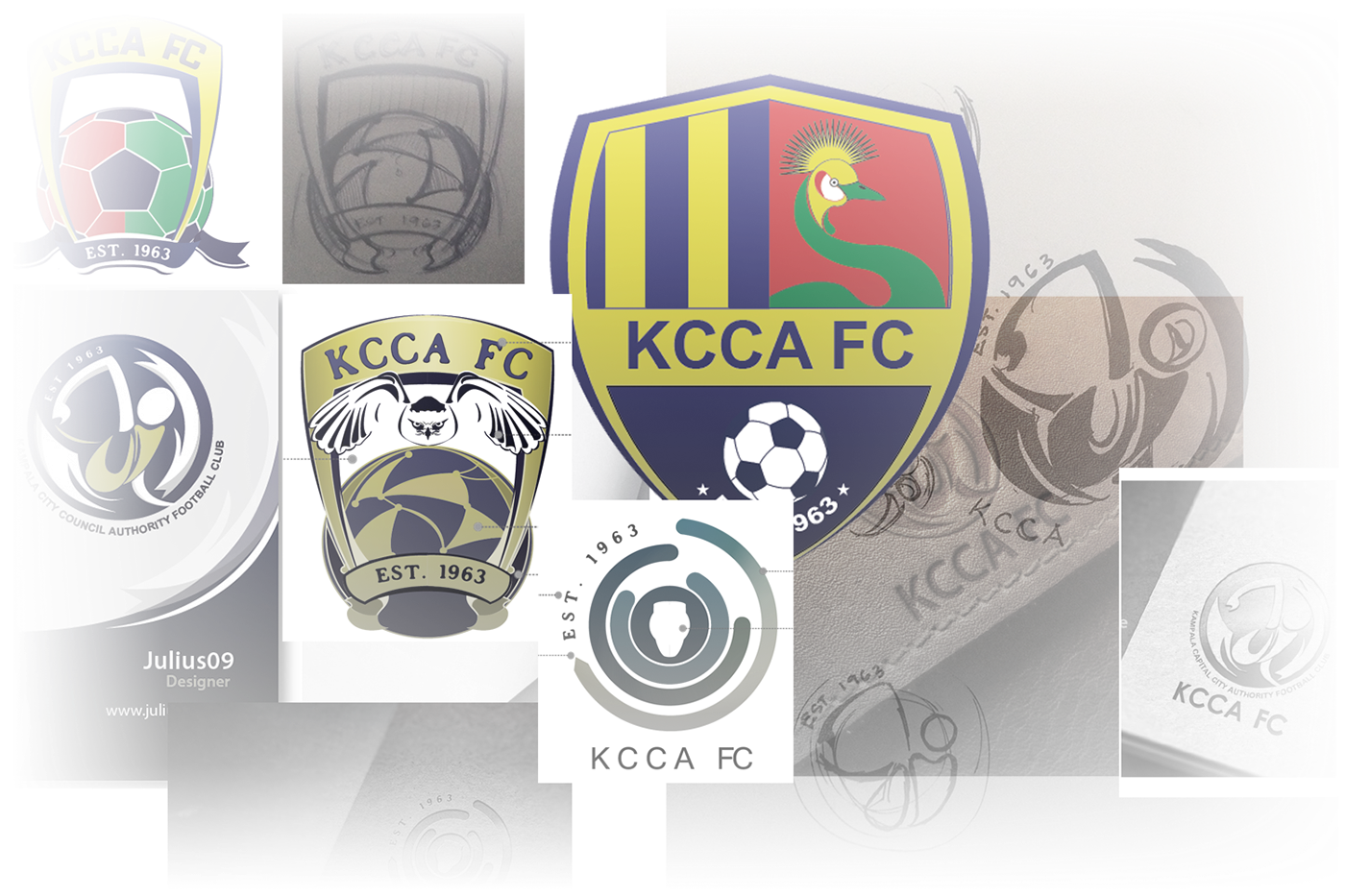
A couple of ideas were brought on table for discussion. It was a tough phase of the project given the fact that producing a good and clear concept is one thing; selling it to the "boards" of members is another.
Various designs and revisions were generated in the process.
Some of the earliest designs at the conceptual level of the project
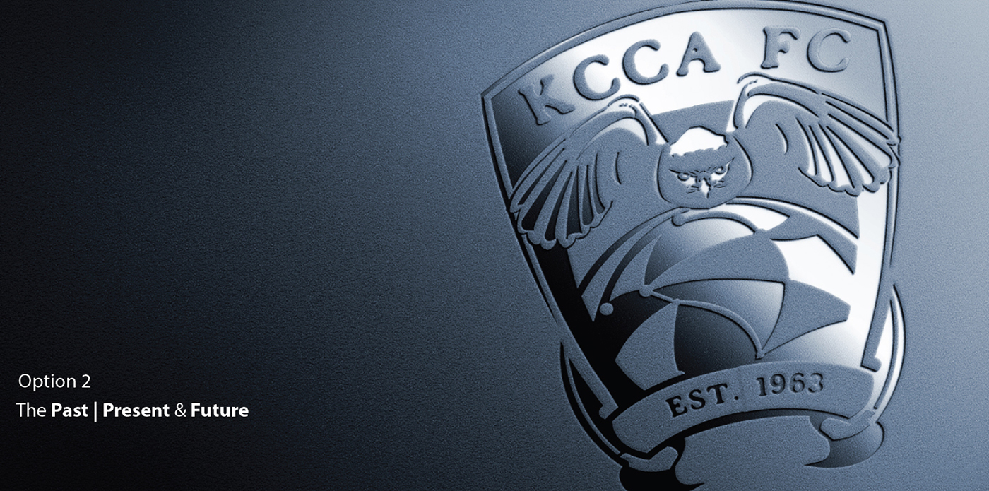
THE MAGICAL SKETCH AT THE BACK OF MY ENVELOPE
Finally, after a long quest for the magical icon/badge for the new clubs, On my way home from meeting the club's officials, I sketched this at the back of my envelope in reference to the discussion that had just been held. It turned out that this could be what we'd been looking for for the past 5 months...
The symbol took on the classical trophy-shaped form. The corporate colors of the club were vividly celebrated by the vertically linear color band. The color band happens to be a long time valued pattern for the club as it formed the base of the club's historical flag. The strong attachment to the mother institution; KCCA was also incorporated in the symbol by borrowing the emblem signature and incorporated into the new logo.
To celebrate the many years of history the club has made, I incorporated a text paying tribute to the year the club was founded. The soccer ball basically represented the game, whereas the modern look of the soccer ball told of its professional and modern approach to the game.

Upon more meticulous refining, the final logo was a development of the sketchy idea.
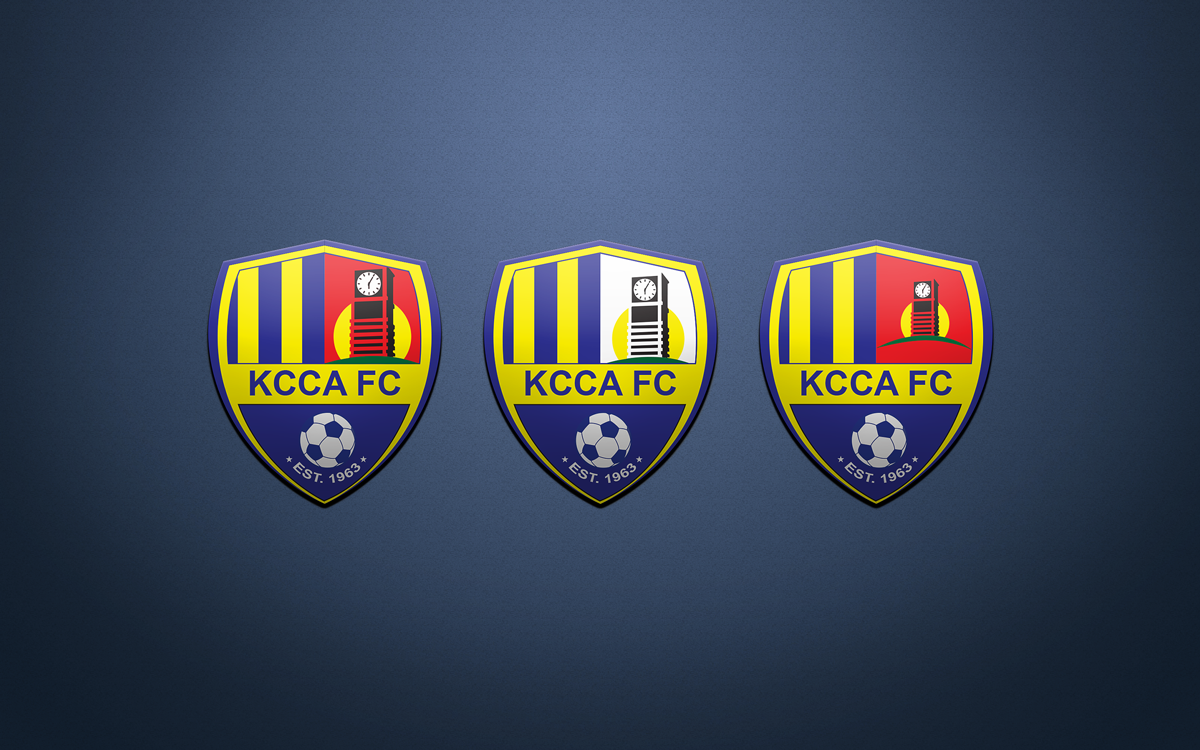
LOGO ELEMENTS EXPLAINED


A short video showcasing the Old to new logo transition (No audio)
More of the brand package to be to be continued...
Thanks for watching


