

Rationale
I was approached by Darren Summersby of Summersby Productions to redesign their logo. The company was evolving but its brand had gone stale, they needed a refresh to better convey their sense of energy and modern creativity.


Symbol:
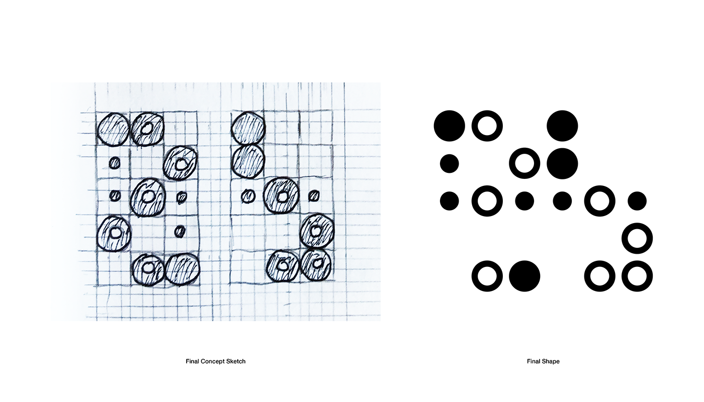
The most important element of the logo is the logo's symbol itself. Summersby Productions is a modern iteration of the film industry, and as such required a modern identifier, free of the typical "film strip" clichés. Using the concept of the thaumatrope, I was able to satisfy the requirements of a modern approach while still maintaining a backstory to the logo.


Thaumatrope
A thaumatrope is an optical illusion toy that takes advantage of the persistence of vision. Thaumatropes are often considered a precursor to motion pictures and animation, and combined with their literal function, combining images into stories, it makes for a great representation of filmmaking. The "thaumatrope" used in the logo is based on the initials "SP," by doing this we create an abstract shape that is not redundant when used with text, yet has a logical background when used on its own.


Wordmark
The "Film Strip" word mark is derived from the main logo type. It is set in League Spartan. The "Film Strip" word mark is meant to be used when the symbol is used individually as a branding piece.


