
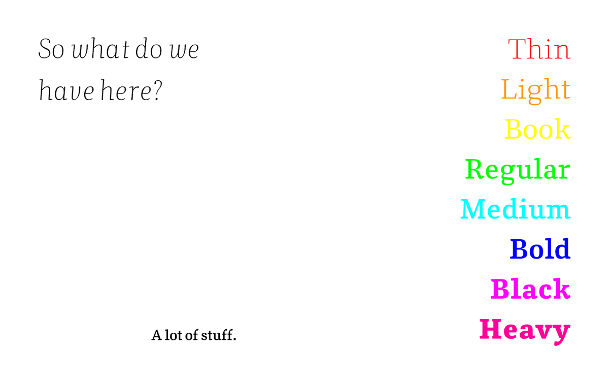
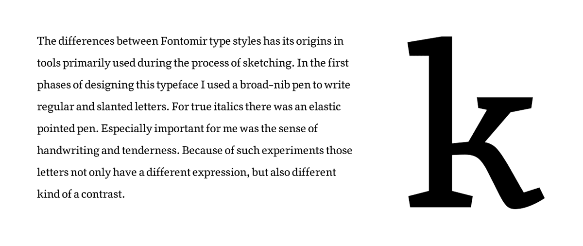
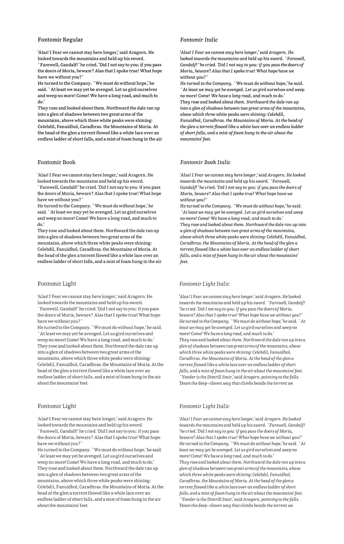
This is my masters degree, a font family called Fontomir. Basically it’s a book font, which allows the user for
various diversions around the text. It has two slanted styles, true italic and slanted antiqua. Also 8 weights,
from thin to heavy, bold and bolder types this font have more display character. As a book font it has rather
small contrast and noticeable serifs. Fontomir has full set of European diacritics, including diphtongs,
few ligatures or even icelandic letters.
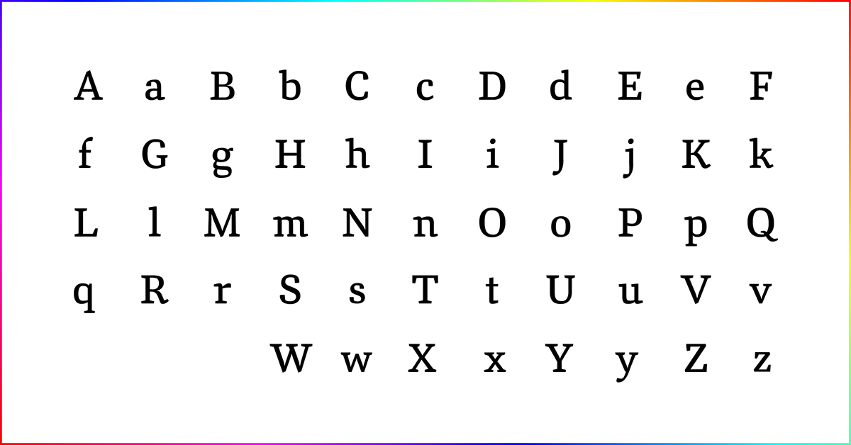
Here you can see all the latin letters.

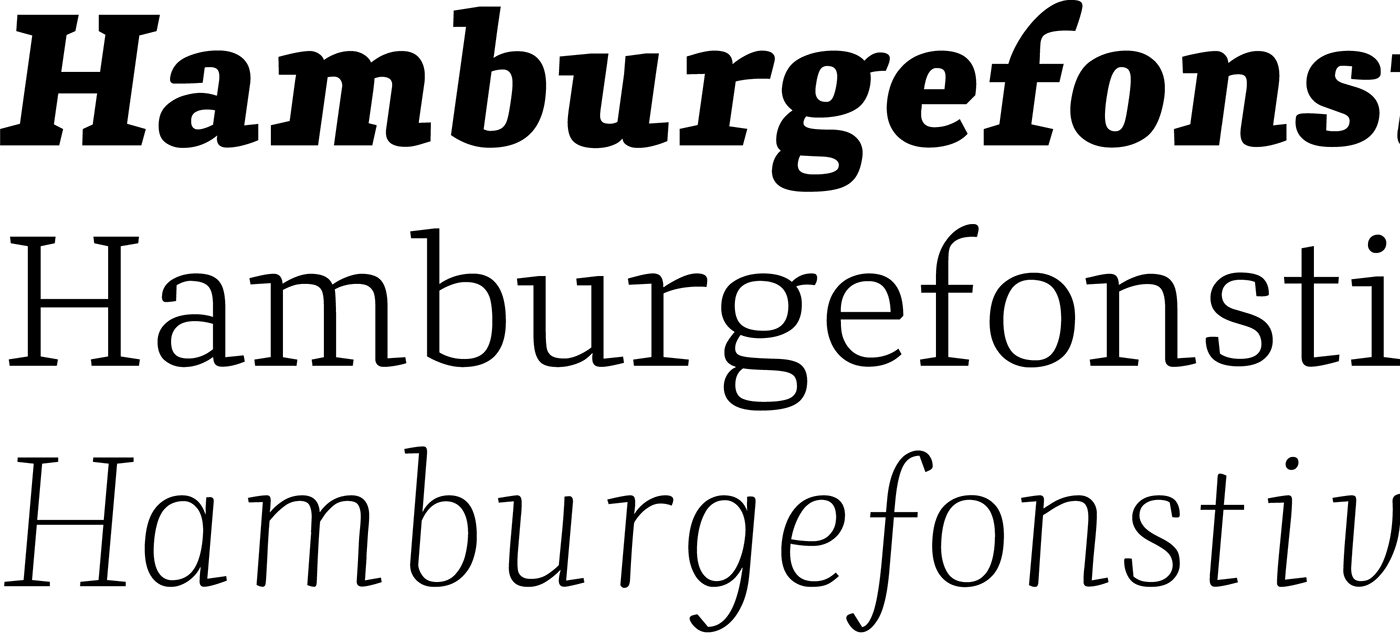
Ratio of contrast in heavy styles. Differences between the italic and antiqua.
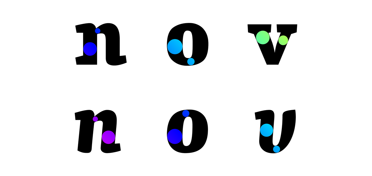
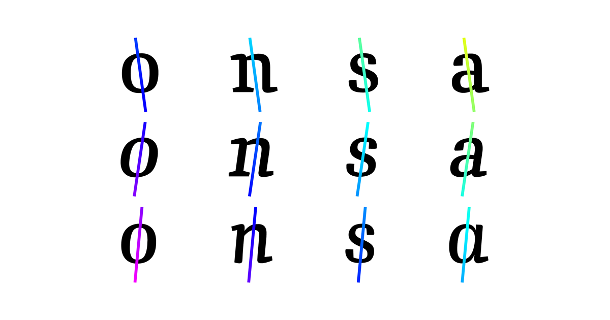
Axis of the letters differs depending on the style.
The interpolation.
So…
You can use it to write some poetry for example.

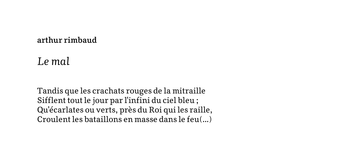
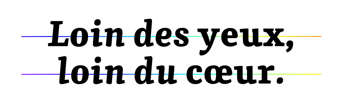
…or a book.
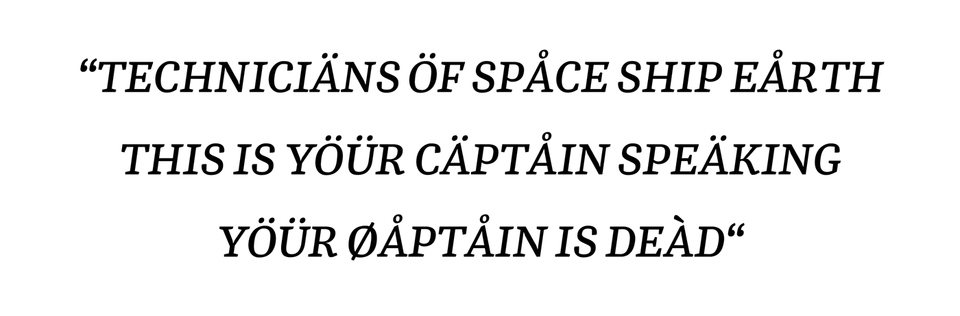
You can use any European language.


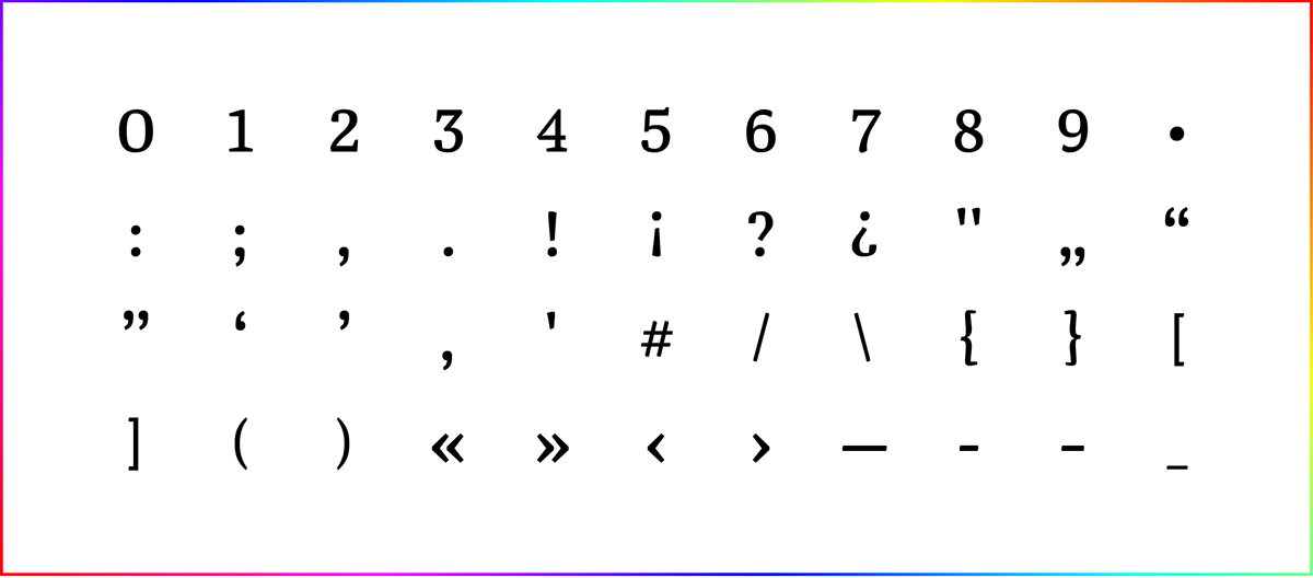
Of course there are numbers and punctuation symbols.
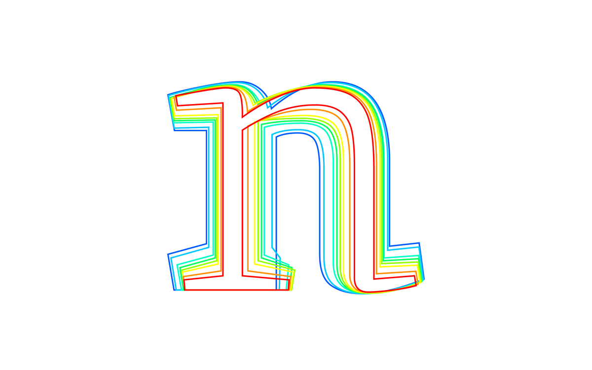
Dancing letters!

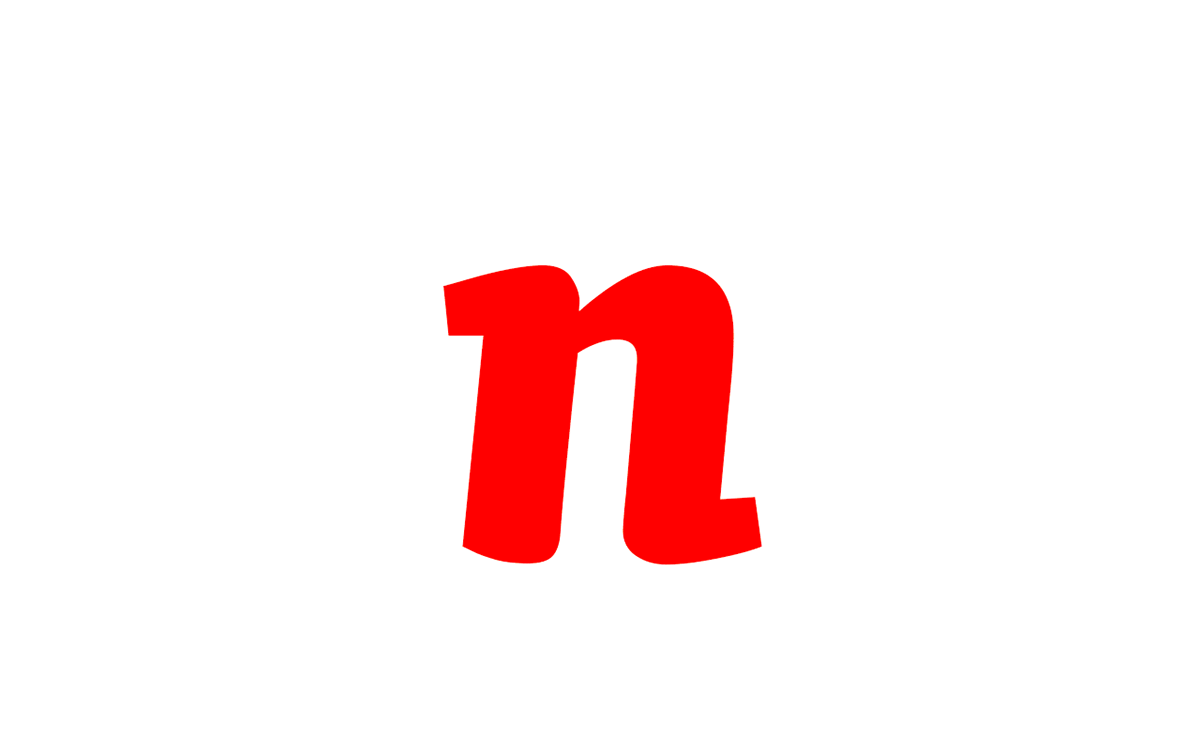
And here you can see dancing alone letter "n".
THANKS!
If you wanna check this font out, you can do it in empirical way, you can download it here:
https://db.tt/23HKBRYo
I'm still working on it, so expect bad kernig and wierd numbers.
