


Hydro Agri
Your Partner for Growth
Creating a global brand identity for an industrial scale global chemical fertiliser business which redefines their partnership with farmers.
Hydro Agri are industrial scale global manufacturers of chemical fertiliser. As a division of the Norwegian conglomerate Nörsk Hydro they were branded using Hydro’s ‘Viking Ship’ corporate mark. This device was appropriate for a group of companies with diverse interests, but it said very little about what Hydro Agri actually did in the agriculture sector and failed to resonate with farmers. We were asked to create a new brand strategy and corporate identity which would distinguish Hydro Agri from competitors. Our goal was to redefine their relationship with farmers and help Hydro Agri communicate their commitment to environmental concerns and sustainable farming practices.

Dynamic growing industry
Agriculture is an increasingly competitive and rapidly changing industry. With income, profitability and environmental issues focused on more than ever, farmers are demanding more from suppliers, in terms of the skills and knowledge of representatives, product suitability and the services they offer. Changes in the industry landscape demanded a rethink of how Hydro Agri connect with customers and offer products and services.
A sustainable philosophy
First, we had to develop a differentiated positioning with a clear understanding of customer needs. Our strategy centred around the philosophy of profit being driven by sustainable growth where Hydro Agri work in partnership with farmers; providing rigorous soil analysis and solutions to maximise crop yield whilst preserving the viability and ecology of the land.


A genuine partnership for growth
An industry-wide competitive audit revealed that chemical fertiliser company brands leant towards a more ‘industrial’ style of design. This identified a strategic opportunity for Hydro Agri to take ownership of the concept of ‘nurturing growth’ (both agriculturally and financially) by building trusted and transparent relationships with farmers. The success of Hydro Agri would be driven by careful analysis of customer need rather than selling as much fertiliser as possible.
Branding ‘nurturing growth’
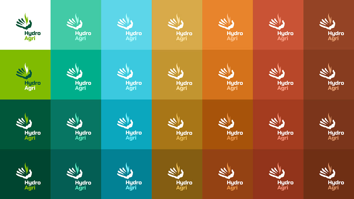
The new logo for Hydro Agri visualises a seedling growing from a brushstroke hand which is designed to resemble furrows in field. The logo communicates a more open, caring and approachable style and projects Hydro Agri’s on-going commitment to building relationships with customers and caring for the environment. It signifies a ‘hands-on’ approach which delivers sustainable profitable growth for farmers.


Flexible endorsed brand architecture
An additional challenge was the new Hydro Agri logo had to appear endorsed by the Nörsk Hydro logo. The problem is that when any two different logos work side-by-side they always visually ‘clash’ with each other. To create visual harmony we developed the ‘graphic field’ system inspired by aerial photographs of agricultural land and the square shape of the Nörsk Hydro logo. This flexible system allowed for multiple colours, configuration and even photographic application within it.


Project outcome


Acknowledgements
Project Date
1999
Agency
Springpoint
Design
Gary Broadbent
Strategy
Alistair Cummings
Production
Dennis Furniss
Thank you!
Your likes and comments
are much appreciated.
Based in Sydney, Australia
we work on projects big and small
all around the world and we’d love to
talk to you about yours.
For all project enquiries
media and PR requests
or job opportunities, please


