

龍一燒肉丼飯 Long-I Visual Identity design
Branding | Visual Identity


Purpose:
Long-I is a Taipei-based Japanese restaurant targeted at white collar workers. Through the joy of Japanese cuisine, Long-I aims
to replenish and nourish white-collar workers’ motivation to give their all. In 2016, Long-I sought a logo and visual applications
that would help express its distinctiveness amongst the myriad of white-collar oriented Japanese restaurants in Taipei.


Process:
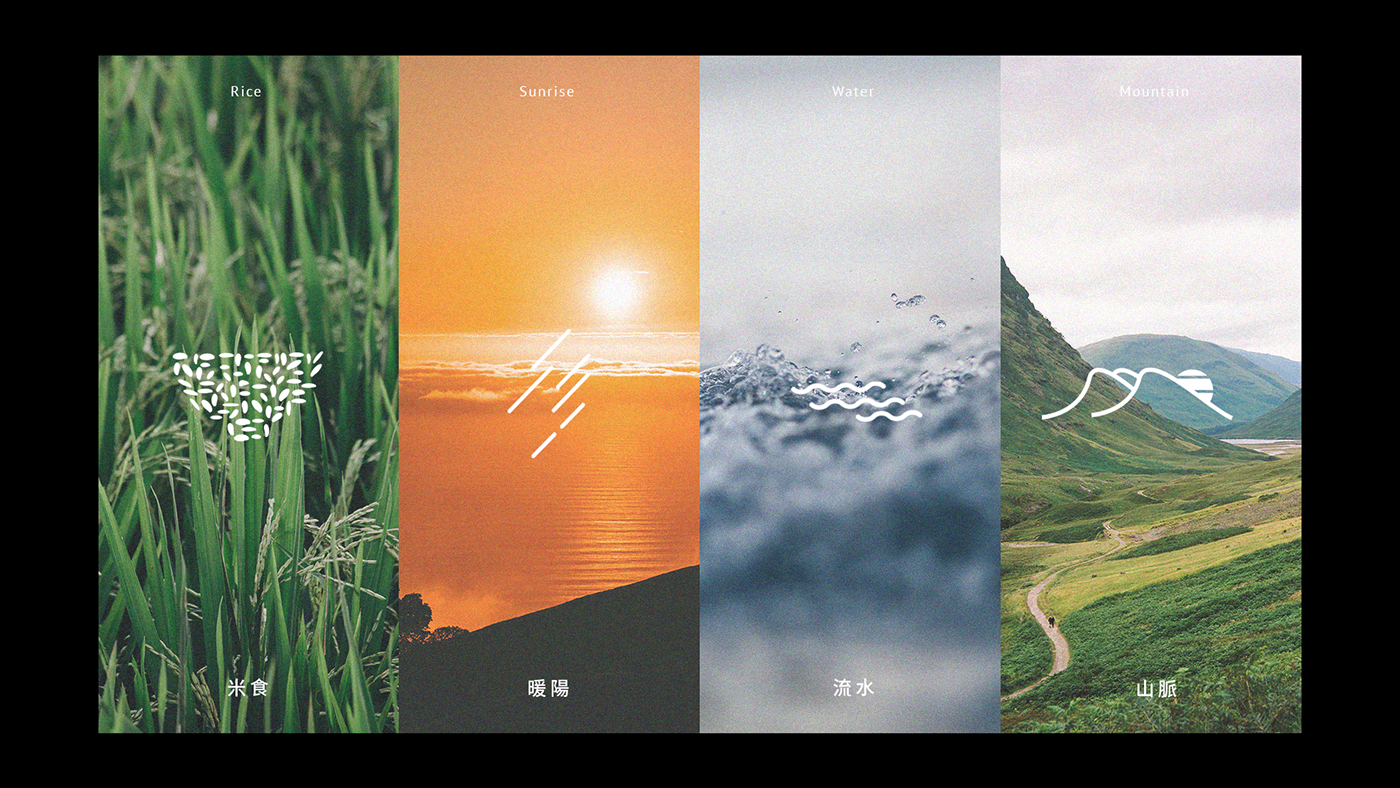
“Full of Sincere Goodness” or『 誠意食足』 is Long-I’s positioning and the brand’s expression strategy. The logo’s core visual device consists of 66 individual millets of rice, reflecting a level of detail orientation that reflect’s Long-I’s SINCERITY towards providing replenishing and nourishing Japanese cuisine for Taipei’s white collar workers. The usage of 66 - a lucky number in Japanese culture - and the ‘sunrise over mountain’ graphic ties the logo and visual applications back to Japanese culture, which is the GOODNESS that Long-I delivers to its customers. Comfortable shades of orange and blue are Long-I’s brand colors, ensuring that the visual identity expresses the warm welcome evident in Long-I’s intention to deliver “Sincere Goodness”.


Deliverable:
Logo Design/ Brand book/ Menu design/ Name card/
Signboard/ Staff uniforms
-
C: Long-I Japanese Bistro_Taiwan
AD: WeiLun Huang
D: WeiLun Huang
D: WeiLun Huang
-
2016


