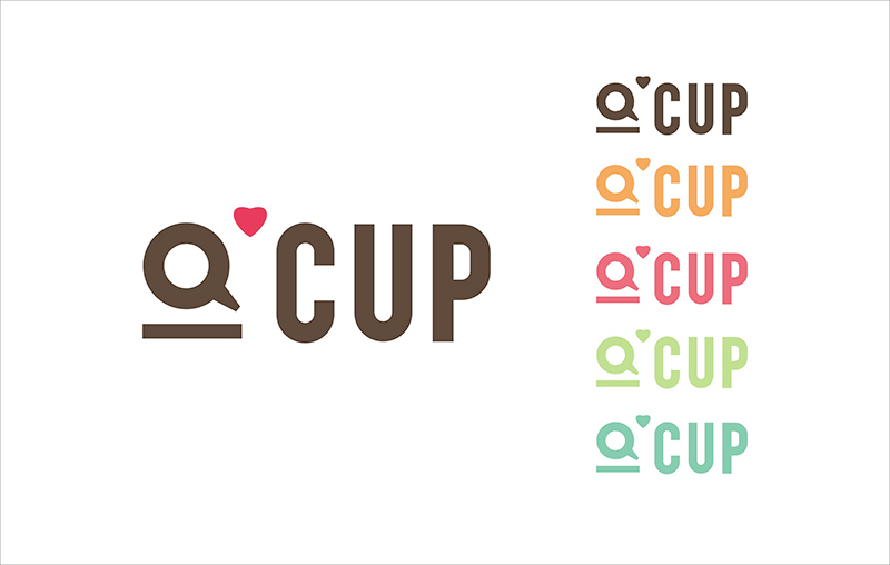
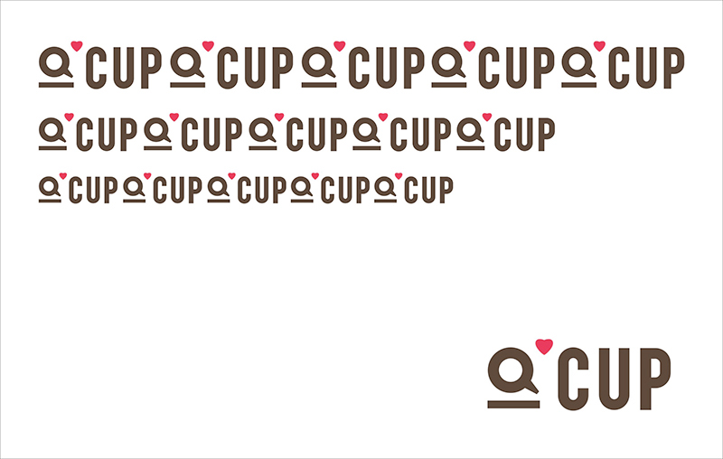
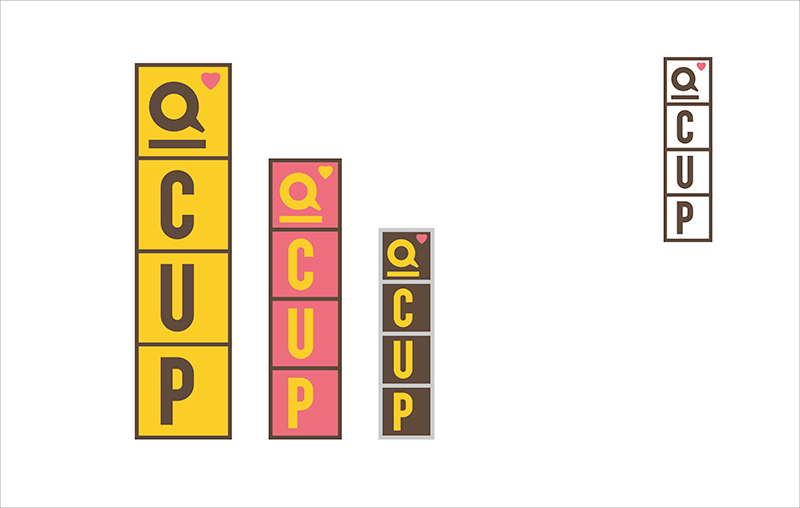
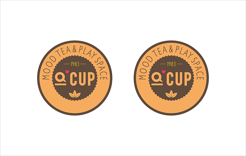
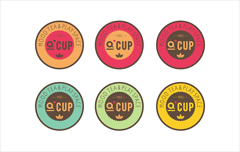
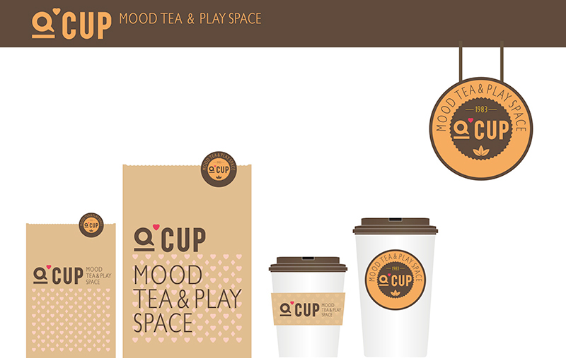
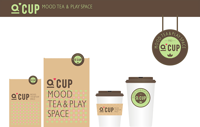
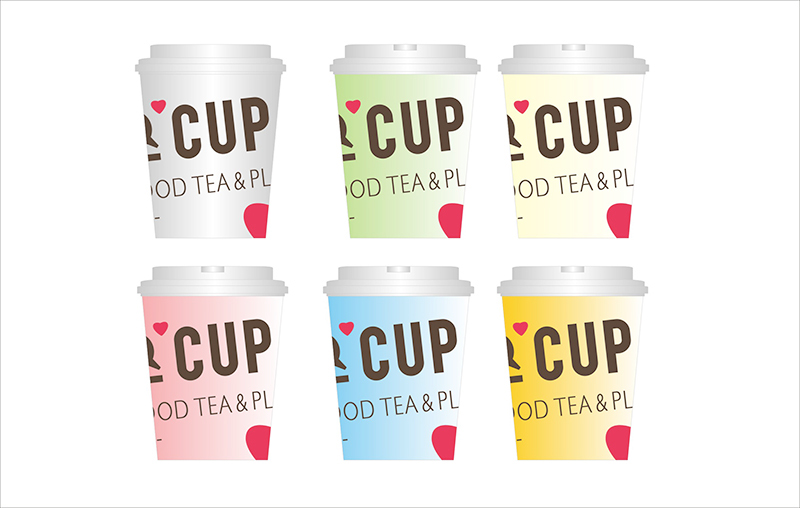
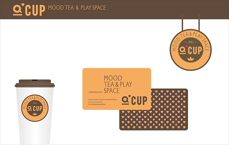
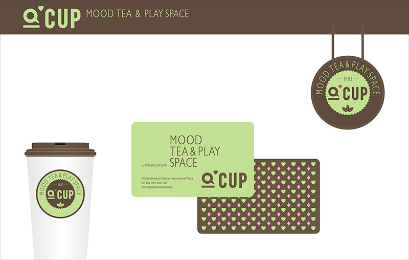
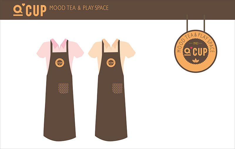
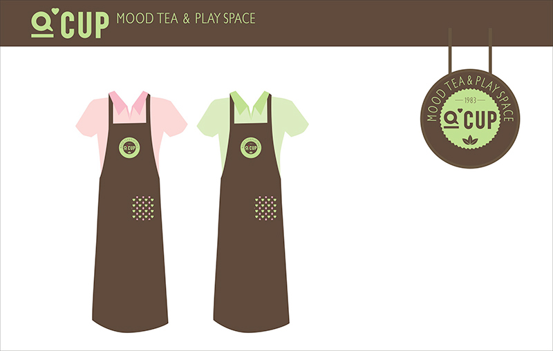
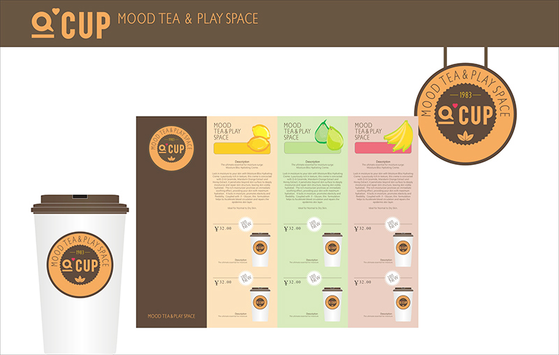
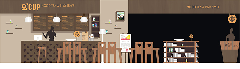
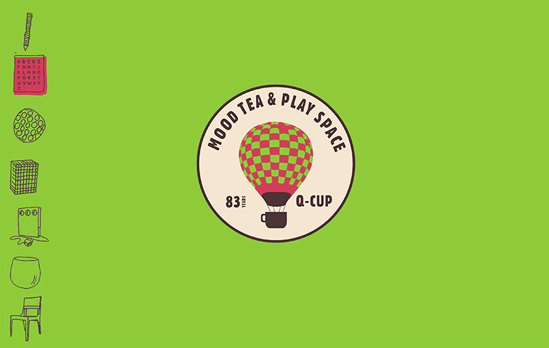
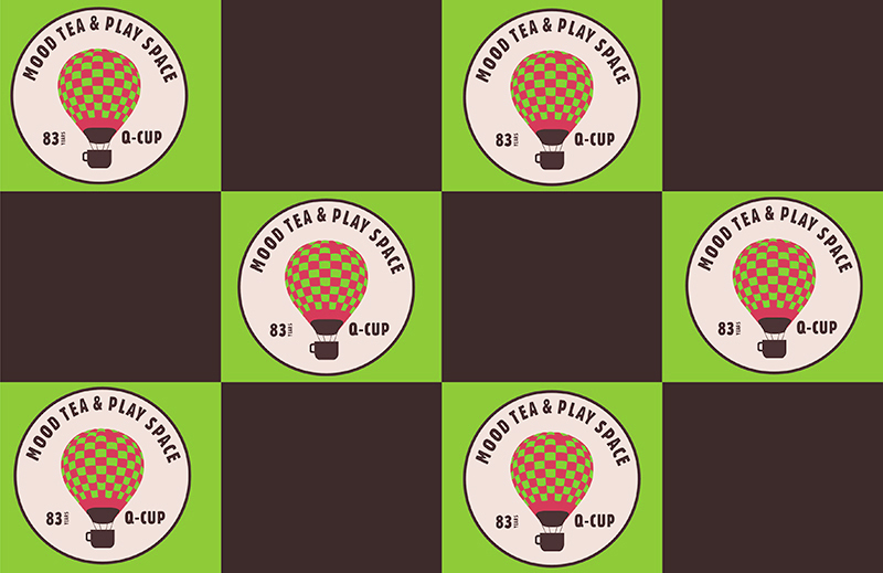
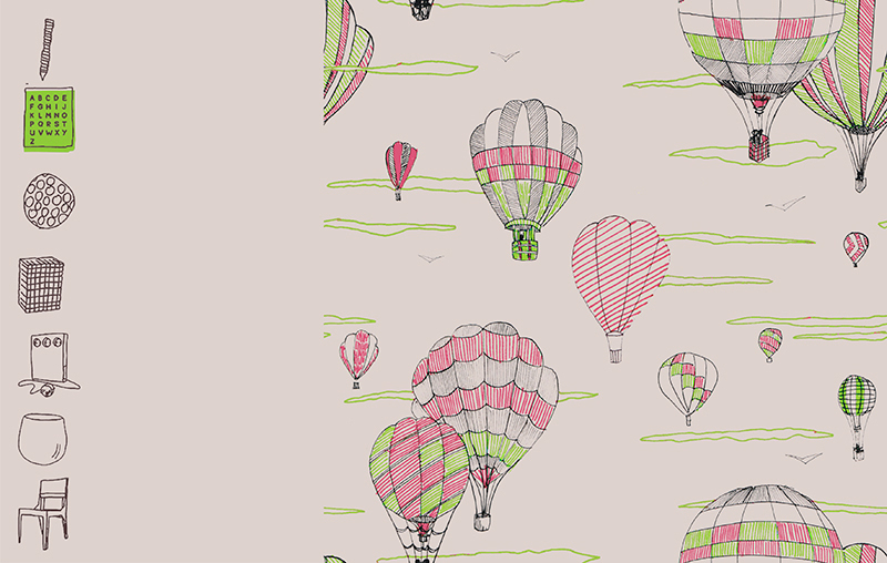
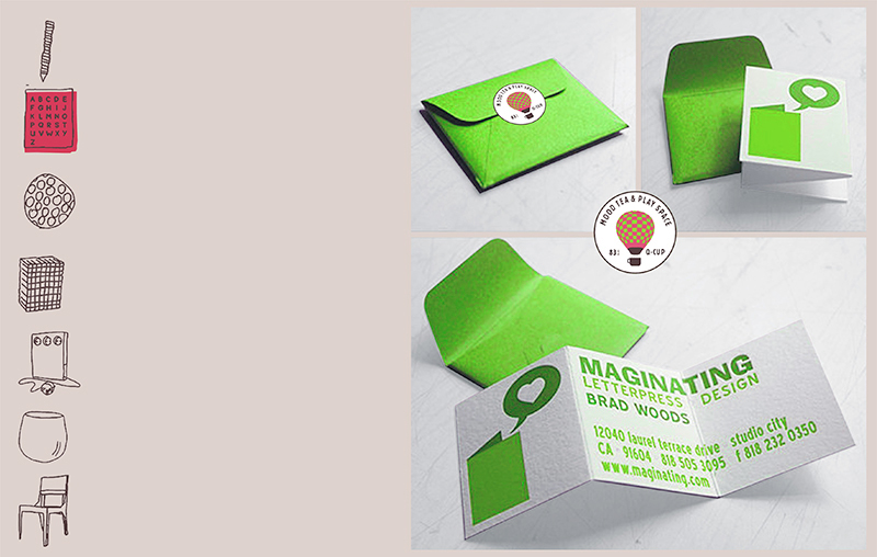
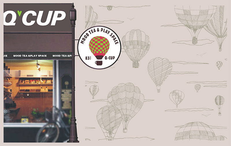
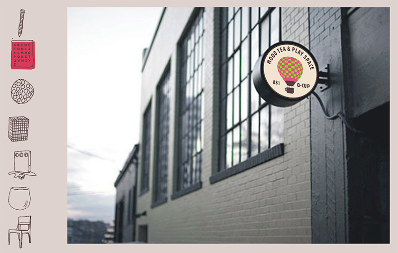
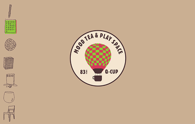
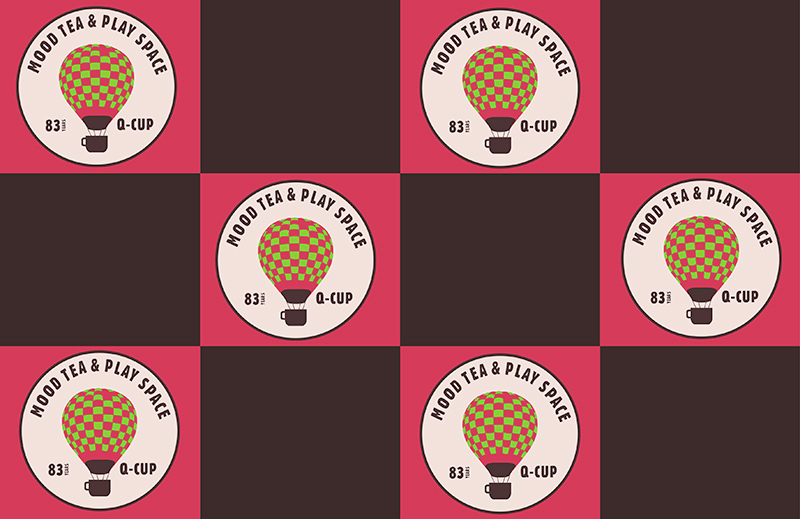
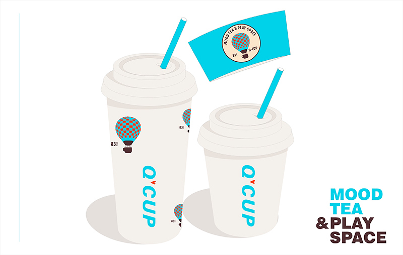
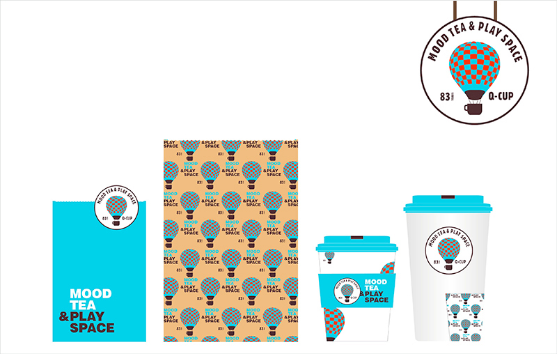
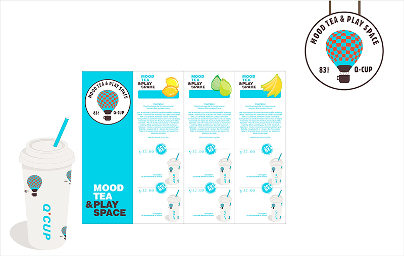
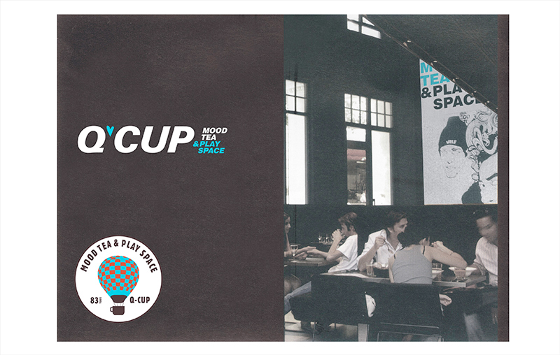
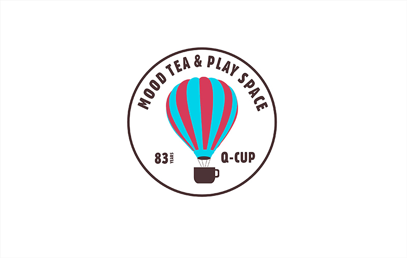
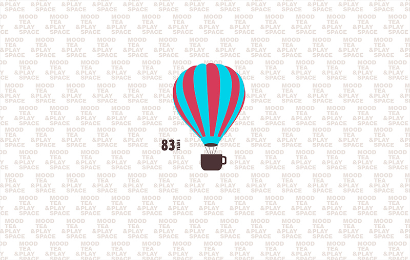
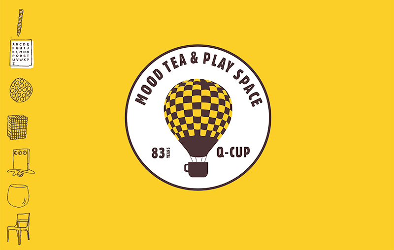
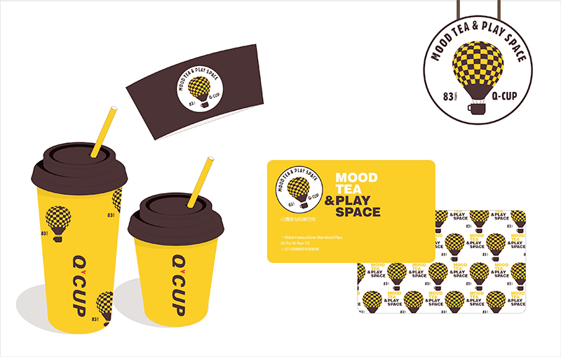
Q-Cup is the American milk-tea store that can provide simple leisure and entertainment. Founded in 1983, it needs a new image when it enters Chinese market. The logo of Q-CUP themes on “leisure tea and enjoyment space”. By taking the heart and cup as the elements, the simple brand style is showed from the 2-D to 3-D, which makes the clients fully feel the message of the brand from the very beginning of entering the store.
“Q-CUP”是专营美国奶茶及提供简单休闲娱乐专门店,创始于1983年,2012进入中国市场需要全新的形象。Q-CUP以“心情茶与玩享空间”品牌语为概念,直接以心、杯子做为元素,配以简约风格,把品牌风格从平面到空间立体呈现,让顾客从进入店后毎一环节都能感受品牌传递的讯息。