My work focuses on re-branding Grand Cafe’s range of coffee, by bringing it to life. My outcomes focus on the natural and ethical side of production. This influenced the colours used and the overall look both the logo and packaging have. From my research I realized that the packaging of a product really does help give a sense of the type of business is behind it
– in terms of if it is environmentally friendly for example. For this reason I tried to visually market it slightly similar to those products who are ethical and environmentally friendly, and also showing a piece of the background of where the coffee is sourced.
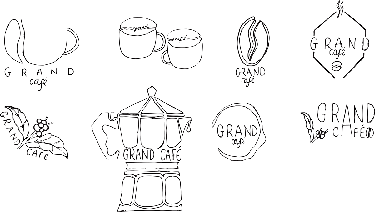
Here's some of my initial ideas for the grand cafe logo re-design
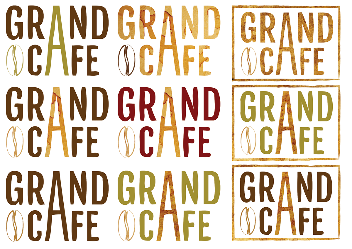
After deciding on the base of the logo I started to experiment with colour and also coffee, seeing if I could add that to the logo design and how.
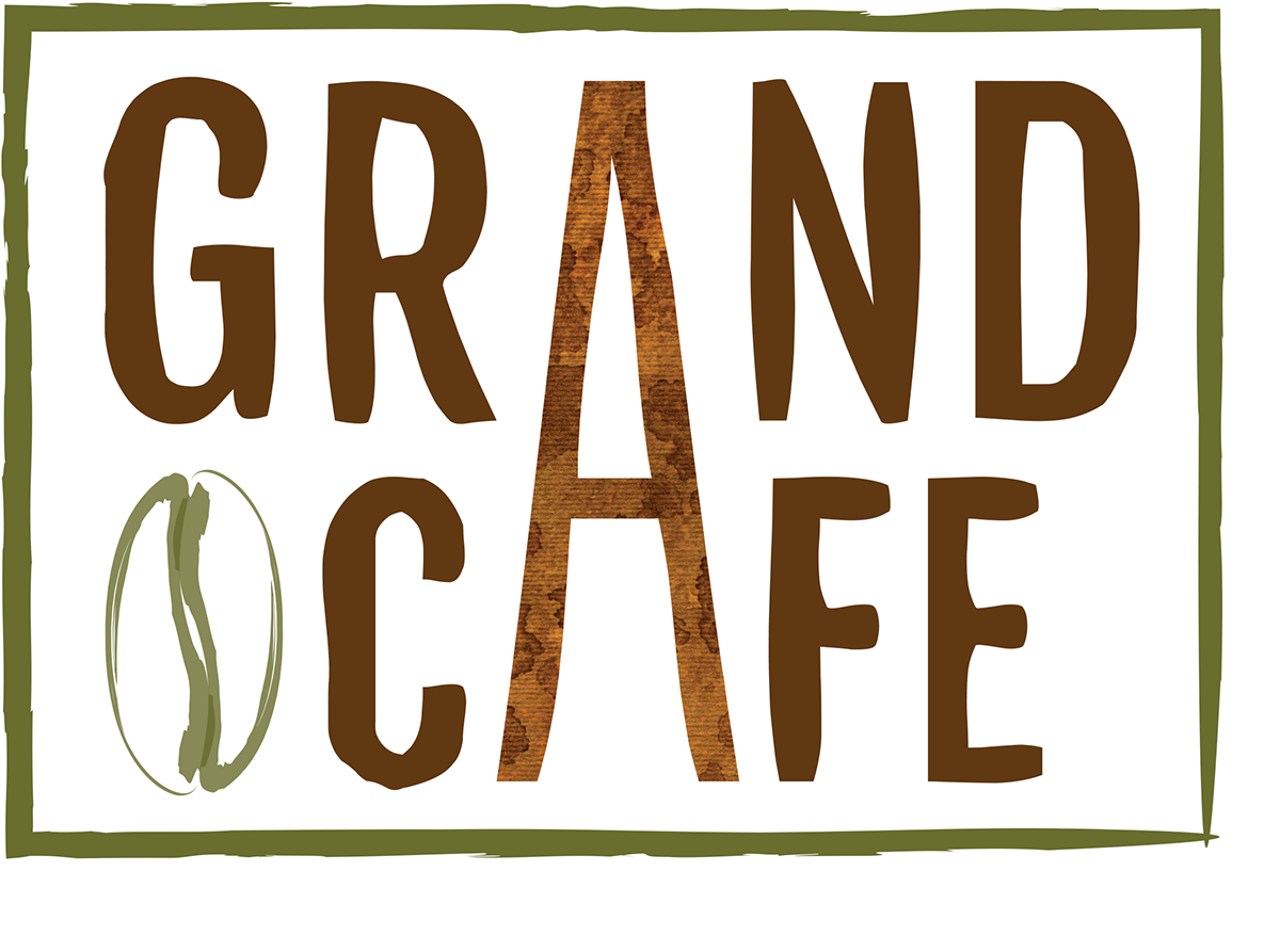
Final version of the re-designed logo
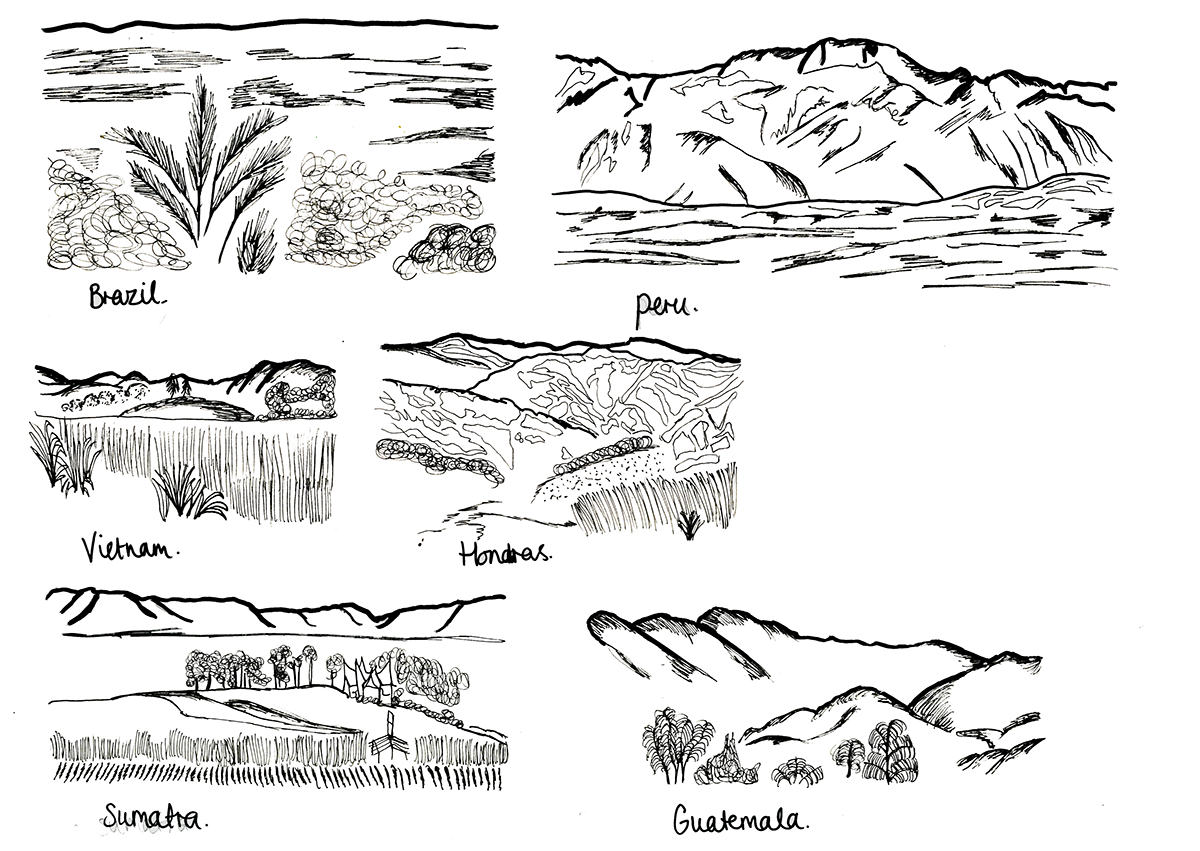
Sketches of landscapes showing where the coffee is sourced from.
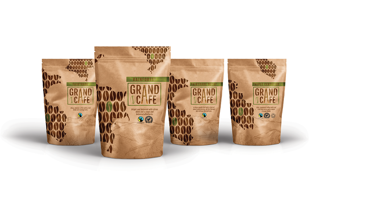
The main aesthetic values of the coffee packaging are the coffee beans, which make up the states and country where the coffee is sourced. I decided to use the outline of the state where the each type of coffee is from and use the coffee bean to make up the inside of the state. This way I was visually showing where the coffee comes from on the packaging. The packages that feature more than one state mean that the coffee is made up of a blend from different states. On each state I added a green coffee bean to add a splash of colour to these sections. I also created hand drawings of landscapes from each place the coffee originates from and added these faintly in the background of the packaging to add another visual element and reference to where the coffee comes from (This is what the 2nd image from bottom is).


