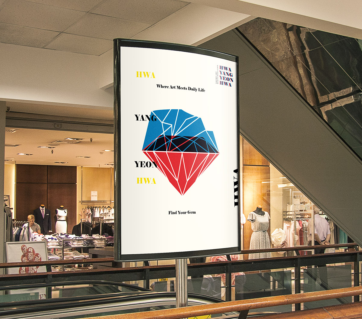
This identity design project I created is about a flea market called “Hwa Yang Yeon Hwa”. Briefly summarizing it, there is a flea market that opens every Friday and Saturday in Seoul, near Kunkuk Universty. I have decided to improve the identity of this market since it had no specific theme for its special being. So, I renamed the market as “ Hwa Yang Yeon Hwa”, which means “ The most beautiful moment in your life”. The sellers who participate in the flea market are all artists and I wanted to really focus on that identity and created a slogan, “ Where Art Meets Daily Life.”


Logo is simply and delicately designed with solely typography with the colors blue and red.

As with the logo, I combined and made a fushion of the two colors, red and blue, signifying that Art and Daily intertwines together and exist at the same moment and time. Red here, signifies passion that captures the passion of the artists and the volunteers in the flea market. The blue, signifies nature that represent daily life in this context.


These are the name cards for the staff. Through the interview I had with the current staffs in the flea market, they were all volunteers who wanted to contribute for the better of the society. These normal people who work in companies and who have normal lives, gave me the impression of superheroes because they volunteered with a good heart to make the area a culturally flourishing part of Seoul.


