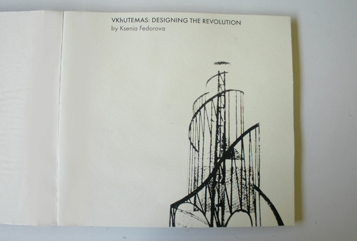

My BA dissertation was a study of VKhUTEMAS as a pioneering design institution, the cultural and social processes that lead to its opening and the complex reasons of its sudden closure.
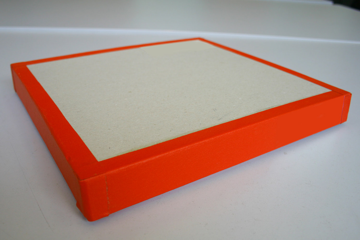
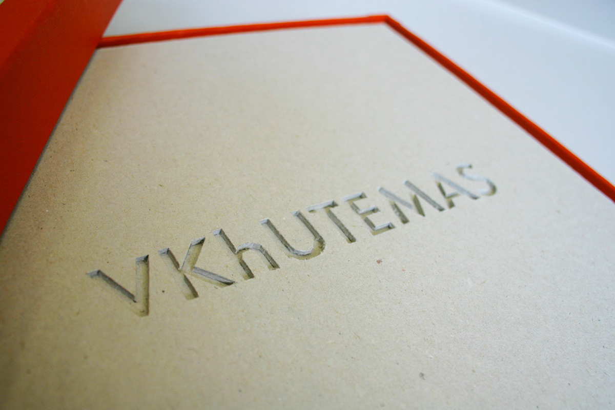
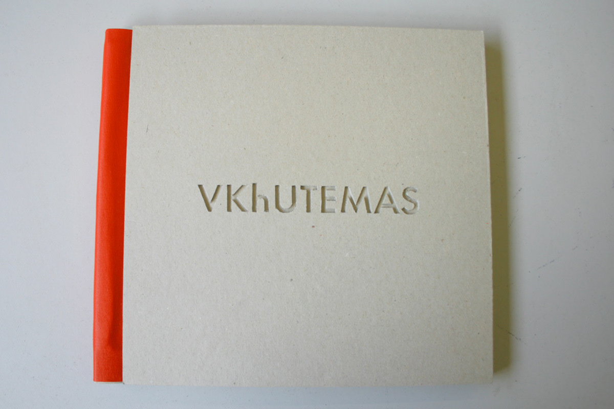
My aim was to reflect the essence of 20s Russia constuctivism and its futuristic publications without making a pastiche. The color, material and thickness of the cover is meant to represent the solidness of a concrete block with the title "engraved" into it. 9 silkscreen prints used as chapter dividers are a sequence illustrationg "deconstruction" of Tatlin's tower as a symbol of avangarde into a socialist realism tackyness of pillars, porticos and idolatry. The layout and typeface (Futura by ParaType) are also adjusted to represent the epoque.