


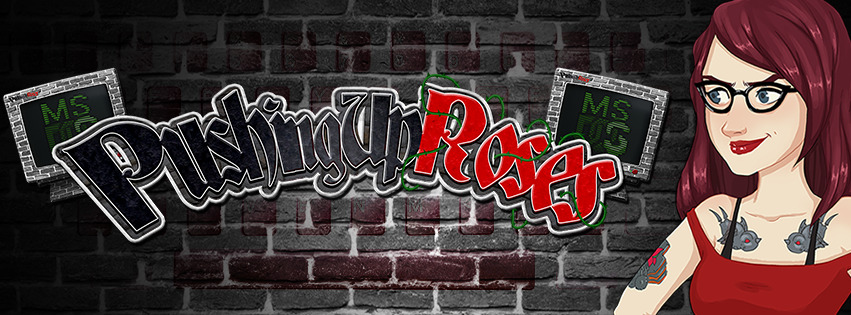
This is the new logo I made for PushingUpRoses! When looking at Sarahs persona on YouTube she has a very tough personality that blends in with a bit of rock and goth. For me it was the challange to find a balance within those characteristics to make the best logo possible.
I wanted to keep things monotone, but yet with a splash of color, to keep the very dark style possible. Therefor I chose to add a bit of red, since it's one of her main colors in her branding. To keep things tough, I added celtic letters with pointy edges. to not only create depth via the bricks and borders, I wanted to create a bit more of a dynamic feel and added a curve with thornes to create a sense of depth.
The MS Dos computers in the back are there to give the viewer a sense of what the content will be about. Since Roses reviews a lot of Dos games, I thought it would be cool to create these gothic like CRT monitors that have MS Dos projected on them.

This is a version of the logo without the monitors.

The background for the banners of PushingUpRoses! To still create a bit of character in a brick wall, I created a keyboard stencil art on top of it, to give a bit more color and flavor. The dark edges on the side are there to give the art a bit more depth, that would fite with the logo.


The Twitter, Twitch, Facebook and YouTube banner for Roses! This is basically all the images stamped together in one nice composition :)
The avatar on the right was created by Unicornism, please check her work out!


