
Lately, it seems that I've been seeing an influx of logo updates come my way. Logo updates are pretty interesting, because you get to see where the client's business has been before you start the project. This logo update was unique in that the client had just paid an agency to update their logo (pictured above). Our company had been called in to work on TV, but after seeing our logo work they hired us to go back to the drawing board on a new logo design. This typically doesn't happen, but in this case the client felt unsettled on the mark they had been sold. Knowing this, I felt that I needed to give them a logo that had strong legs... but I only had a few days to do it.

After meeting with the client, I felt that they were truly a master of their craft (pharmaceutical compounding) and they really cared a lot about providing a quality service. the mortar & pestal are very iconic when it comes to the wide world of pharmacies, but since my clients business truly used these tools, it was important to incorporate them in their new logo/mark. I did a few quick thumbnails, trying to incorporate a very subtle image of a humanoid figure cradling a pestal, the mortar serving as the head of the figure.
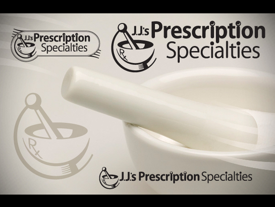
While I do think the concept of a figure cradling the pestal with care is a sound idea, I'm not 100% sure that it comes across in the final mark. That being said, I do think that by moving in that direction we ended up with a strong mark, and if the figure is seen, then that is a bonus. I wouldn't sacrifice the quality of the mark for the idea. As always, I made sure, first and foremost, that the mark worked well in black & white. Elements from the logo-mark are echoed in the word-mark itself. I try to avoid leaving a font in it's standard format, and this project was no different. The word-mark has been modified to create a custom set of letters that is unique to our client's brand.
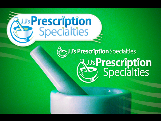
Once I established a strong single color mark, as is standard, I moved into the full-color realm. Here I established the color palette for the mark, which will spill over into our client's future brand touch points.

It was important to our client that we reflect of the tradition of their craft. Taking that into account, I believe our updated "mortar & pestal" logo-mark winks at that heritage. Seeing the full-color version of the mark, along with the framing, our client was sold on the color choices. The mark works well in either of the singular brand colors.

Now, why did I only have few days to update this logo? Our client is currently moving to a new location and in desperate need of signage for their building, and it seems that a decent amount of time had already been spent developing the first logo. We needed to update the mark, but in a time frame that worked with the sign company's production schedule. As a part of the logo update, I agreed to help the client come up with a strong sign that would show off their new mark and brand palette. We provided this mock-up and a vinyl ready vector file for the sign company to use in their production process. All in all, this was a very pleasant project to work on. The time frame may have been tight, but the client was very pleased with the end result... and I was too.

(vinyl ready graphics for sign)
