
REBRANDING
Concept & design of the new logo for the "Cubo di Sole"
Solar Powered Water Purificator machine.
Client Briefing
This machine basically converts dirty or salty water in pure and drinkable water, using a chimical process making use of an electrical engine powered by a photovoltaic shelter on the top of the machine.
The Ideas
The ideas that I come up with were focused on the "collaboration" of the sun and water, the union and the exanche of this two forces that works together.
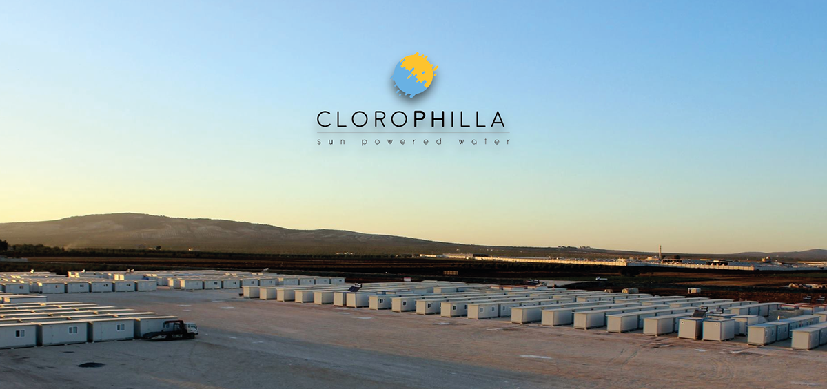
"CLOROPHILLA"
The first concept is based on the italian name of the natural process that plants use to live and grow using water and sun, adding the PH phonetic "F" to enfasize the link with clean water. The logo itself is a visual rappresentation of this two elements (sun and water) that merge together one in the other.

"NEWT"
The Newt is a semiaquatic amphibian of the family Salamandridae. Doing some research I came across this little creature and I found interesting the idea of using an amphibian animal as a logo for this product. First for the fact that this type of creature have the need to live on land under the sun and in water and second is the name, I found the name Newt very suitable for a product naming. The logo itself is the paw of a triton.


"HYLA"
This one is simply a variation on the "Newt" logo and basically for the same reasons. The name Hyla is associated to the common frogs gene, with over 300 species under it. For the same reasons of before, I have decided to use this term for the name, I found that Hyla was perfect even because create an assonance with Hydros, the greek god of water. I decided for this one not to use a logo, but instead to play with the font making it more "fluid" and soft.


For more info: