Al Waab City
Me and the Unisono team designed the original rebrand of the first logo back in 2008 and were recently asked to redevelop the brand (development version three) in line with their new development strategy which was essentially to make the project more open to outsiders.
The design of the icon and additional visual device references the notion that at a city is a live and gravitates around a central hub - where life is concentrated. The dynamic branding solution is multilayered like any city and changes shape and colour according to what aspect of the project you are promoting. Here you will see just a few of the many logos
The design of the icon and additional visual device references the notion that at a city is a live and gravitates around a central hub - where life is concentrated. The dynamic branding solution is multilayered like any city and changes shape and colour according to what aspect of the project you are promoting. Here you will see just a few of the many logos

Master brand identity

Arabic versioning was done for each district

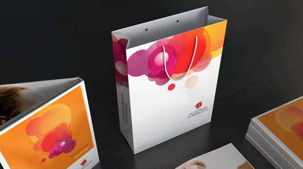
Each brand (master and four sub-brands) had their own unique illustration-based fifth element graphic device to aid in differentiation and to extend the graphic pallet.

Their was only one logo for the Riyad (garden) district


Multiple logo's were developed for retail - one per retail district


Multiple logos were developed for each business district

Brand elements represented the energy of city life, web-like arabesque feature represented rich interconnected nature of lives in the city


Brand book, bag and collateral set


Cityscape Doha stand design

Cityscape Doha stand design
