

LATAM Sans was designed in 2015 by Blackletra together with the Interbrand team. The idea of using a proprietary typeface to communicate LATAM’s tone of voice and integrate all media items was, since the beginning, a strategic solution. The brand is closely identified with the South American continent, its sunny weather and the warmth of its people, thus the greatest challenge of this project was to try to capture those characteristics on the design of the letter forms. Besides that, connecting the forms of the typeface to those of the logotype was imperative to the design team.
.
.
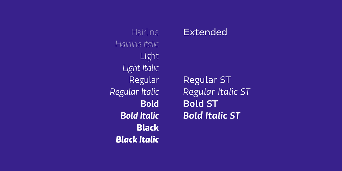
To ensure performance on screens a special version of the font was created: Latam Sans sT (screen text). As the name suggests, this is a redrawn version of Latam Sans, optimized for screen text setting. It comes in two weights, Regular and Bold, plus the respective italics. There is also the Extended version, which has a very specific role: to be used together with the logo in the creation of sub-brands. Its weight and width were fine-tuned in order to achieve the best proportion and contrast for that purpose.
.
.
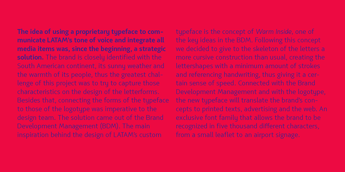
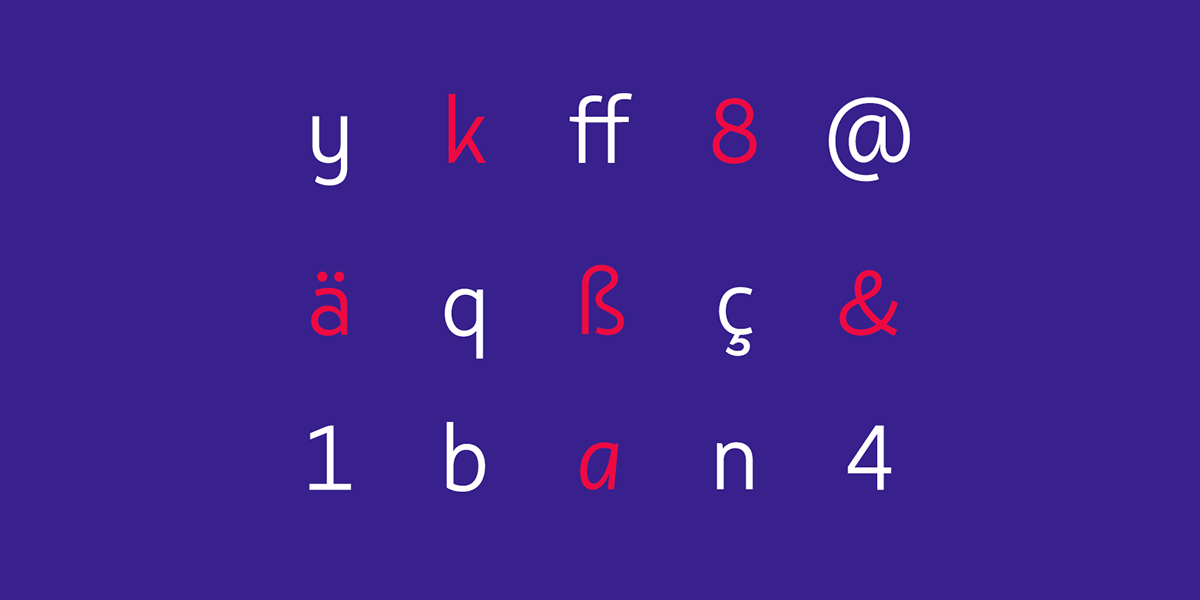
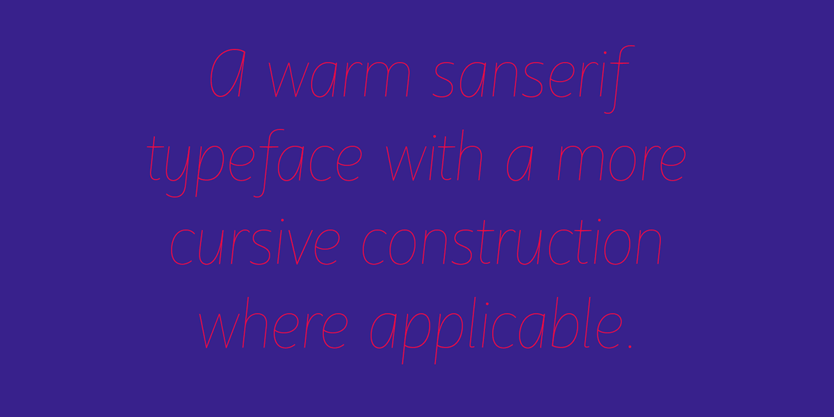
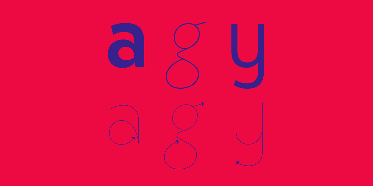
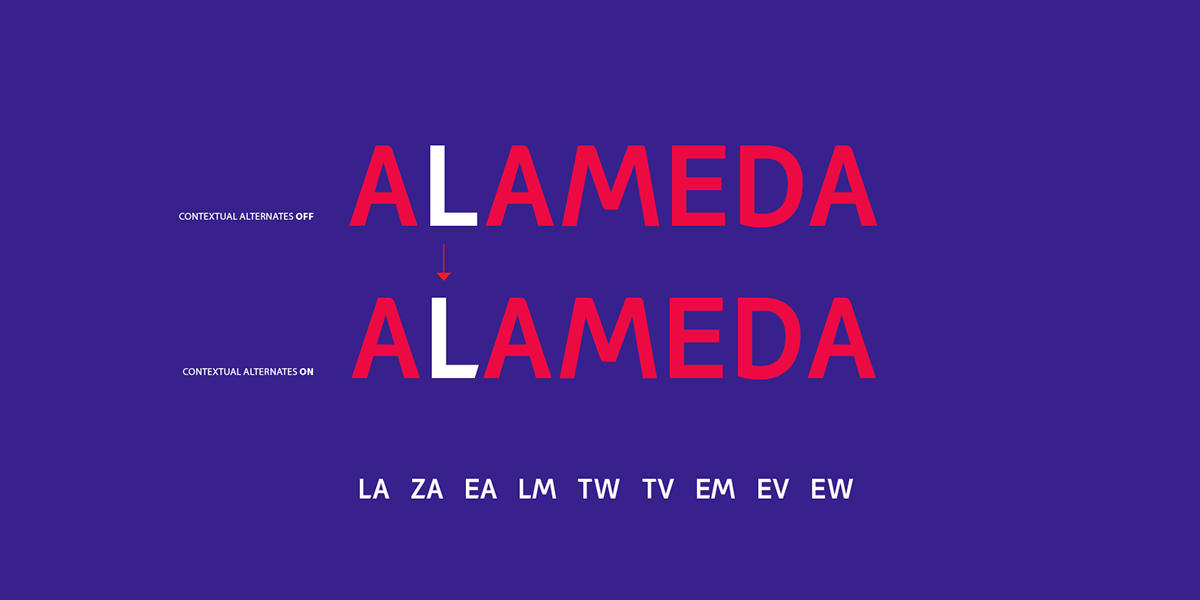
The solution came out of the Brand Development Management (BDM). The main inspiration behind the design of LATAM’s custom typeface is the concept of Warm Inside, one of the key ideas in the BDM. Following this concept we decided to give to the skeleton of the letters a more cursive construction than usual, creating the lettershapes with a minimum amount of strokes and referencing handwriting, thus giving it a certain sense of speed. This explains the alternate glyph created for the uppercase /A of the italics, shown below:
.

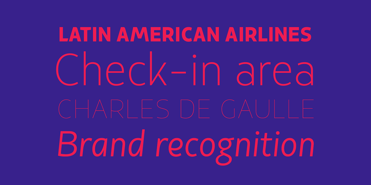
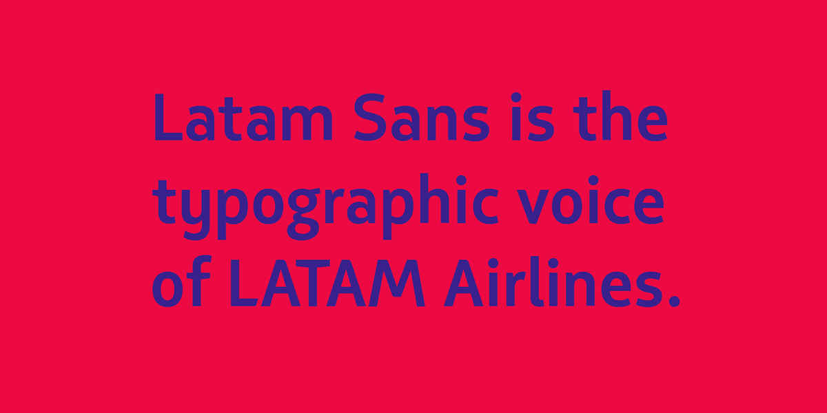
The result is Latam Sans — the typographic voice of LATAM Airlines, a sanserif with a more friendly, human and warm aspect. A highly versatile typographic system with just the right amount of personality.
.
.


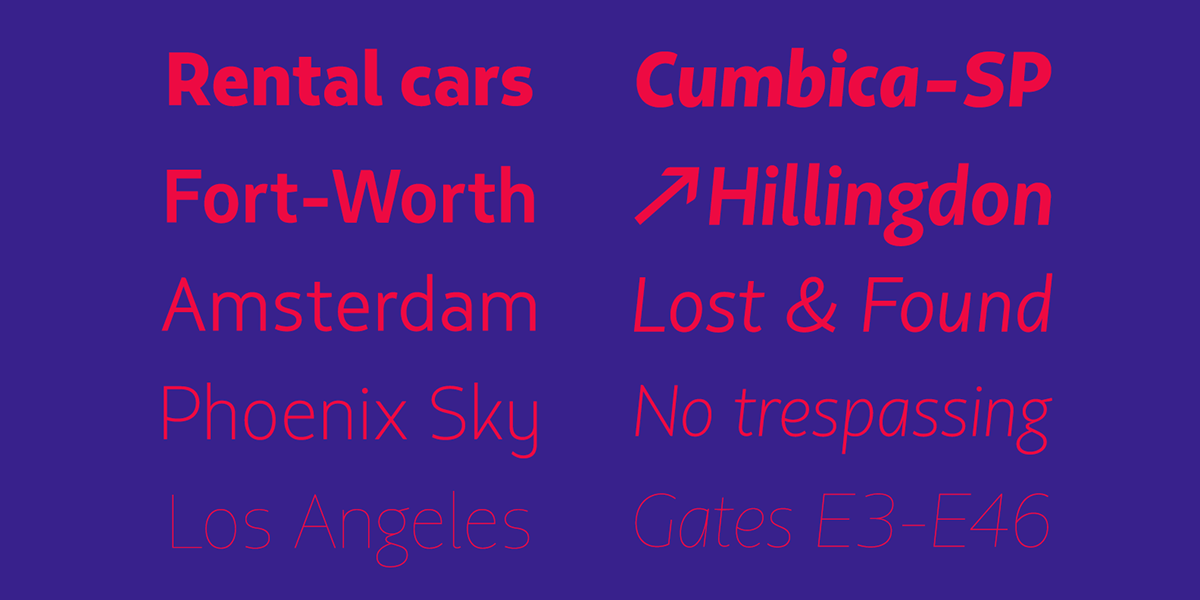
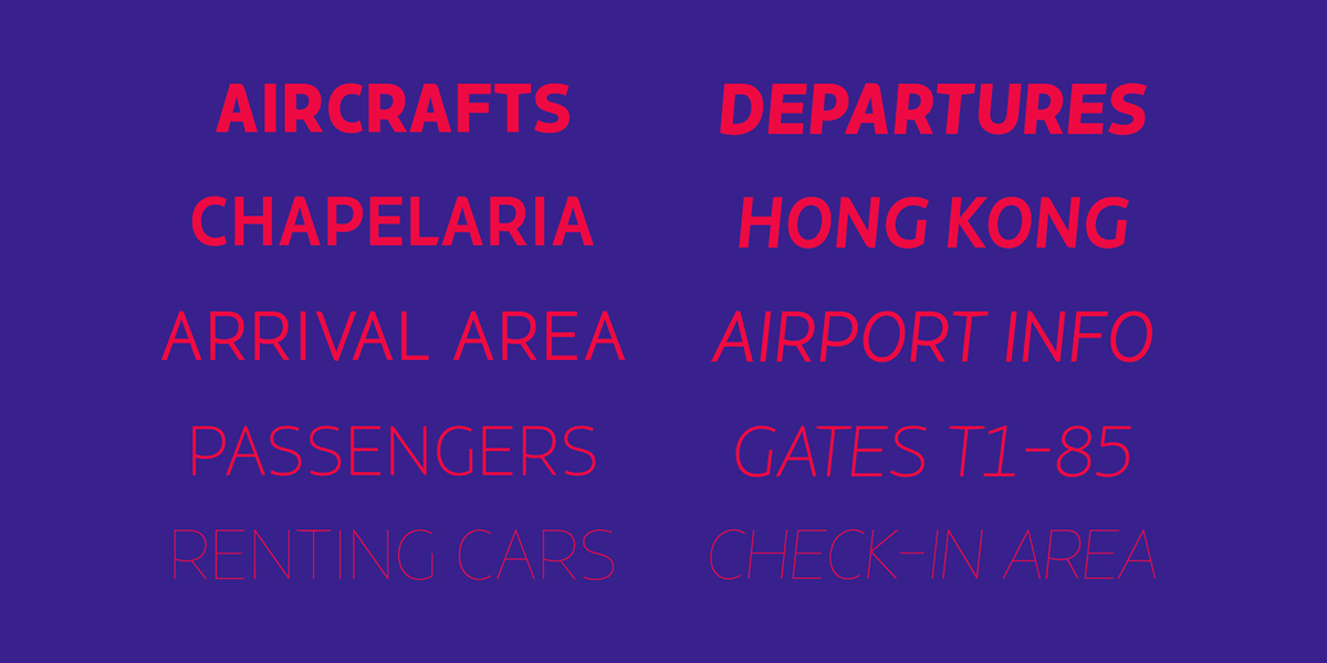
The intermediate weights — Light, Regular and Bold — have been carefully designed for optimal performance in text sizes, while the more extreme weights — Hairline and Black — are intended for use exclusively in display sizes.
.
.
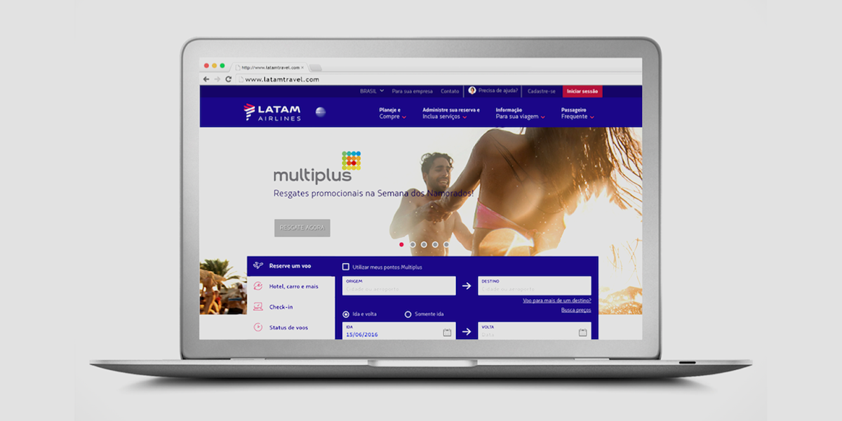
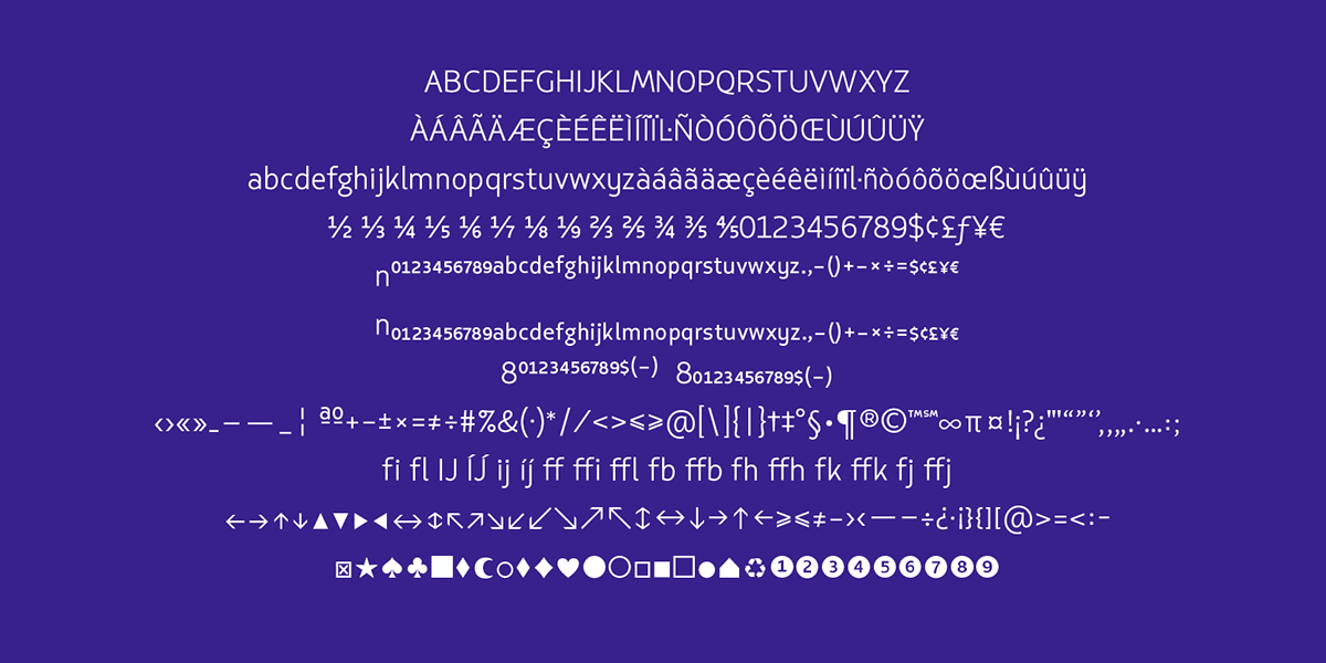
Connected with the Brand Development Management and with the logotype, the new typeface will translate the brand’s concepts to printed texts, advertising and the web. An exclusive font family that allows the brand to be recognized in five thousand different characters, from a small leaflet to an airport signage.
.
.