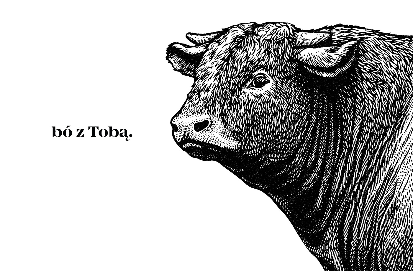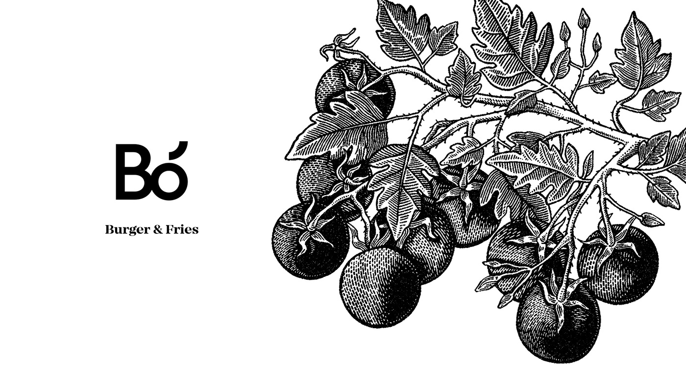
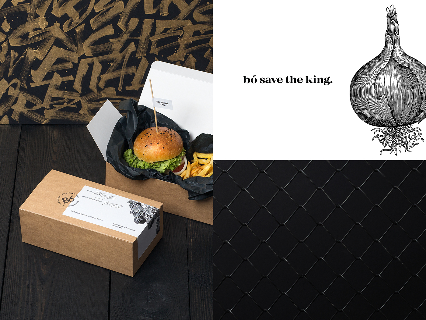
Bó is a new place on the culinary map of Kielce. A place where you can have the best burger and fries, served with the famous sesame sauce.
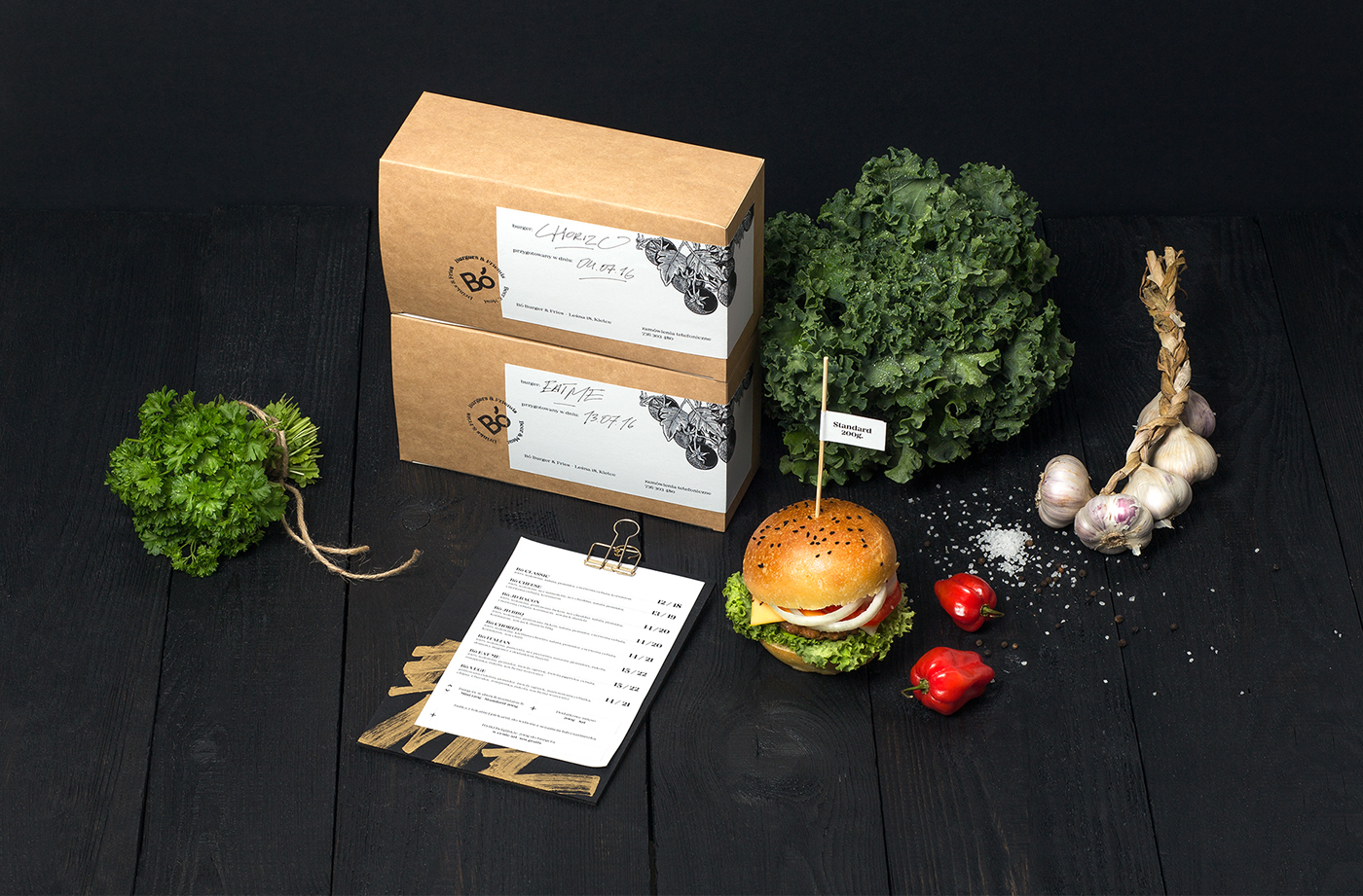
One of those bars which you open out of sheer passion. For yourself, your friends and colleagues. A place in which everyone should feel good, tasting the highest quality foods. Original recipes, ingredients from regional suppliers, and our corporate identity tying everything together in a coherent whole.
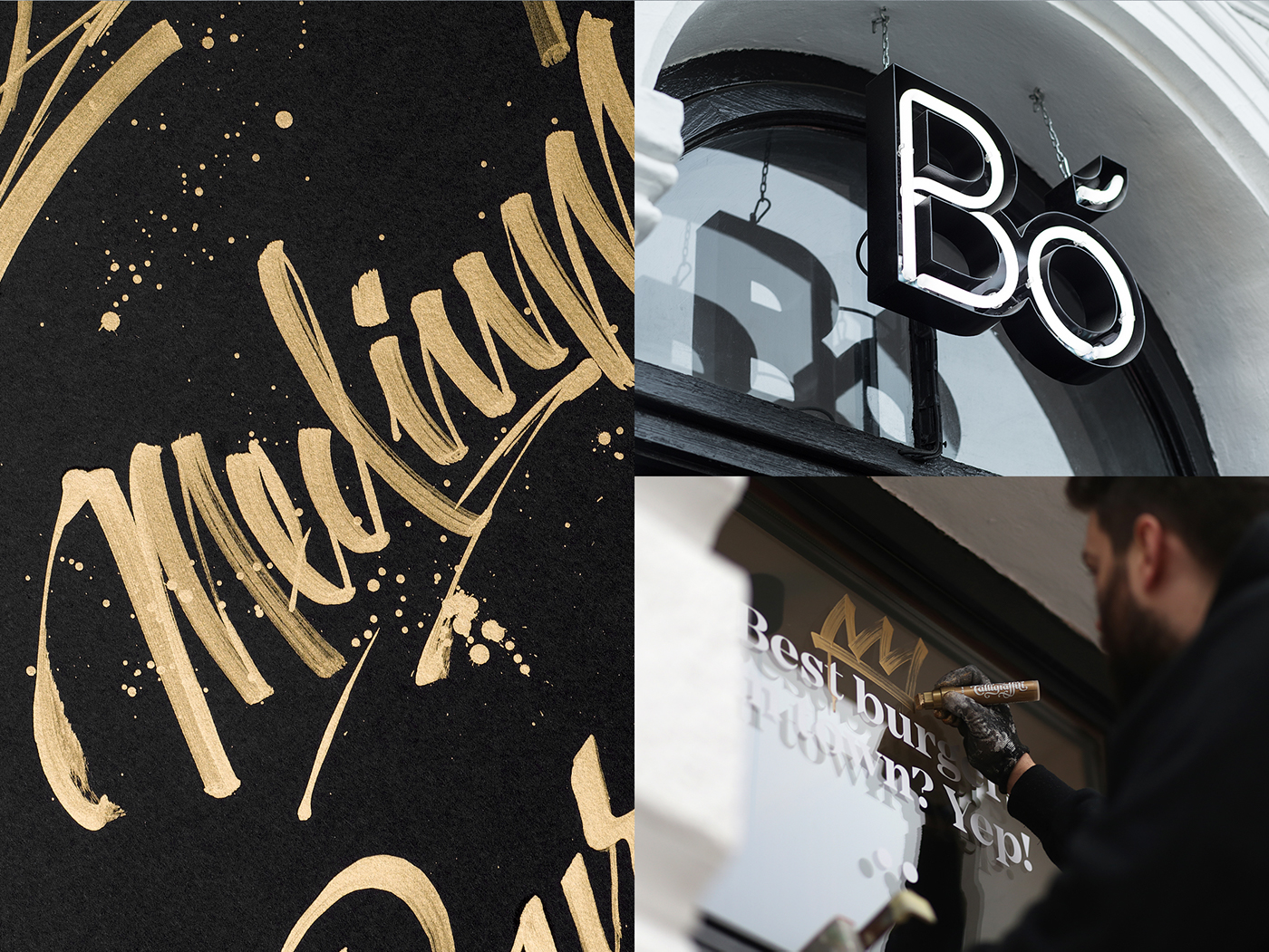
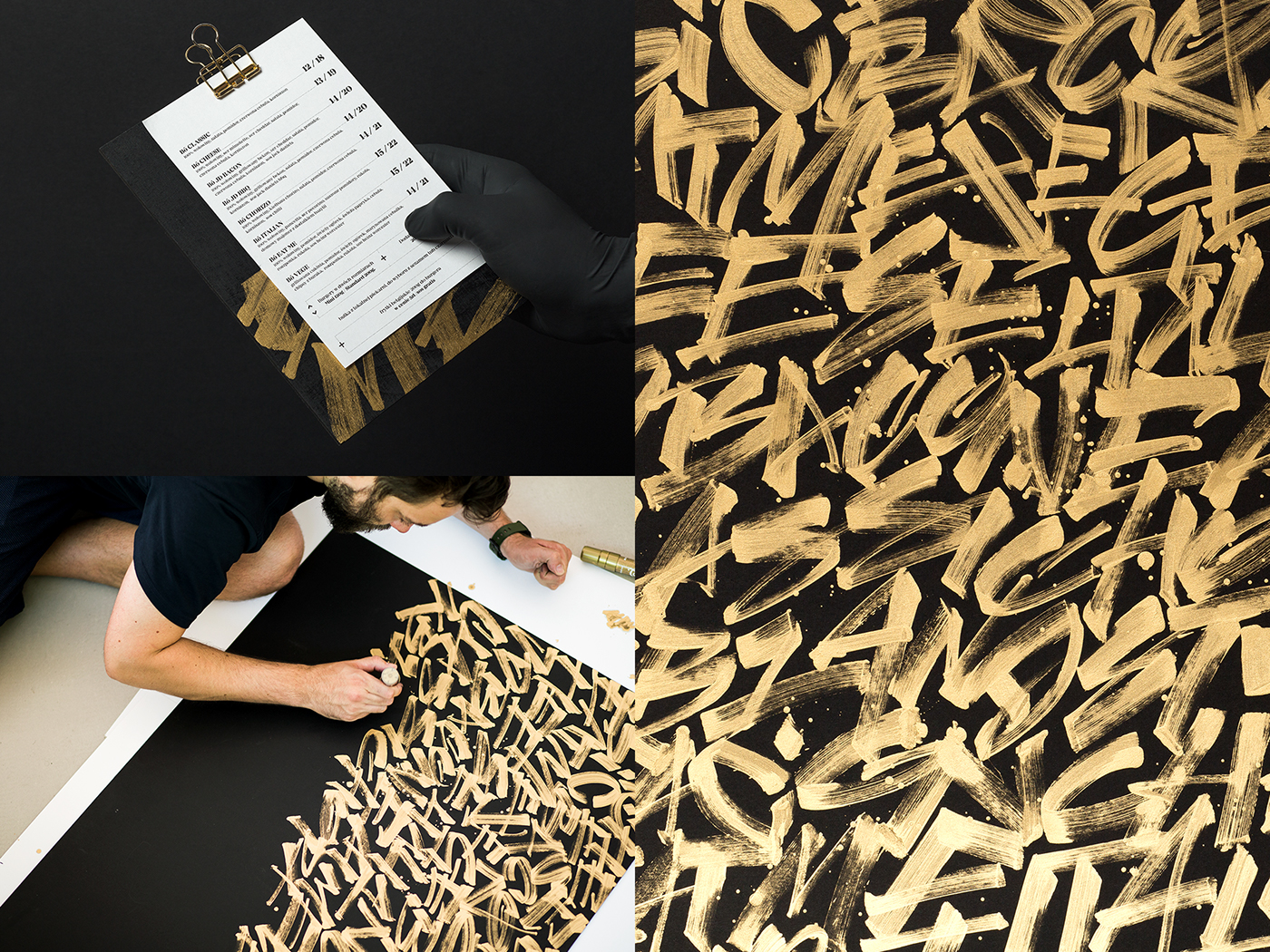
We've combined the symbolic character of hand lettering – street naturalness, spontaneity and freedom, with the quality of the best restaurant. And it is precisely this contrast on which we have built our idea.
The corporate identity assumes two layers – the first associated with slow food, urban life and culture. The second – golden – refers to the style of the New York subway, graffiti and hip-hop. Elegant, glamorous typography combined with the style of letters and graphic forms, close to the style of the streets.
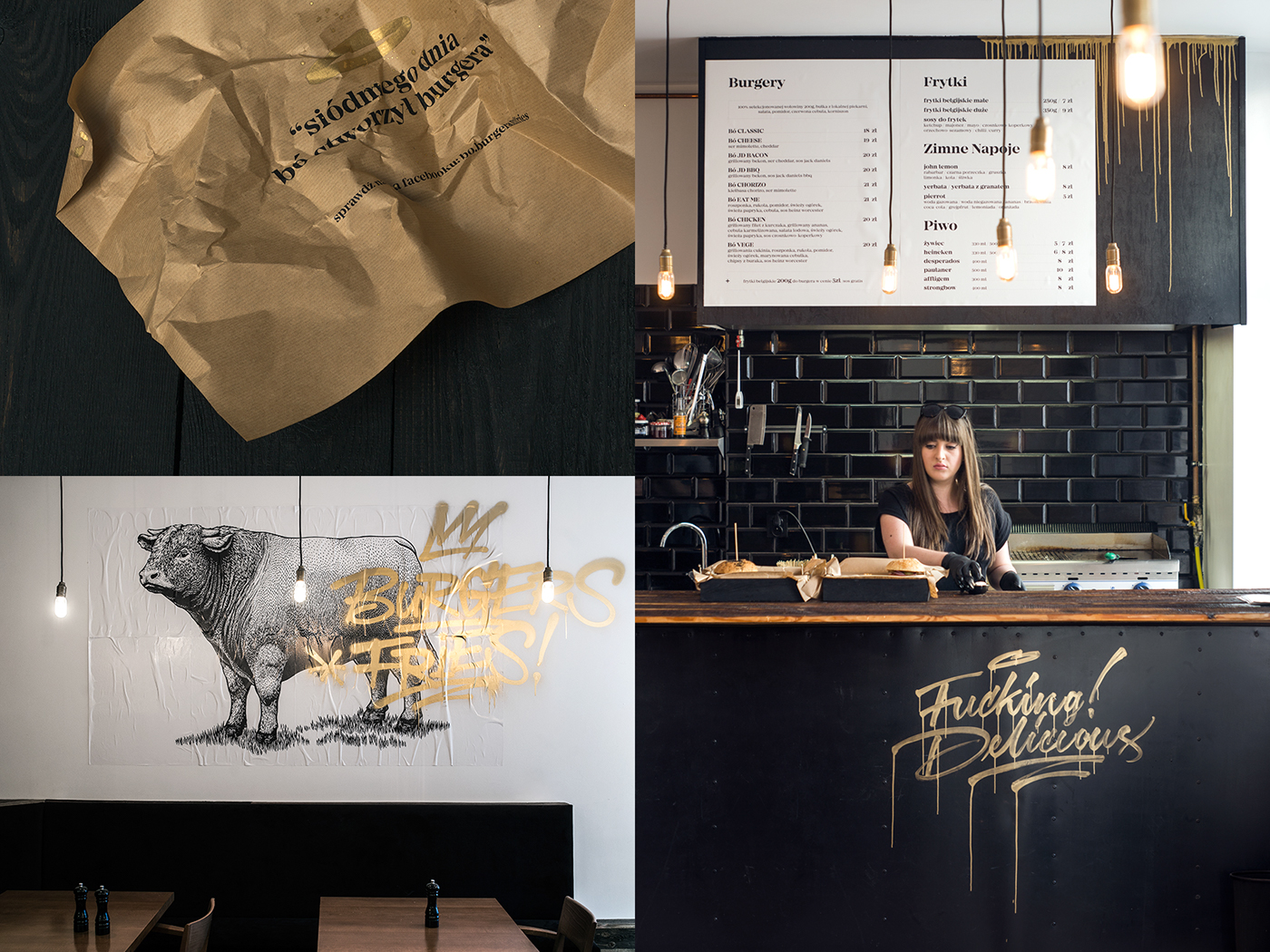
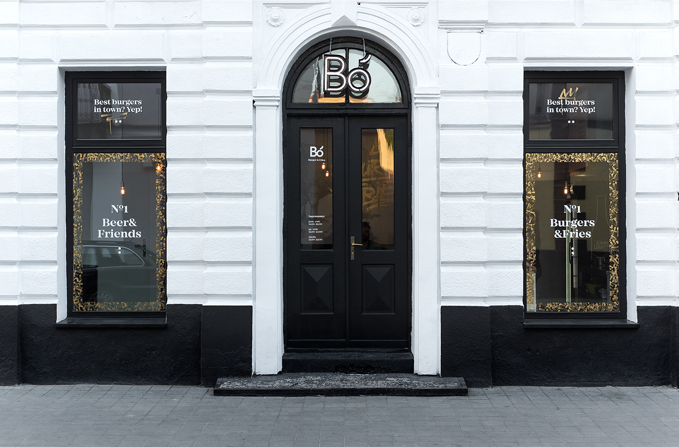
A very important element of the corporate identity is the design of the facade. The first impression, basing on which the client will decide whether to enter.
Logo lines determine the location and distances of particular content. Everything is ordered and in its place, owing to which we will quickly find specific information. More information about Udo Master’s beer experiments can be read on his website.