

Logo Drafts

Client: Occupy.com
Brief: To design the main logo for the huge Occupy movement, centring on the influential Occupy.com organisation. The logo here features a strong 'O' circle for the purpose of showing a ring of people, a fence or the marking of a location for the purpose of demonstrating. Within this is an anchor to denote people being anchored to one space in solidarity and kinship. This is modified to include the scales of justice which is one of the central tenets of the Occupy movement. Below is a mock-up using an image I took at the Occupy St.Paul's demo.
The final logo was just the 'O' ring itself.


Client: US Tennis Tour
Brief: To produce the official logo to be used across all media platforms. The logo obviously features the Stars and Strips colours and also a star, which I've changed the perspective on to show a stylized player serving with power and poise. This also doubles up as a play on the Statue of Liberty silhouette.

Client: Malik Media
Brief: Design a logo using a double 'M' feature, whilst referring to the meaning of Malik as 'King', hence the crown. The company is Canadian so I incorporated the Maple leaf motif in centre/top of the crown area.

Client: Capicola's
Brief: A US based sandwich bar and coffee shop. They wanted the logo to not feature sandwiches so I focused on placing a coffee spoon within a circle, to produce the 'C' of Capicola's.

Client: Baked Fresh
Brief: To create a modern, clean and standout logo based on fresh baking. This logo takes the recognisable form of a loaf of bread which are baked at sunrise each morning. I added the blue sky to compliment the dark brown and and a puffed out logotext to denote baked goods.
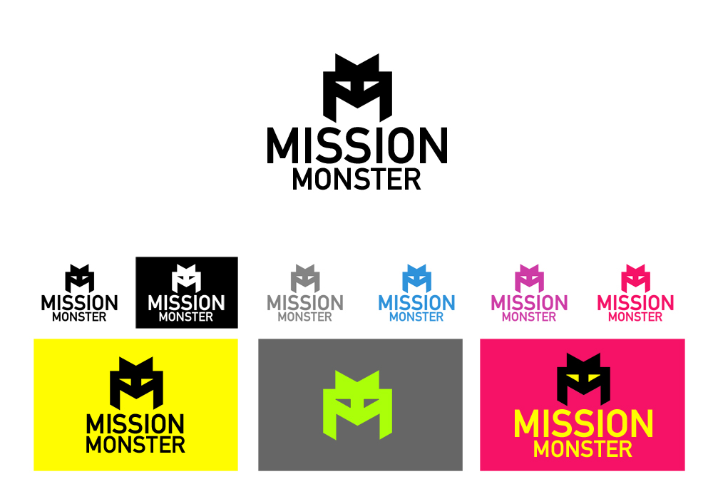
Client: Mission Monster
Brief: Another company with a double 'M' requirement. This company represent a charity campaign and wanted a modern and colourful logo that can be applied to many campaign materials.

Client: Royal Standard Minerals
Brief: A big player in the world of mining, Royal Standard Minerals needed a gold luxury motif that denotes high end industry, luxury and strength. This logo shows a pyramidal shape that has 3 layer types of strata like the Earth's crust itself. It also has a 6-sided star to represent growth and crystalline structures, doubling as a sparkle from a diamond.

Client: Heart Rhythm Centre
Brief: An independent clinic in the US that specializes in monitoring heart rhythms, palpitations and murmurs, needed a simple logo. This one shows a heart shifting from side to side quickly in the same colours as anaglyph 3D glasses, which is to show that they 'look' into the working of the heart using specific frequencies.

Client: Pay@
Brief: A new cardless payment system using mobile technology Pay@, needs a logo that also features the @ glyph withing the logo. This logo is simple and can be used across all media and points of sale.


