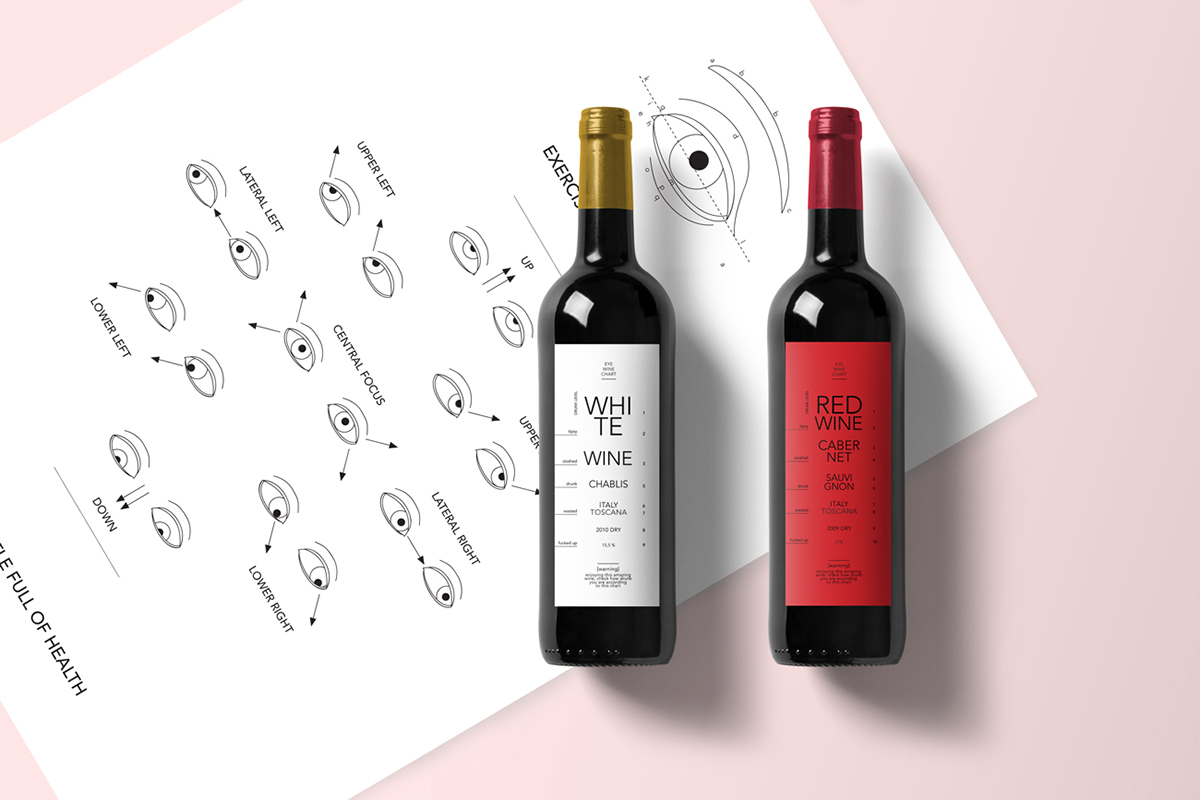
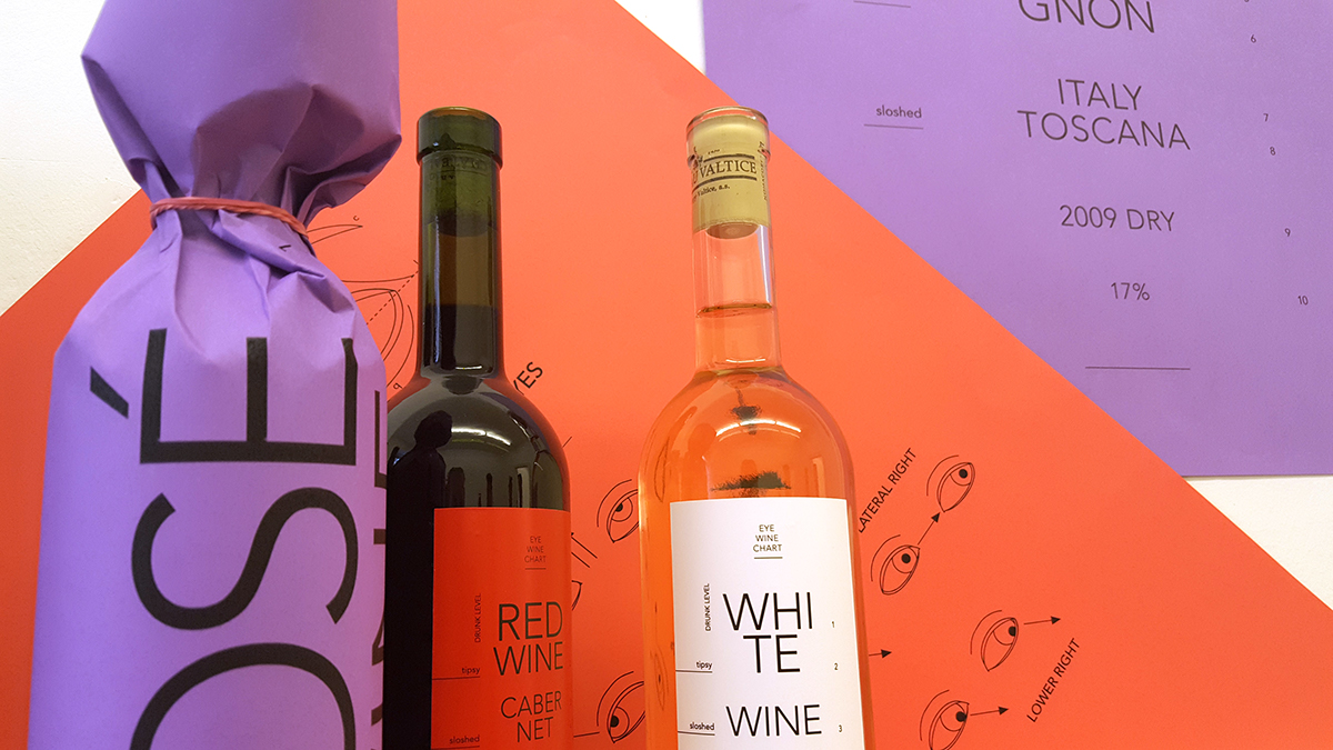
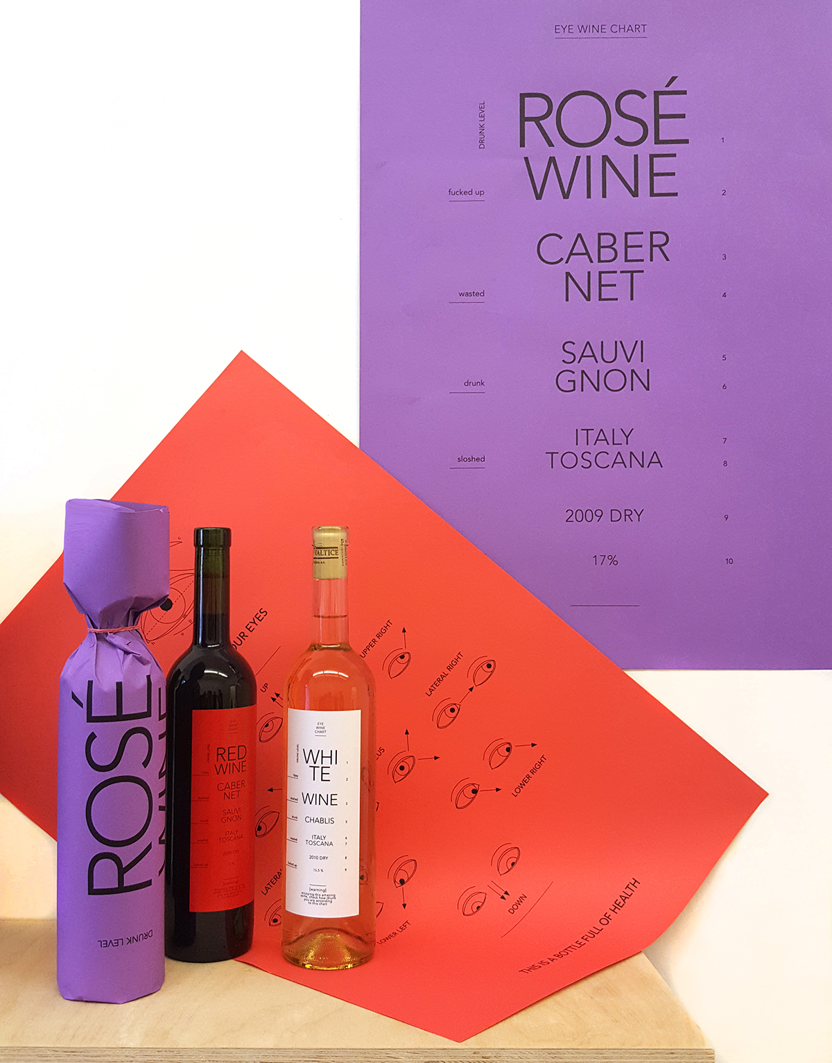
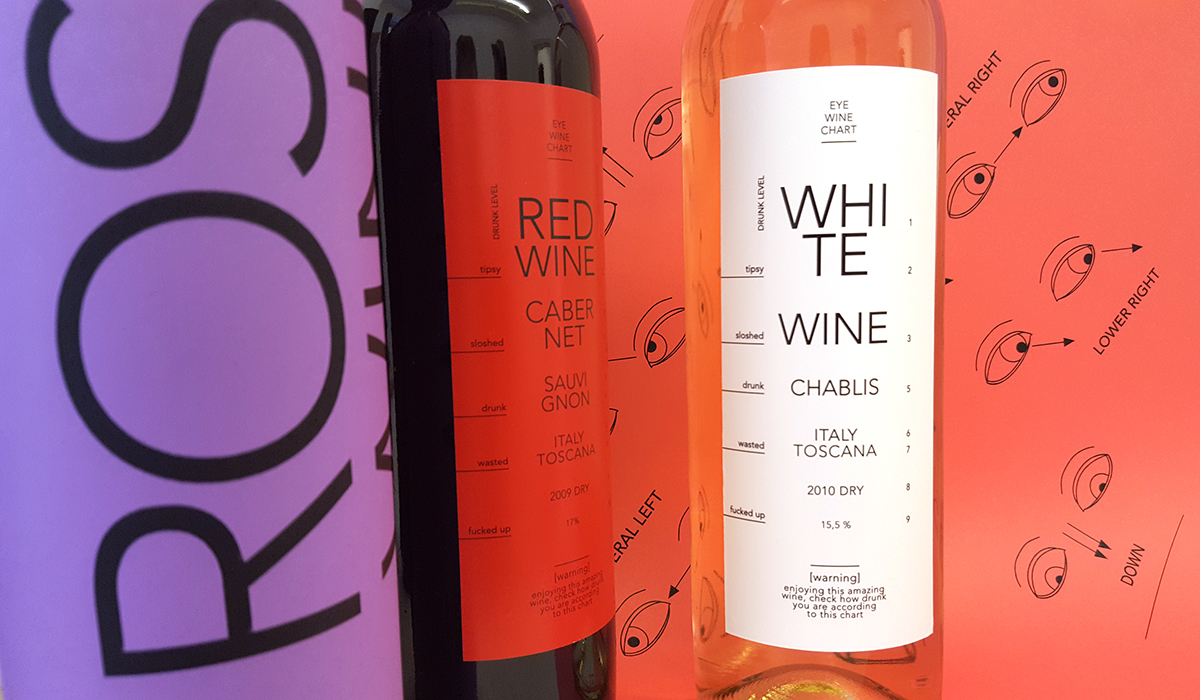
Creation of the new wine packaging was inspired by classic medicine Eye chart. The idea was to create a game instead of the classic system of drinking wine. Maked it more in teractive. On the etiquettes, you could see information about wine which are done in a style of Eye Chart. I called it WIne Eye Chart.
During drinking, you could "check" how drink you are. I created three colour of etiquettes, logicly, for white wine - white etiquette, for red wine - red etc.
Part of the packaging are the posters, in which the bottles are packed in. Posters has two designs, Wine Eye Chart, which is used for the etiquettes as well, and the classic medicine eye exersises, which I used as a great graphic element of the concept. The posters could be used in a classic way, but eather they could be used as a ground cover for a pic-nic in the park or at any other place.
The posters by them selfs, covered bottle of alcohol, in case of the drinking in the public places, so you will not have any problem with the police.

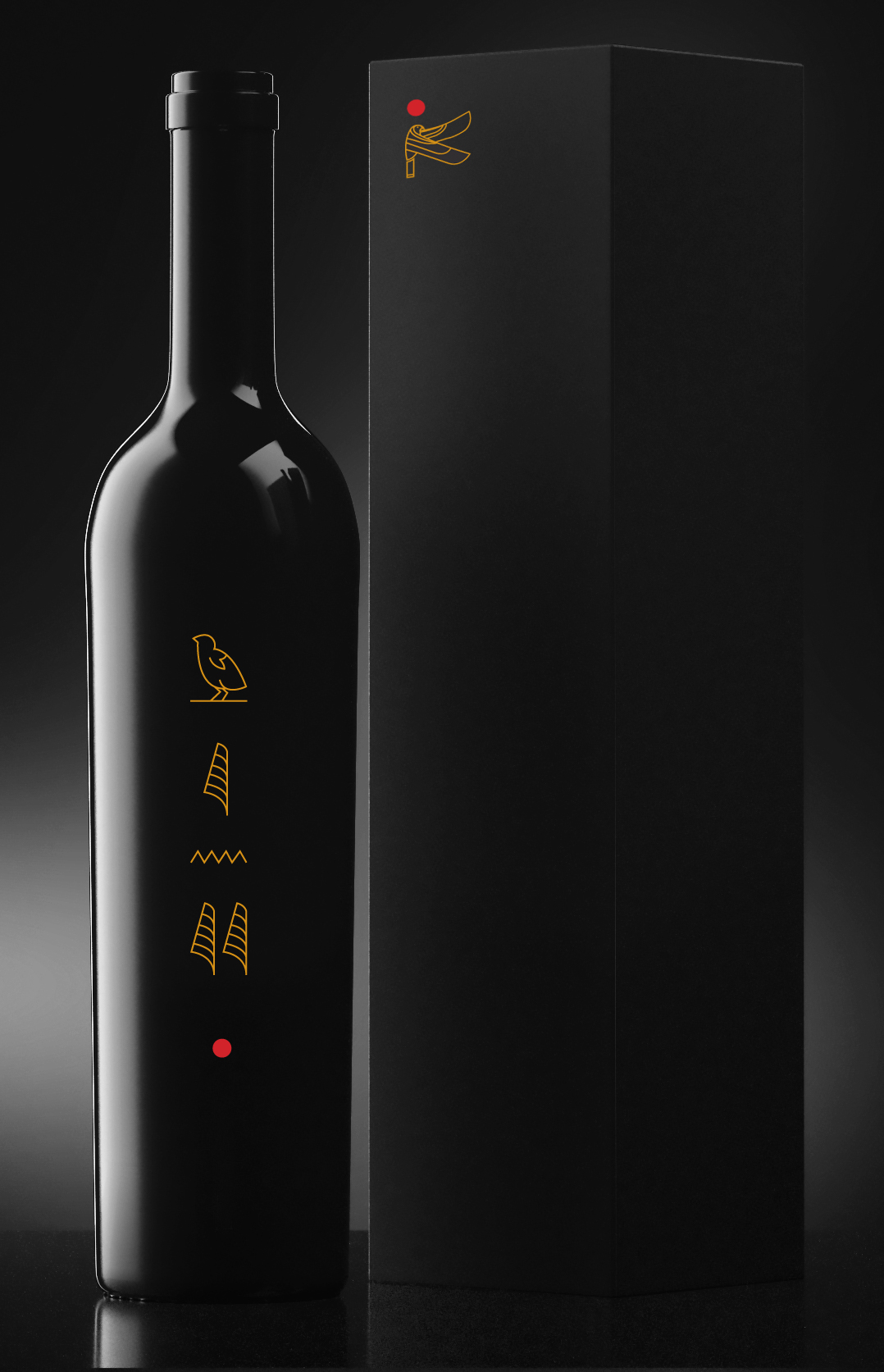
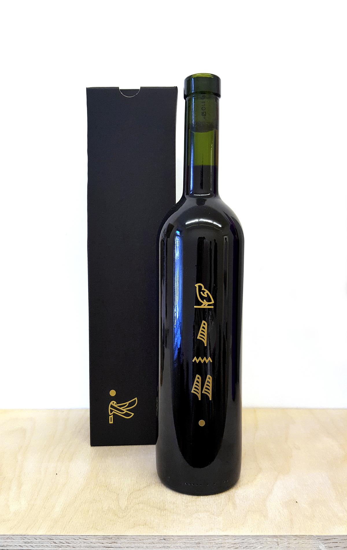
Second packaging design is developed for more exclusive and expensive winery.
The design is inspired by Egyptian culture and expecially sarcophagus. Most exslusive and high quality wine suppose to be preconditioned for a several, even more years. There I found the great connection with Egiptian culture.
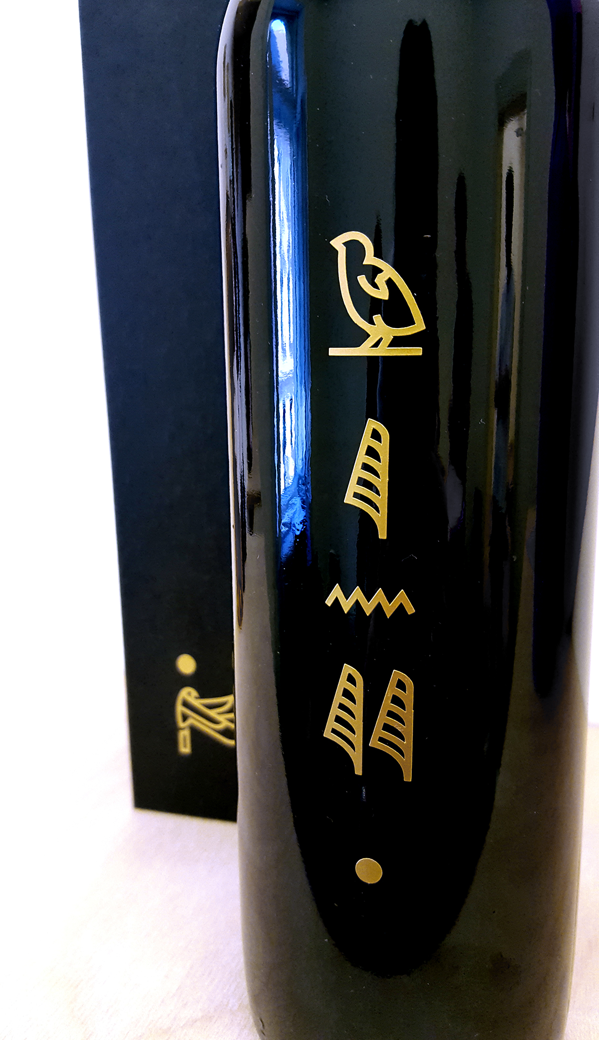
The Bird with a circle under head is a logo for the winery, which means freedom, goddness and power of the sun. Color of the circle is always mutual with color of the wine.
Symbols on the bottle means - wine.
The design is created to be very simple, with minimum detailes. The bottles are created from the black glass.