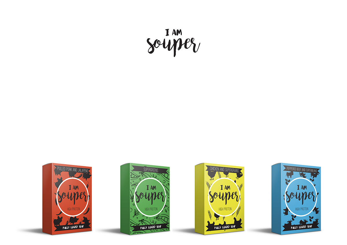

Soup Rebrand
I rebranded the soup company called ‘I am Souper’, I used a curly typeface because I wanted the brand to look cosy and warm. This sort of font reminds me of steam and food. I used simple black silhouette illustrations of the animals so it flowed through in each packaging and made it look like it is from the same family.


