GOD MORGON FIBERDRYCK
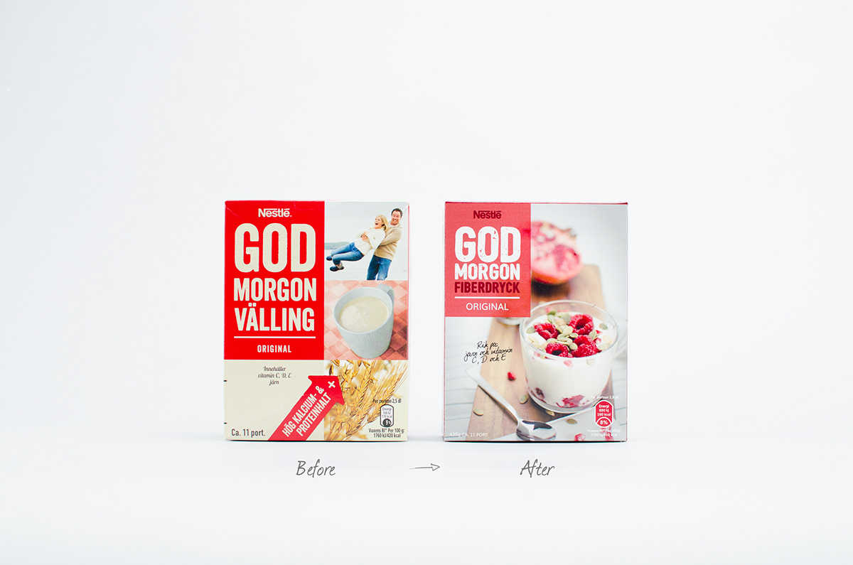
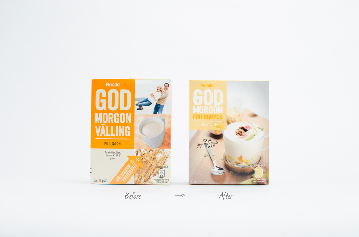
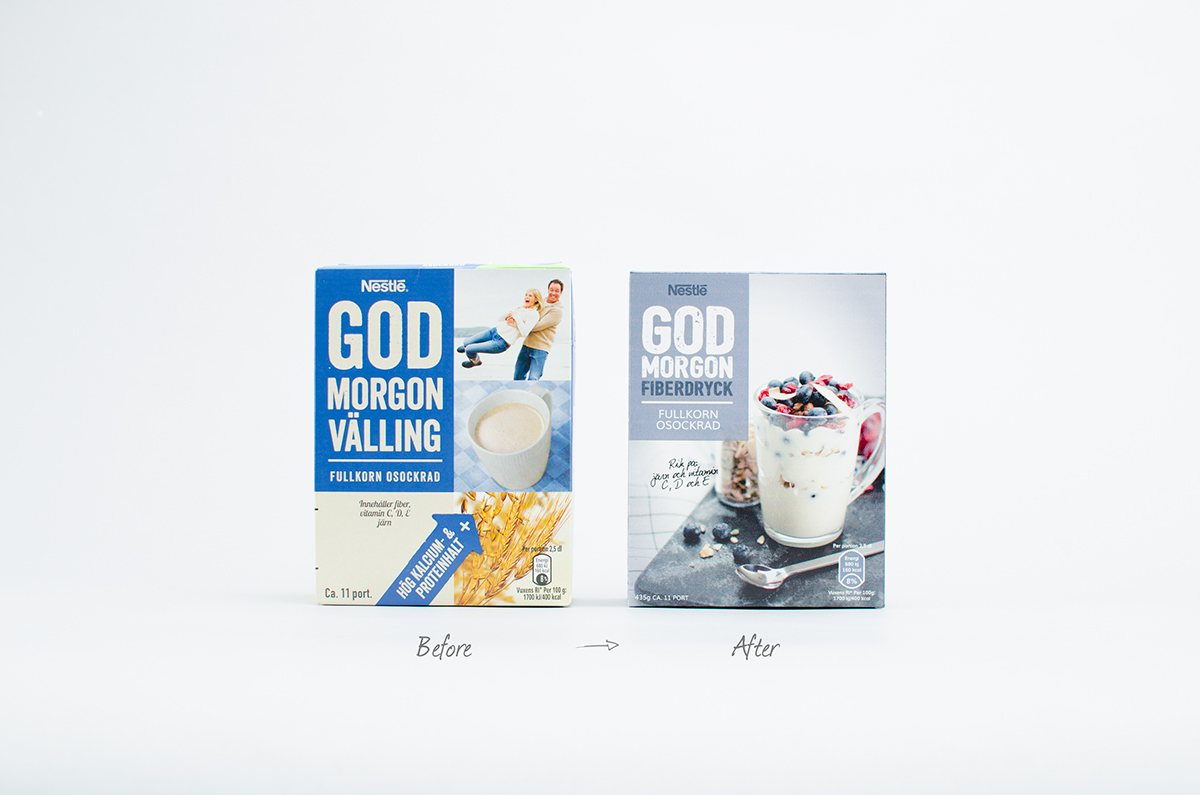
The classic ”GOD MORGON” gruel / baby formula has been a breakfast product for seniors and the elderly over centuries, but has disappeared from the shelves due to new brands in a constant changing breakfast category, where more brands focus on a more healthier prospects.
Nestlé gave us a brief where the focus was to revive the brand for a healthier target market; young men and women who appreciate and prefer a more healthier breakfast and snack. The target group are happy to pay a little extra for good quality food and compromising on their diet is not an option. They affirm their own health, well-being and living a healthy life. The expanded target audience is both well-informed and knowledgeable when it comes to nutrition.
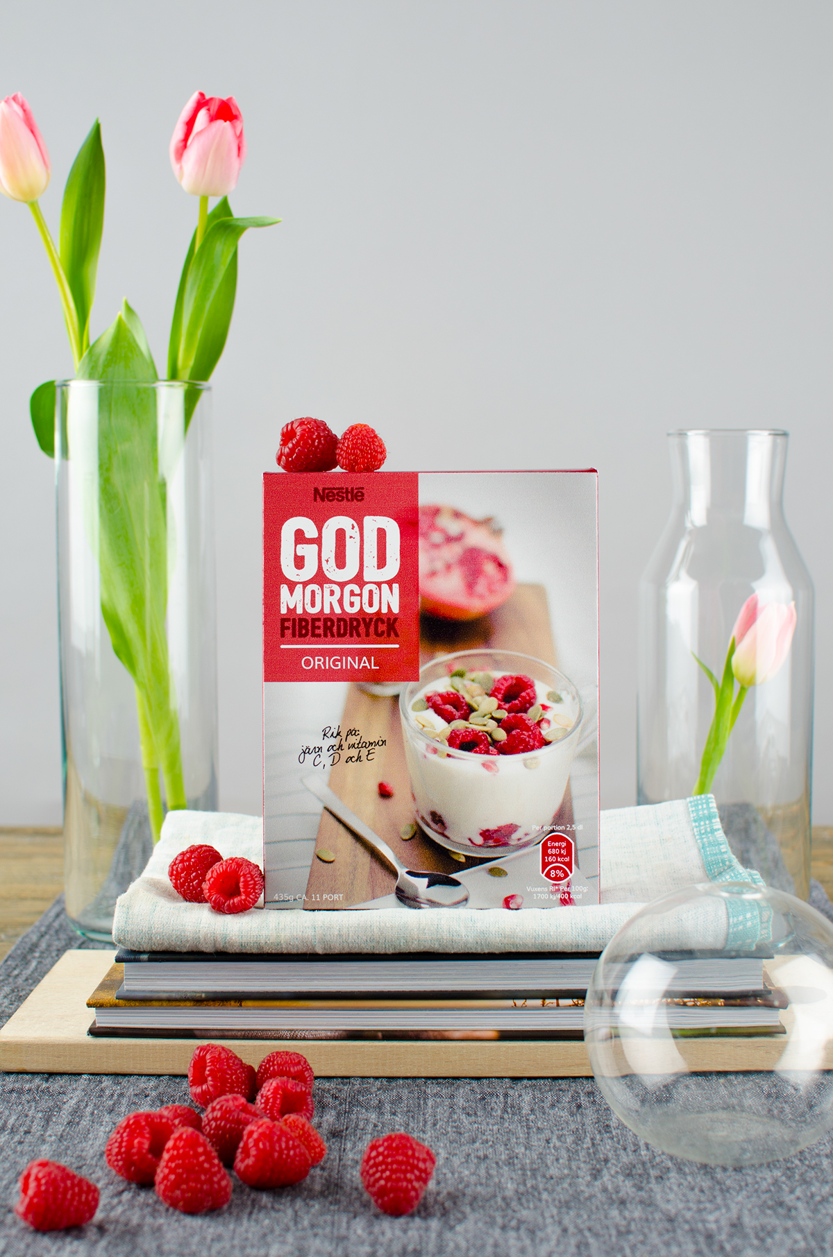
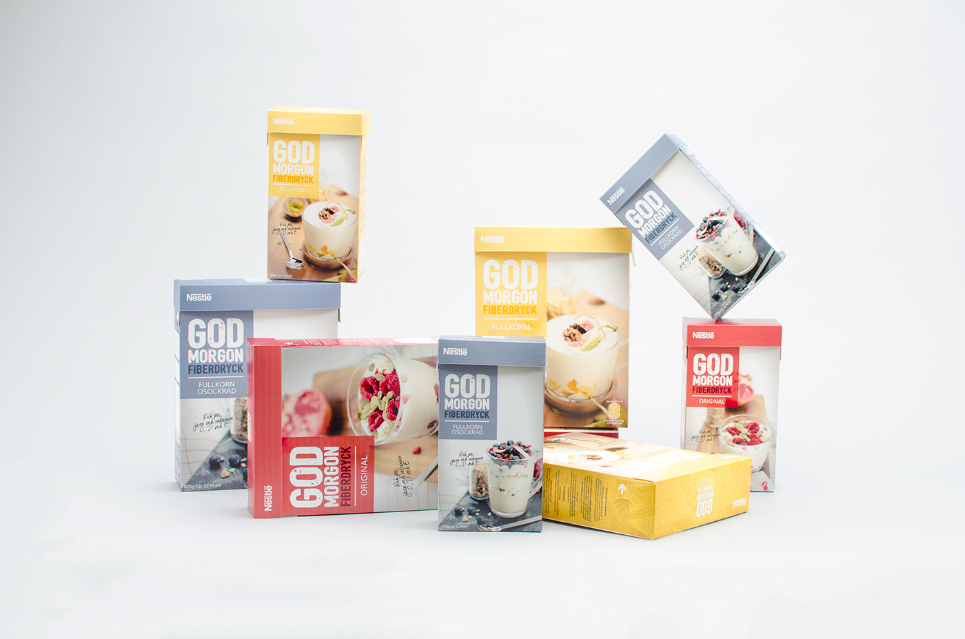
We wanted to build an easy bridge between todays packaging range to the rebranding, so the old target market doesn't get lost. We created an attractive and tempting visual language with bright pictures, northern colors and clear typography. The design visualizes the power of a good and nutritious breakfast that is good for you. In order to communicate with the new GOD MORGONs brand identity, we changed the name from gruel / baby formula to fiber drink, to emphasize how nutritious and healthy this product actually is.
The redesign range of GOD MORGON fiber drinks was well received and this is the winning entry of the brief. The rebrand and products will be launched in the markets in mid-August, 2016.
In collaboration with Linnea Djurberg, Katarina Häll and Sara Knipström.

Inspired by bright colors with clear typography and tempting pictures, we created a new packaging design that now truly conveys GOD MORGONS true key values of how important it is with a nutritious breakfast.


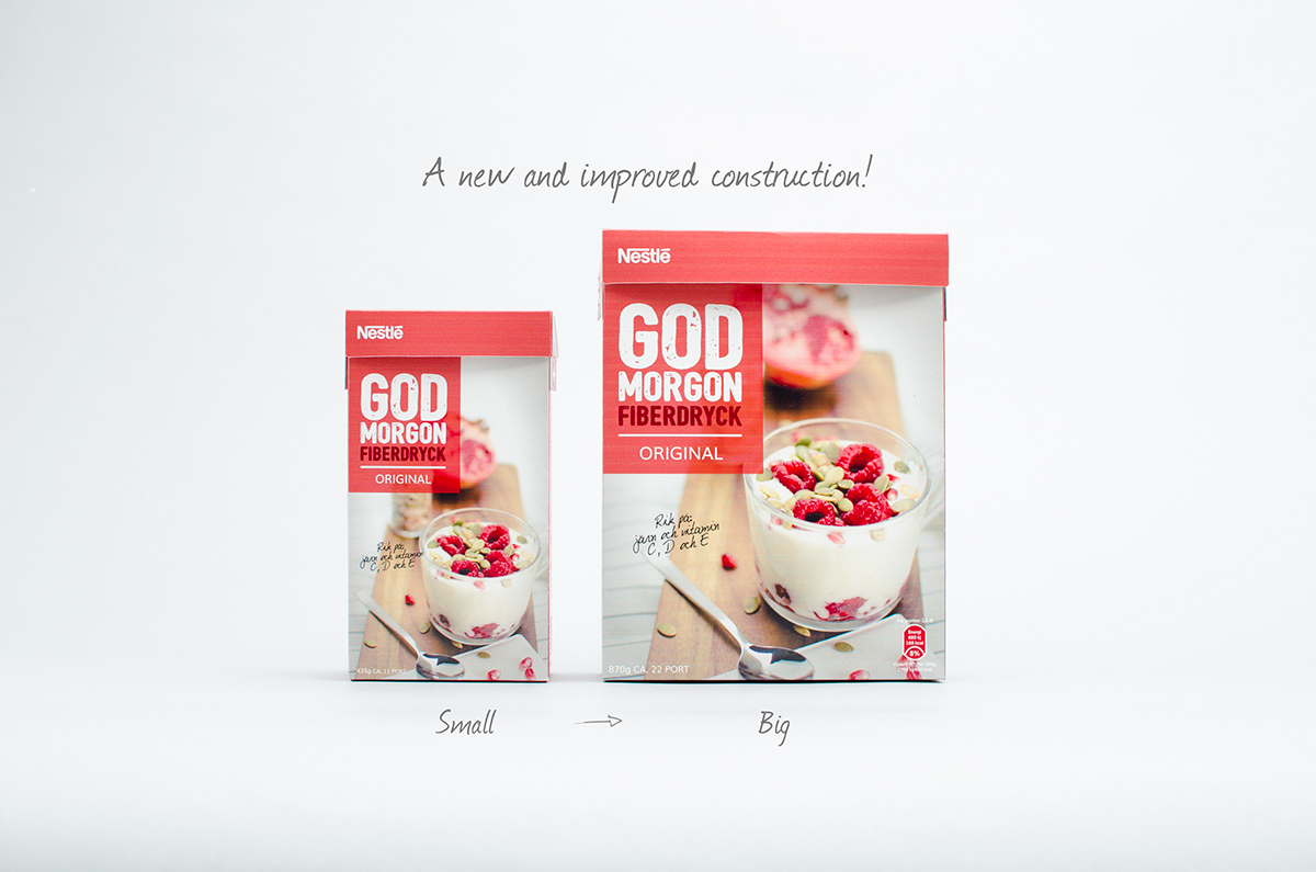
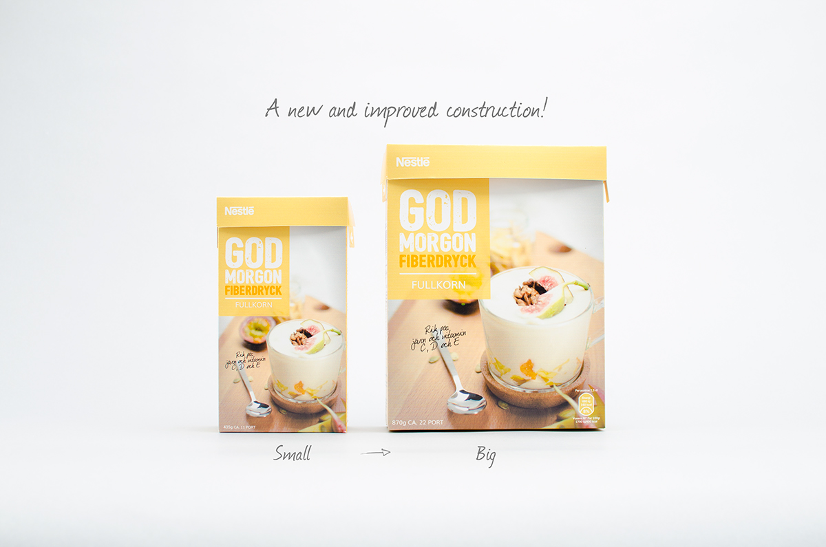
During the project, we also made a new improved construction solution that optimizes and solves the earlier shortcomings in the original packaging. The focus of the new solution was to optimise the package so more packages could fit on the pallet. We've thought very carefully about the logistics and economic benefits for Nestlé.
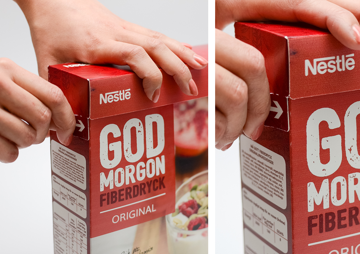
This construction solution was created with a so-called tablet locking which contributes to stability and minimizes wear and tear. We also created a perforation on each side of the package which is glued when it arrives at the store. Pulling away the perforation when you're home, serves as a quality assurance for the consumer that the package has not been opened before.


With this redesign we have taken GOD MORGON gruel from being a nearly forgotten breakfast product, to nowadays be a healthy fiber drink and a front runner in the breakfast category.