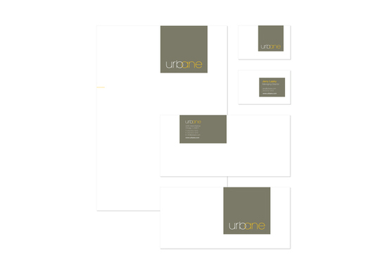
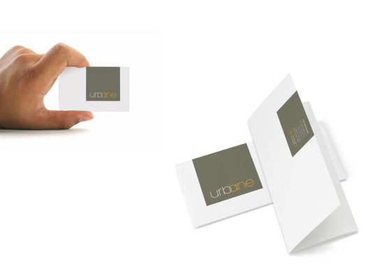
URBANE
New property development company Urbane take old industrial buildings and convert them into modern apartments.The brief was to design an identity for the company to reflect what they do and then apply it to stationary and brochures.
The logo has the b and a intertwined to represent the interaction between the old and the new.
The logo has the b and a intertwined to represent the interaction between the old and the new.