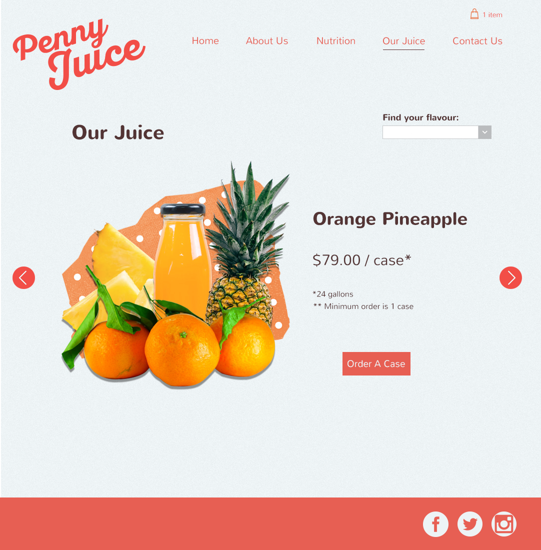
This was a final assignment for Year 1 Digital Design at Humber College. Choosing from a list of existing websites, we were asked to re-design one of them to make it more user-friendly and more appealing. Penny Juice is a children's concentrated juice product. I decided to go with a retro-modern theme. The inspiration for this theme came from vintage advertising with that kitschy sort of feel. In order to pull off this idea without being too tacky, I decided to incorporate a flat and sleek main colour palette using subdued background and main text colours with a pop of pink in order to contrast the texture within the custom 'collage style' imagery. This keeps the design modern, while still retaining that retro feel. A round, open header font contrasts the more traditional serif body copy font for a playful, yet professional look. This redesign is about bringing the idea of the wholesome vintage advertisement into 2016, and injecting some new life and identity to the brand.