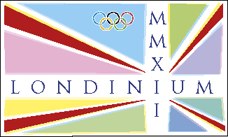
LONDINIUM MMXII
alternative London 2012 Olympic logo
alternative London 2012 Olympic logo
After much frustration and Facebook debate I decided to compile a list of things that I felt may improve on the current chosen logo. I'm not usually inclined to criticising (English spelling) another designer's work, I neither know the designer nor the company involved. But I do feel the original falls short in many departments and gives a rather confused vision of London to our continental cousins. London and indeed the UK as a whole is a modern, vibrant and stylish community with our roots firmly in the glorious past. Surely the logo design should amplify this?
So, the objective was seemingly clear! Firstly, to make the design pleasing on the eye. Secondly, to incorporate something very influential for London, what better than the founders themselves, the Romans (as opposed to the Greeks of course). The 'Trajan' typeface was decided on, and when used in CAPS which one could argue is suitably 'Romanesque'. Thirdly, something extremely and obviously recognisably British, in this case, the Union flag revamped for some 2012 appeal – this I agree is nothing new, but just nice to add a little more vibrancy to the whole British thing. After just a few hours of thought and creative artworking using Creative Suite's InDesign, an alternative Olympic logo was born – didn't cost the taxpayer a penny either.
Below that, I found the audacity (no pun intended) to fish out a suitable anthem to go with it – ho hum !!!

Alternative London 2012 Olympic logo

www.tfsmudge.com


