Overview
itcher is a personalised entertainment recommendations app that suggests movies, books, music and games that are specifically recommended to the user. Using an advanced collaborative filtering system, people with similar taste are connected in order to provide tailored and accurate recommendations.
The problem
In today's "on-demand" world people expect quality entertainment that they can access quickly and easily. Users want personalized, tailored recommendations and not a generic top 20 list.
The goal of itcher was to create a simple, user centric experience that would solve this issue and exceed the expectations of the user. itcher not only provides tailored recommendations but also allows users to discuss, share and even be taken directly to the suggested media at the click of a button; so if a user selects their recommended movie or album itcher will provide an abundance of information on the source and also give them the option to view it directly by connection them with popular apps such as Netflix or iTunes.
The deliverables and challenges
The core deliverables were ambitious given the limited time and whilst working on a pre VC funding start-up budget. The business needed greatly enhanced engagement and retention for the new app and had to offer an amazing UX across Android and iOS platforms for both phone and tablet. The biggest challenges were the size of our team, the budget, and as always, time. Given our limitations, I knew we could not perform full research so I ensured that I made the most of our resources.
1. Discover
Research
When embarking on any design project my absolute number one priority is to begin by clearly identifying the needs and desires of the business i.e what does success look like to the company? I usually create my own brief after in-depth discussions with each stakeholder and a few rounds of questions with the team to ensure everyone is on the same page - assumptions have no place at this stage. When we have the business priorities clear we can move on to user research.
I held user interviews with different demographics and we soon learned our user's general behavior and expectations. I generally find 90% of the usability problems can be found within the first 3 - 5 tests and so I also conducted some testing on our MVP by asking users to complete a set of tasks from which I could assess existing pain points on our outgoing system.
In addition to this, we conducted an updated competitor analysis and checked our core technical metrics, such as conversion rates and various other KPI's (Key Performance Indicators). This initial testing identified the problems with our existing system and provided a much more intimate understanding of our user's needs.
2. Define
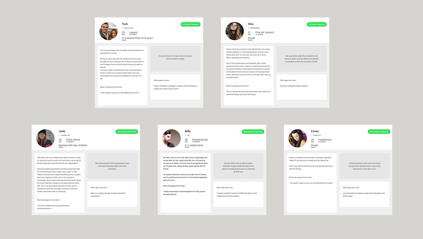
Once we completed the bulk of our initial research I was able to craft more accurate personas to help guide our design decisions. I conducted a creative thinking and planning session with the dev, marketing and design team to analyze our findings and create some persona profiles. I always find this is a great way to keep other departments involved and to get some helpful feedback whilst also giving everyone a clear picture of who our users are. Personas give a human face to the problem you are solving; they generate empathy and can also act as a good set standard for feature requests or ideas e.g "Would Jenny use this? Would this help her complete her goals?"
After that, we created different use cases/scenarios for each persona, combining the user’s personality with how they would interact with our site.
This allowed us to move onto creating some initial user flows, which help us clarify what the user can or would want to do: what is the realistic flow through our app? To design a better user experience it is important to fully understand not only who your user is but also what problem you are solving for them at all angles. User flows give a basic but clear road map for the core structure of the app and provide a base document that clearly highlights whether a feature request or idea is necessary and, if so, what problem does it solve for the user?
3. Develop
Sketches / Wireframes
After the ground work was done and having the problems/constraints and requirements clear, I moved onto sketches & wireframes. I always start with some basic, very quick sketches with pen and paper - how they look doesn't matter at this stage, its just about getting some ideas down quickly.
The next stage is to produce cleaner wireframe designs; these act as the bones for the app, allowing clearer visualization of the user flow. Wireframes are a great place to ensure you have all of the content, functions and software requirements clarified before launching into UI design work.
4. Deliver
Usabilty Testing: Fix & Repeat
During this phase I always meet with developers to run through requirements, ensure edge cases are accounted for, and that dependencies are noted etc. Once I have the wireframes completed, I do some initial usability testing with InVision.
"Test early, test often" is one of the best mantras in an agile production process; it is much more efficient to fix UX issues early on with mid-low fidelity wireframes. It is also important to ensure that the developers have an understanding of the full requirements of the app so they can design the system most efficiently to ensure maintainability and scale-ability down the line.
We tested this early prototype in house with staff members from outside of the dev, design and marketing departments, asking them to complete a series of tasks so we could then measure the results, fix any issues and retest until I felt we were ready to move on to the high fidelity UI design.