I was asked to do a redesign of Saop, a company which develops accounting software. The primary goal was to express their values which are: trust, efficiency, creativity, partnership, reliability and user-friendliness. I also wanted to include their identity history into the process, because they are the maturest
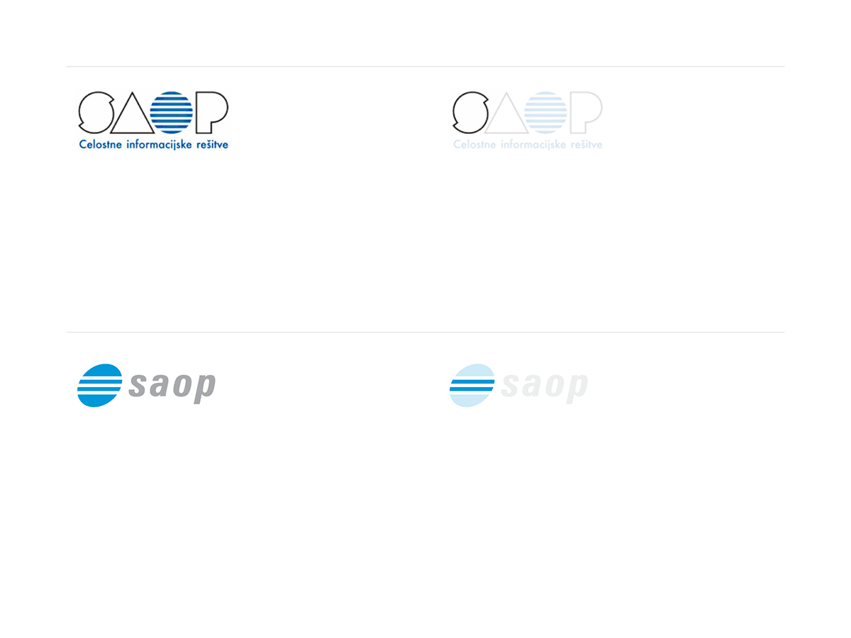
Previous logos
Symbol redesign process.


Using the logo as a decorational element.


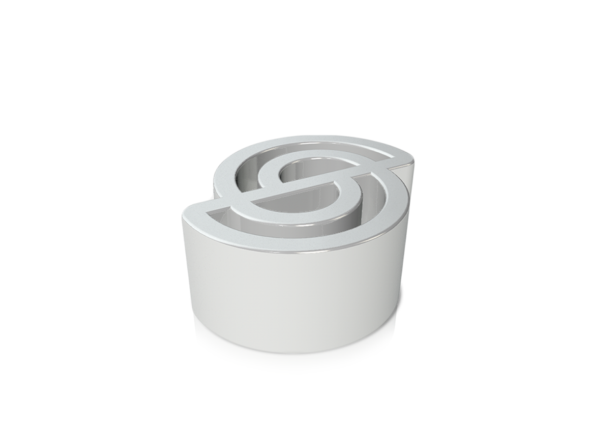
Pencil holder as an internal brand element. (3d design: Žiga Čakš)
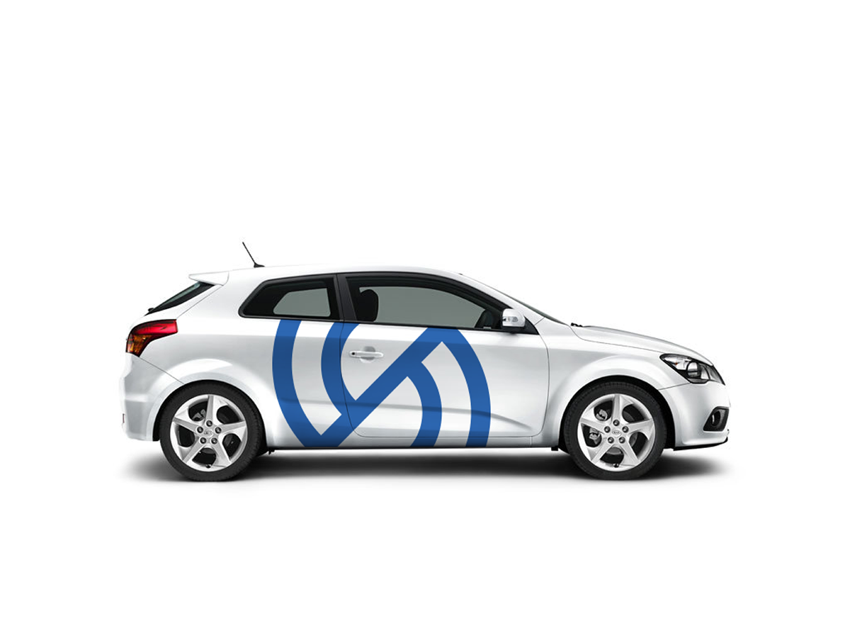
Company car.
16 px version for low res screens.

Logo used as a grid system.
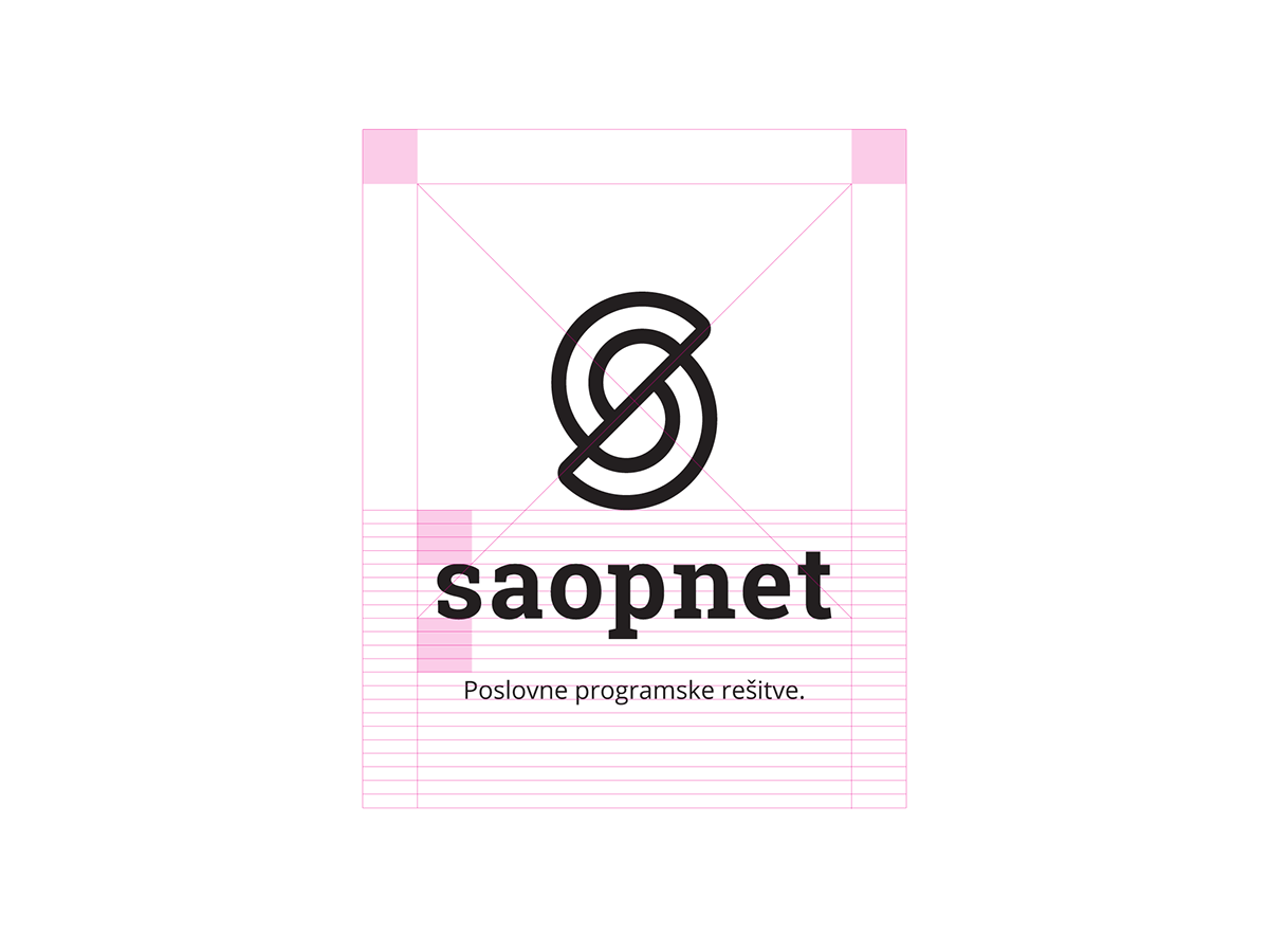
Vertical position - symbol lines have the same thicknes as a character stem.
Loading bar replaces the slogan.

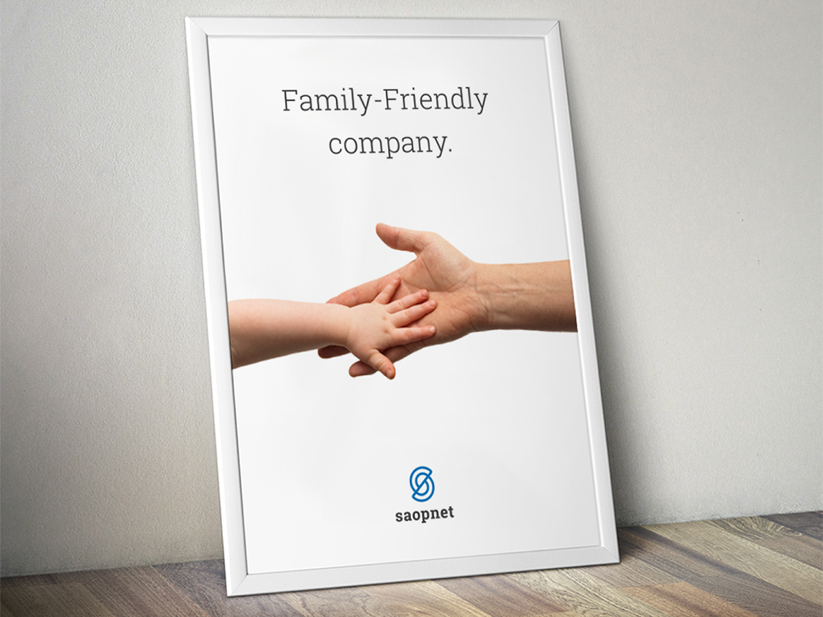
Internal motivational poster.


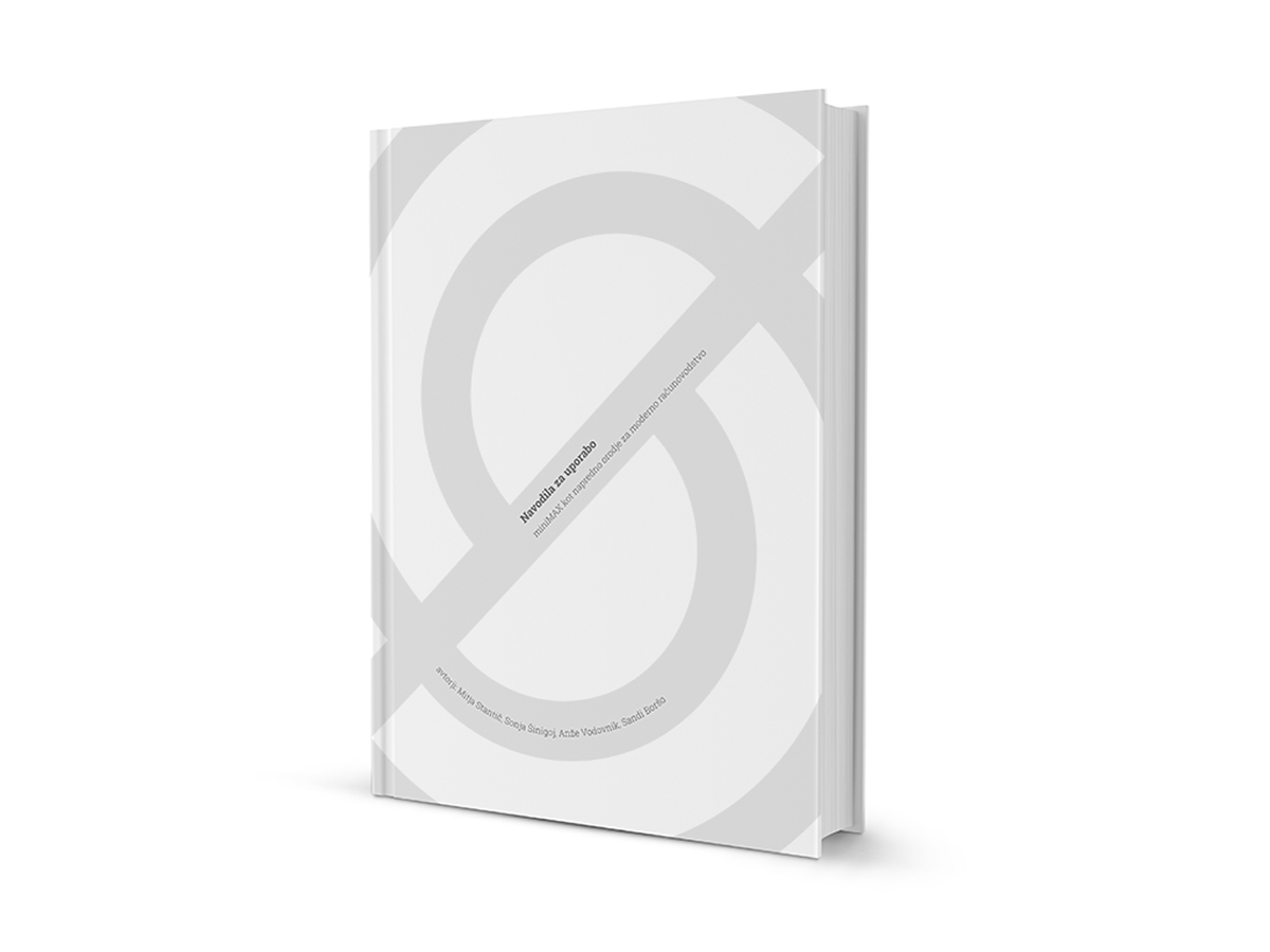
Brochure.

Horizontal position - negative space has the same thicknes as a character stem.

Invoice and business card.

Company badge.

Website - homepage.

Business shirt with a stitched logo.

A pattern is used as a decorational and playful brand element.