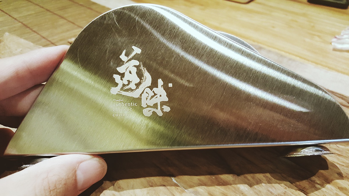
authentic Chinese cuisine 道味(TianJin)
Brand visual identity design
Brand visual identity design
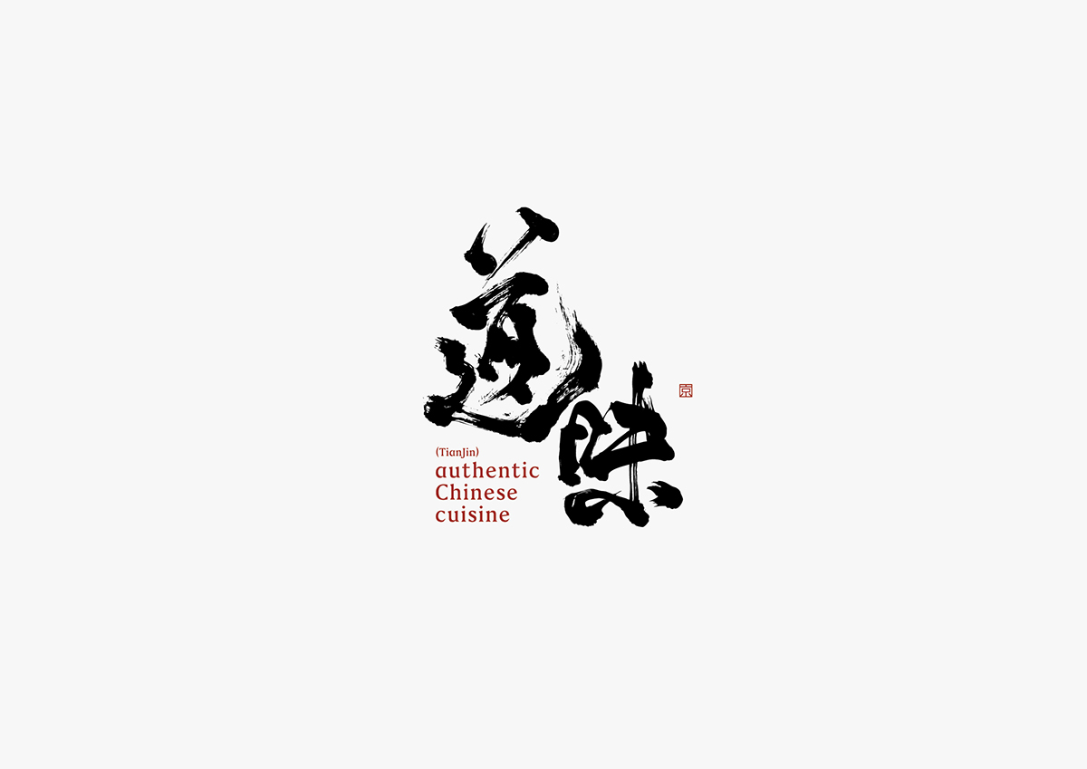
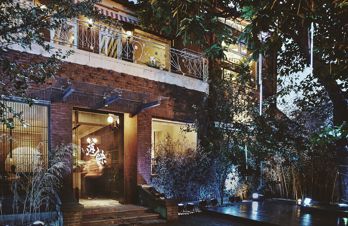
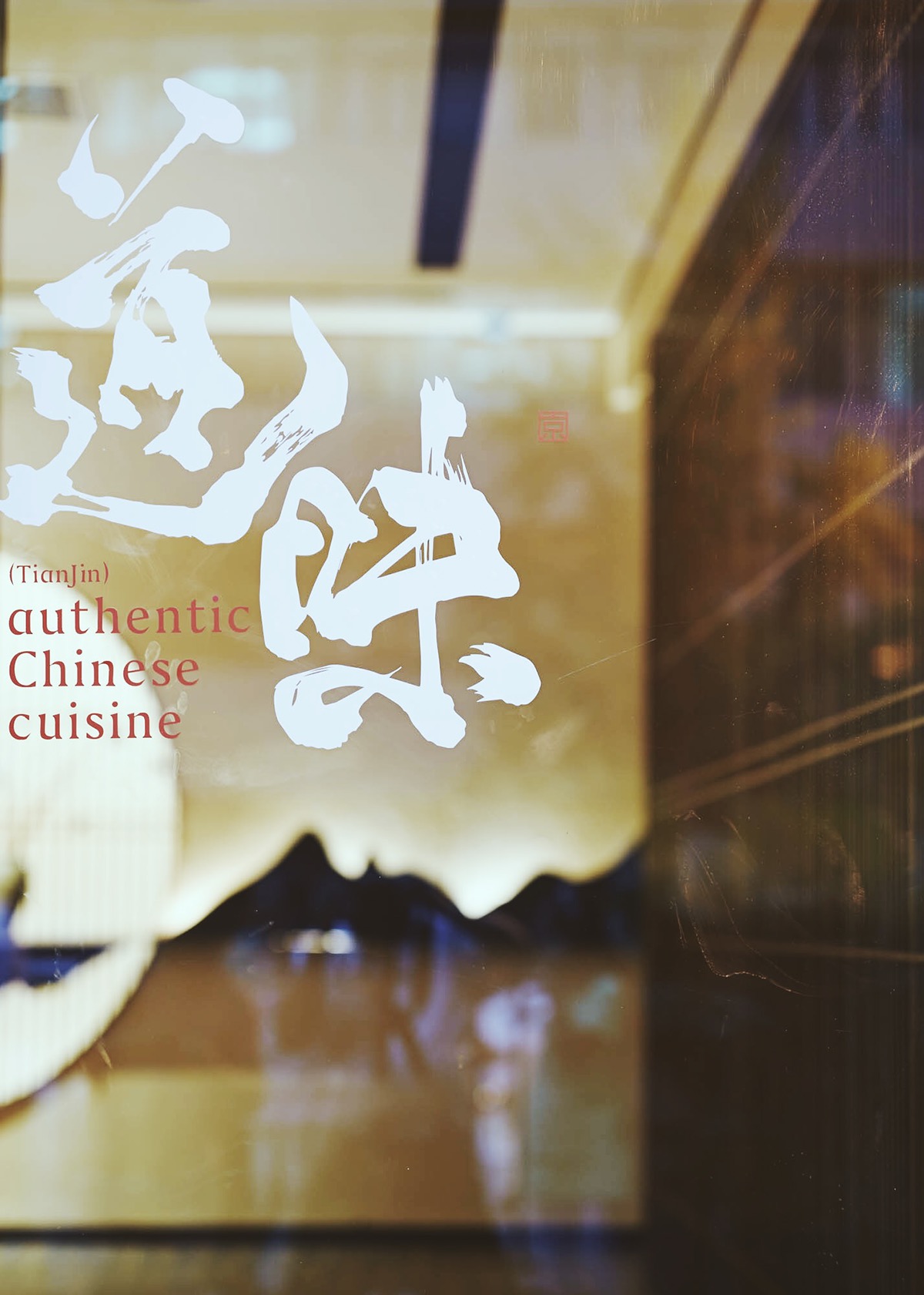
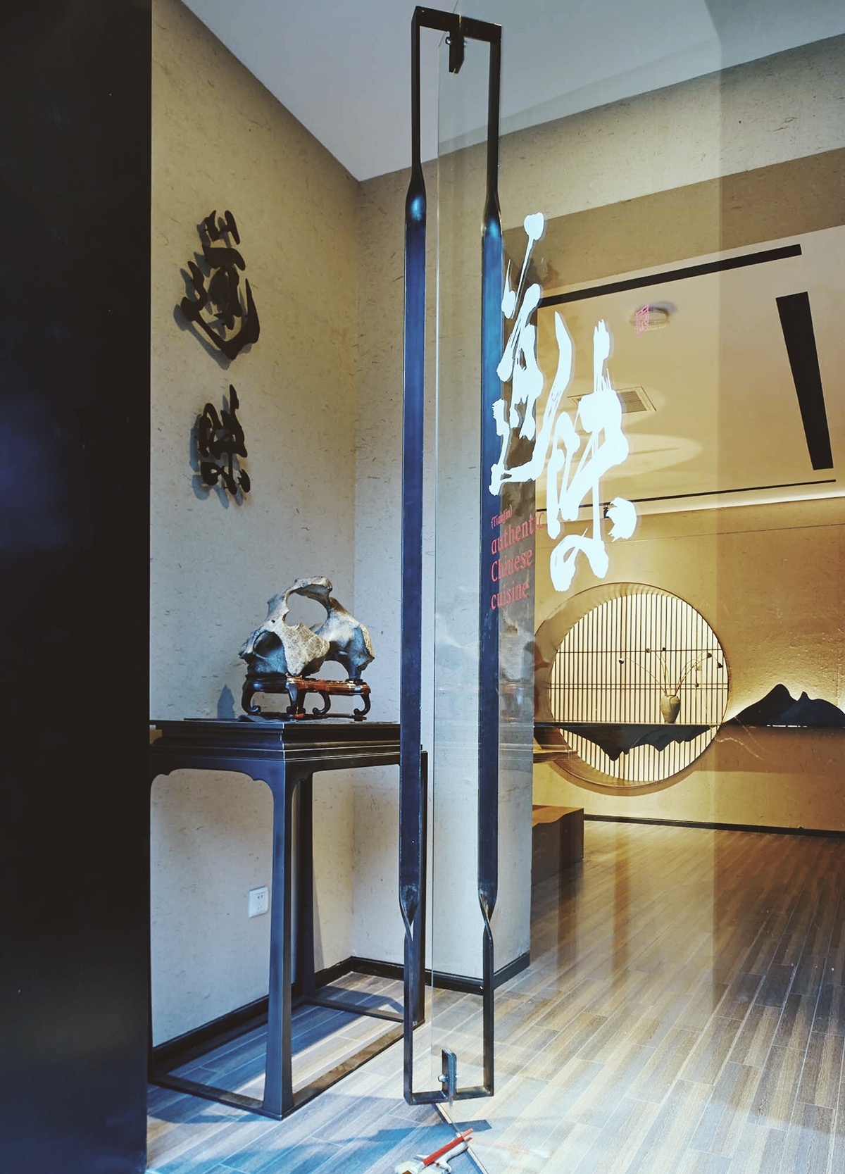
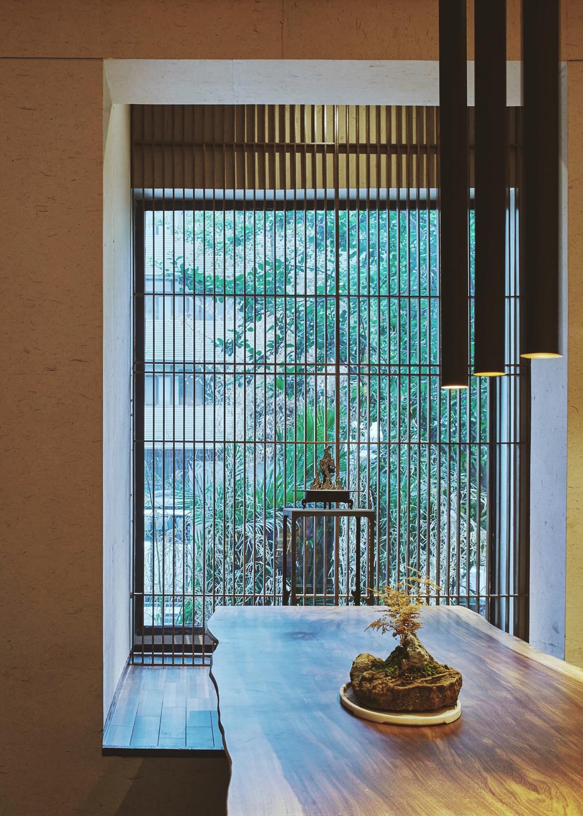
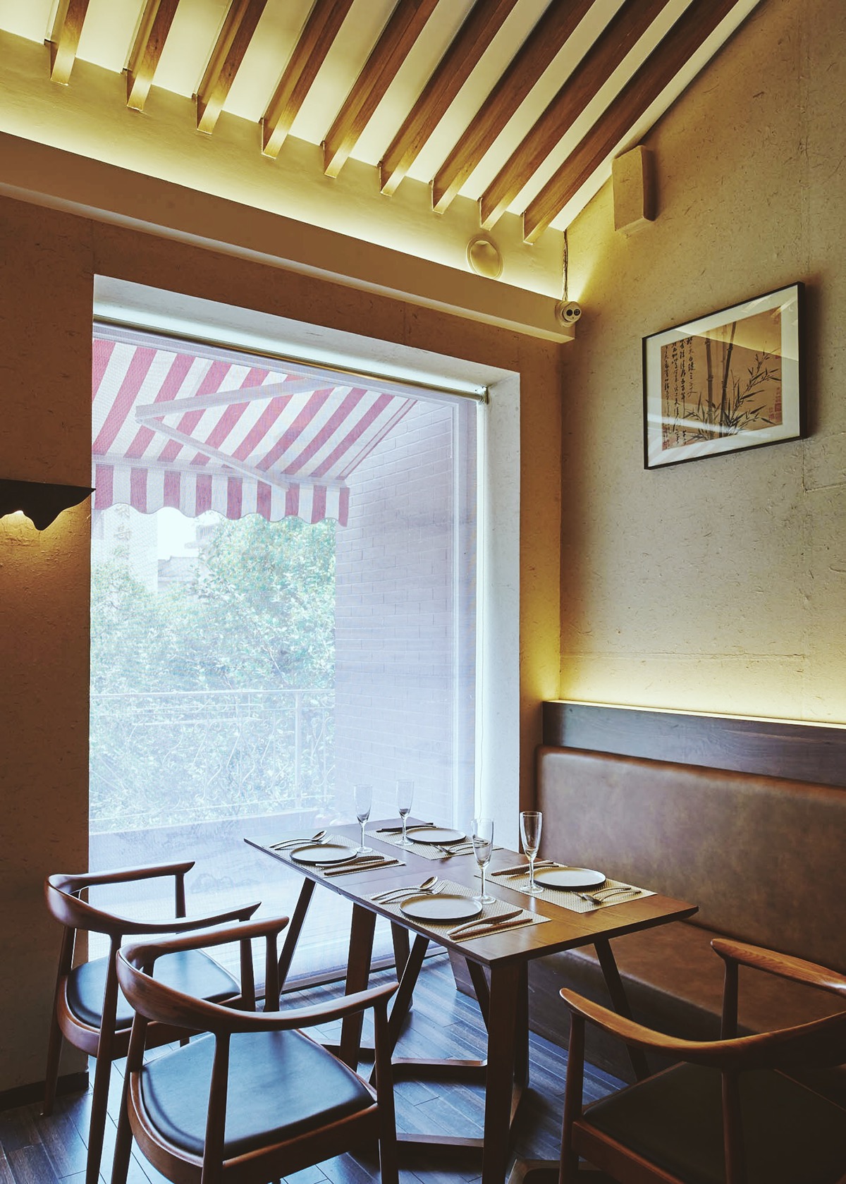
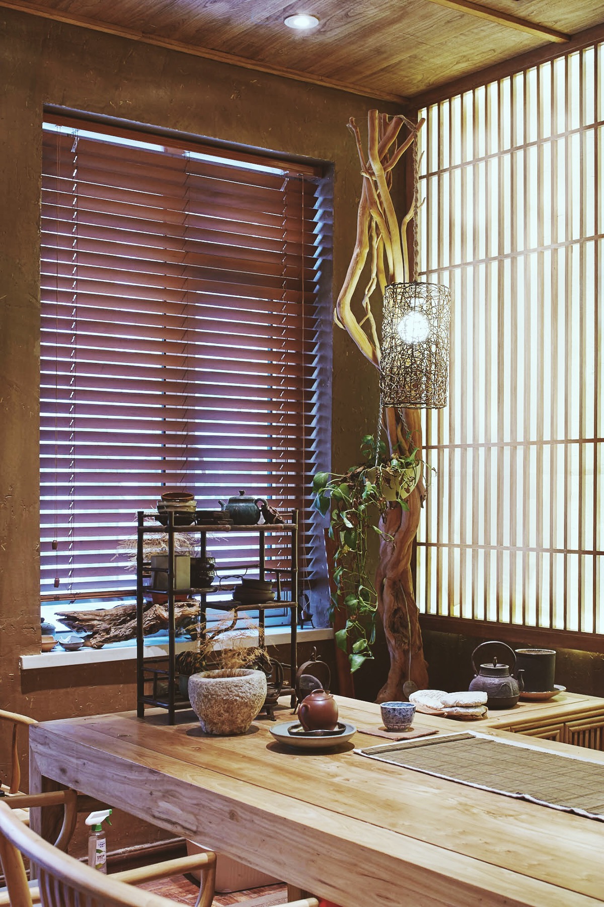
道味 是位於天津市和平區馬場道162號的中華料理餐廳,主營創意特色中餐。
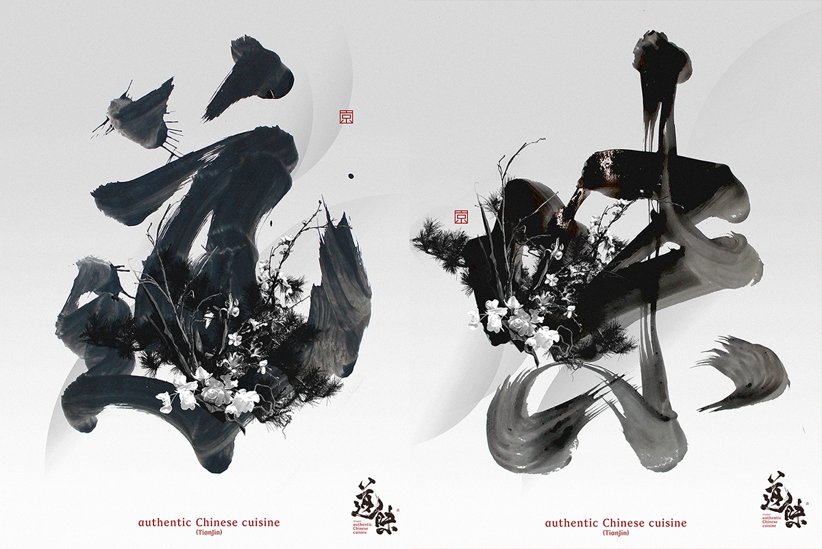
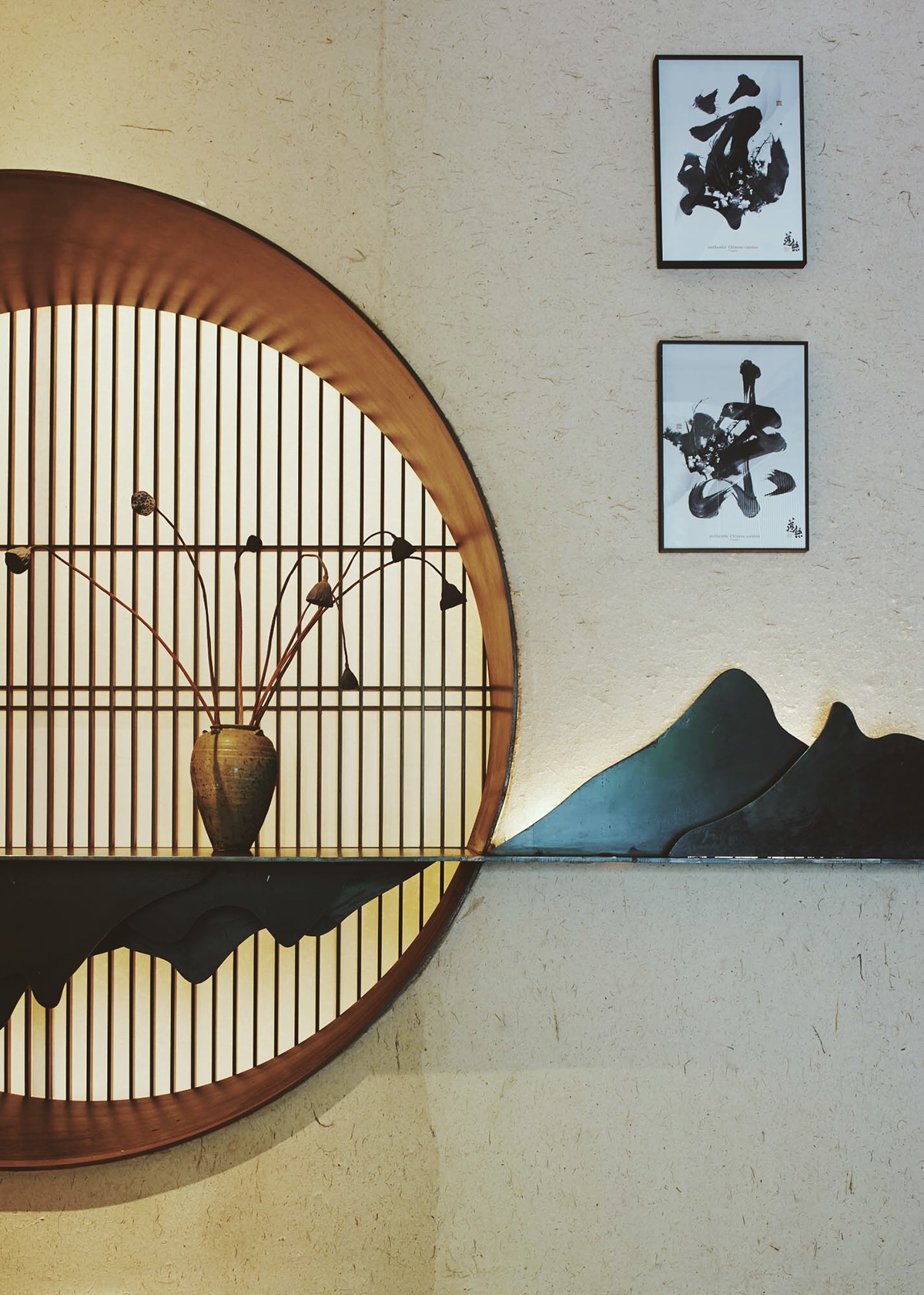
這次創作首次出現『二重』書法視覺。
作為LOGO的書法字體,採用簡潔而有力的展現方式,不作為輔助圖形的延伸,只是單純的LOGO,所以在輔助圖創作時,再次決定採用書法字體進行創作,從風格、書寫、筆觸肌理進行區分,第二套書法字展現方式更賦予藝術感,一種筆畫與線條的交互,一種新的藝術形態,第二套書法字大多數出現在海報,紙袋等地方,作為輔助圖或主視覺圖應用。
這次創作首次出現『二重』書法視覺。
作為LOGO的書法字體,採用簡潔而有力的展現方式,不作為輔助圖形的延伸,只是單純的LOGO,所以在輔助圖創作時,再次決定採用書法字體進行創作,從風格、書寫、筆觸肌理進行區分,第二套書法字展現方式更賦予藝術感,一種筆畫與線條的交互,一種新的藝術形態,第二套書法字大多數出現在海報,紙袋等地方,作為輔助圖或主視覺圖應用。
道味は天津市和平區馬場道162号にある、創意工夫した中華料理を提供している中華レストランです。
今度の創作での初「二重」書道ビジョンはロゴの書体としては、シンプルでパワフルな表し方を使って、アシスタントの図形を延ばしたものではなく、単なるロゴです。ですから、アシスタントの図形を創作した時にもう一度書体で作りことにしました。スタイル、書き方、手書きのきめで分別し、二つ目のプランの表し方の方がもっと芸術感があり、線の交差、新たな芸術のイデオロギーとして、ポスターや紙袋などでアシスタントの図形やメイン ヴィソーグラム(main visuogram)で幅広く使われています。
今度の創作での初「二重」書道ビジョンはロゴの書体としては、シンプルでパワフルな表し方を使って、アシスタントの図形を延ばしたものではなく、単なるロゴです。ですから、アシスタントの図形を創作した時にもう一度書体で作りことにしました。スタイル、書き方、手書きのきめで分別し、二つ目のプランの表し方の方がもっと芸術感があり、線の交差、新たな芸術のイデオロギーとして、ポスターや紙袋などでアシスタントの図形やメイン ヴィソーグラム(main visuogram)で幅広く使われています。
authentic Chinese cuisine 道味(TianJin)Brand visual identity design
authentic Chinese cuisine restaurant of Tianjin.
The "double" technique made it's first appearance this time. as a calligraphic logo, I chose to make it simple and powerful, not as an extension of the image, I've decided to use calligraphic type again, to differentiate it with style, strokes, and texture. The second set of calligraphy used a more artistic approach, the communication of strokes and lines. A new form of artistic expression, the second set of calligraphy will mostly appears in posters, of carrying bags, as an extension of the main image or become the image itself.
Creative Director & Calligrapher: Lok Ng
Design: awt design Inc Staff
Translator(JP): Ngjeoi Angie Lyu (マオ)
Translator(EN): Tomi Tang
Design: awt design Inc Staff
Translator(JP): Ngjeoi Angie Lyu (マオ)
Translator(EN): Tomi Tang