
Working on Play City redesign we were challenged to create a new identity and logo. Redesign includes all the entertainment services, thematically not linked but acting in accordance with each other in one concept.
The base of the main concept is the visualization of the icons created in isometric space.
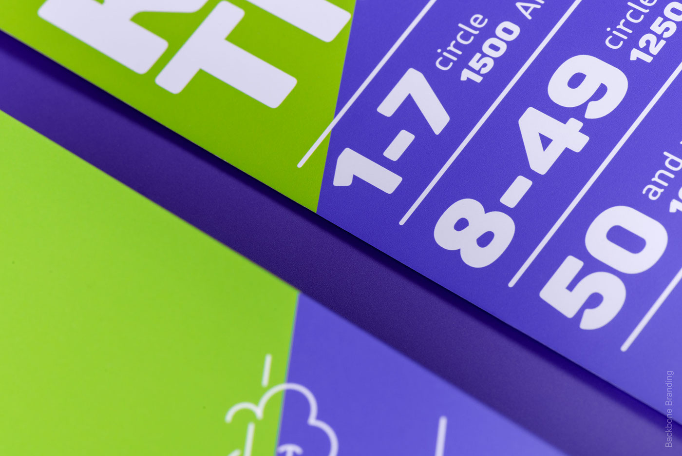
The feeling of dynamics is expressed through the doodles.
The combination of images with persons with graphic vector elements in the posters creates the connection between the real and game world. A unique color spectrum was created for each service in that way so each time you combine new services its obtains a new color spectrum.
The base of the main concept is the visualization of the icons created in isometric space.
The feeling of dynamics is expressed through the doodles.
The combination of images with persons with graphic vector elements in the posters creates the connection between the real and game world. A unique color spectrum was created for each service in that way so each time you combine new services its obtains a new color spectrum.
Credits:
Client: Play City
Date: 2015
Art Direction: Stepan Azaryan
Design: Karen Gevorgyan


Process


