


The Parallel Music Festival identity
The Parallel Music Festival branding identity is a vibrant and dynamic representation of the event. The full set of branding identity includes animations that bring the logo to life, as well as a poster that incorporates the colors and font of the logo. The result is a cohesive and memorable brand that captures the essence of the Parallel Music Festival.
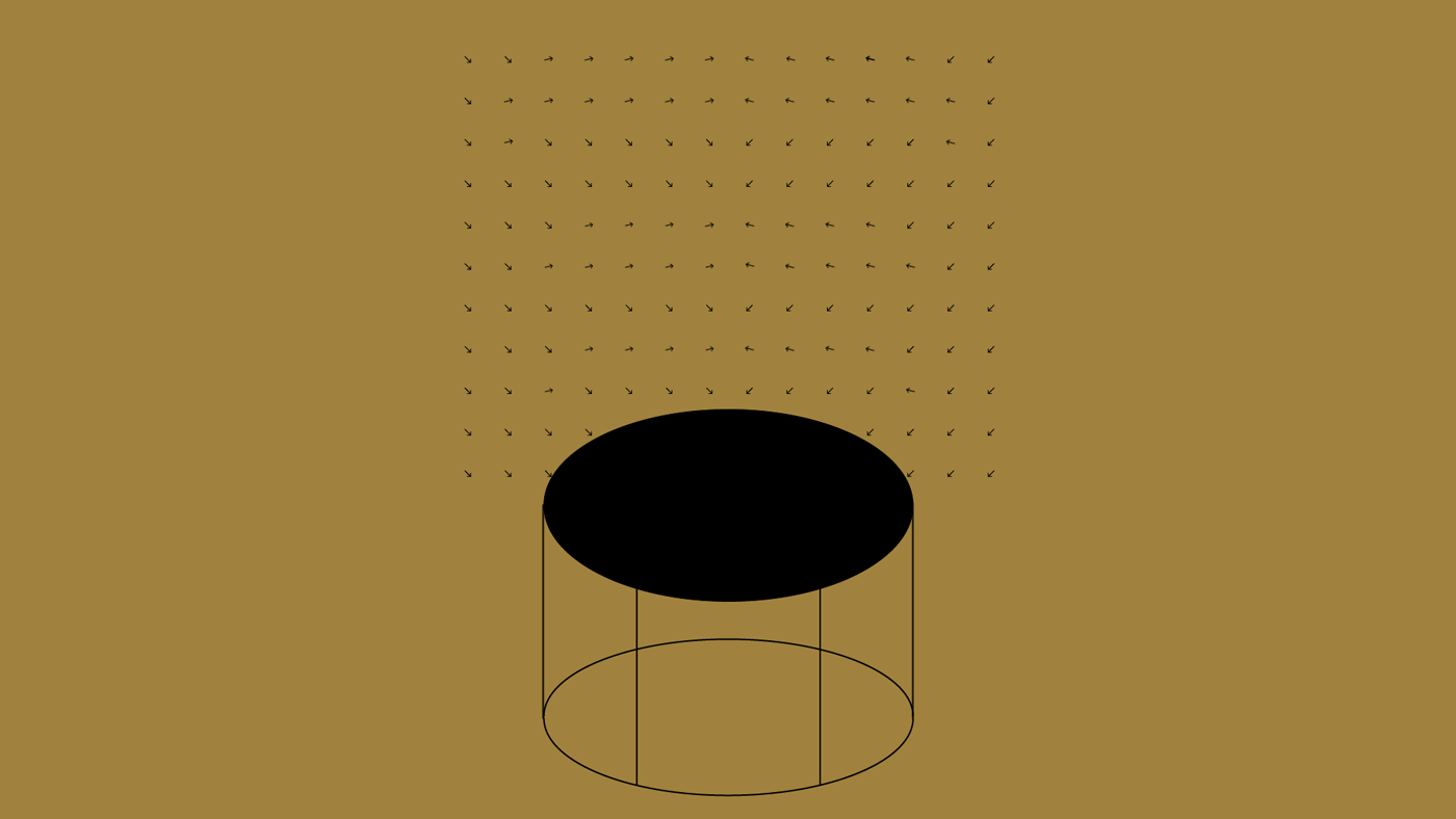


The animation is a vital component of the Parallel Music Festival branding identity project. Instrument shapes are used as the base for a 45-second stop motion video synced to the beat. This dynamic animation can be reproduced for advertising, social media posts, or online promos, creating a buzz around the event.


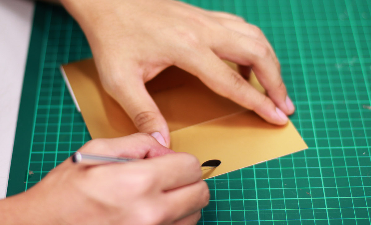
To bring the branding identity of the Parallel Music Festival to life during the presentation, we went the extra mile and created handcrafted mock-ups of the design. Using gold surface paper, we printed out the full set of designs to make them as realistic as possible. The mock-ups allowed us to showcase the brand's potential in a tangible and visually striking way, leaving a lasting impression on the audience.


Thank you for taking the time to watch and engage with the Parallel Music Festival branding identity project. Your feedback is valuable to us, and we would greatly appreciate it if you could leave a comment below and share your thoughts. Your input will help us continue to improve and refine our work in the future.


