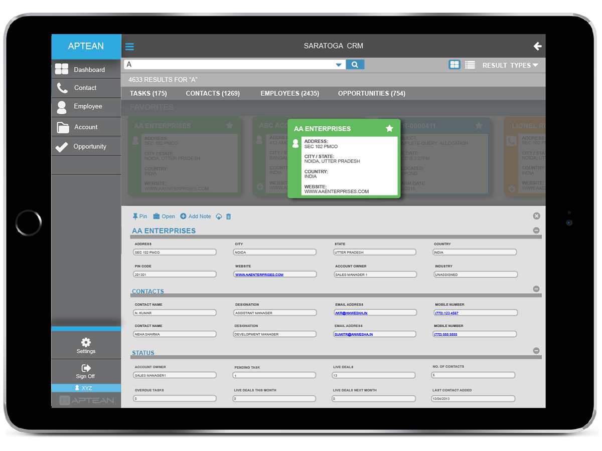
Search Results UI
One of the features that we wanted to improve was that of the search results page for a variety of our products. Before, the search data was overpowering and was displaying too many items on the page. This made our customers feel overwhelmed and have difficulties navigating the results. Also, the grouping for topics, such as accounts, sales, customers, etc. were not existent.

We noticed the easy flow of element selections in a tile view; similar to how Netflix and Microsoft use their tiles, we wanted to display key information within the tiles. There would be sections that we could use to divide any information such as favorites, contacts, or any other information. This allowed us to provide a view that would not over stimulate our customers but allow them to see a snap shot of the detailed information that they would be searching for.

Once we were able to provide the wireframes that showed the functionality of the cards; we then developed a far more detailed look. With grouping and sorting, we were able to provide context for our customers to easily distinguish what areas they were sorting through.

Now each section is divided into its own category and color to help differentiate the significant data. Instead of having a long view of data in a grid format, our customers can now view the snap shot of data within each category.

Upon selection of the category, a larger detailed view will expand thus displaying the data elements. In doing so, our customers can view information to the finest detail without having to scan the list items or grids to find the specific data that they would be looking for.
Content Timeline
Another feature that we wanted to aid customer experience is out timeline. By displaying the status of the content, the users can view history of their items that have been documented. On selection or mouseover, users can gather more data pertaining to each item as shown below. For one our products, our customers were interested in an idea to view previous tasks and aspects and also plan ahead for future engagements. We decided to create a timeline for our customers to view past events and past tasks while creating future events. We also generated expanding windows when an element within the timeline is selected; this would provide our customers a more detailed view of the task that they are viewing with the timeline.

Scanning UI Improvements
One of our products Catalyst documents inventory for medical facilities and much more. The previous concepts and functionality allowed users to type in specific bar code numbers to document any orders within the warehouse. We took the previous concept and expanded it into a more concrete experience.
Below were the previous guides for users to document and receive orders within their warehouse. On the older scanners, user would have to select F1-F12 to navigate from transaction to transaction. As you can see, this method required that the user had very limited navigation. Taking these elements into notice, the early wireframes were used to generate a better flow and to distinguish what page the user was on.


As you can see, this method required that the user had very limited navigation. Taking these elements into notice, the early wireframes were used to generate a better flow and to distinguish what page the user was on.

After generating a flow through the wireframes, we provided high fidelity concepts to generate a better impression and experience that would soon be handed over to the developers for development.


