
Positioning concept
At Pech.ru, people care about the needs, wishes, and means of every customer. Nobody aims to sell more than required or at a higher price. Such approach to service spares the the customer plenty of time and effort, making the buying process simple and enjoyable.

Complex solutions and personalized approach to the customer’s needs along with simplified processes of purchase, transportation, and installation are the key attributes of Pech.ru’s positioning. We built upon these attributes to develop the shop’s identity.

Visual identity concept
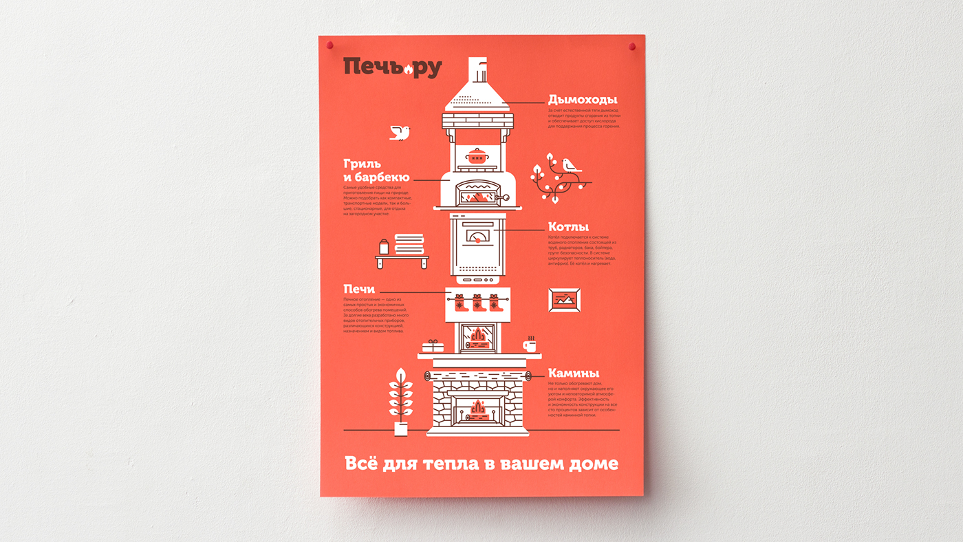
At the heart of Pech.ru brand identity lies an image of a modular furnace consisting of various components. The modular furnace shows the opportunity to combine services and products according to personal needs and means. Analogy with a construction set suggests the process of buying a fireplace at Pech.ru is going to be simple and enjoyable.
For illustrations, we used the combination of plain spots and contrasting lines. With such simple stylistics, we managed to demonstrate not only the various products, but also the variety of styles, materials, and finishes.

Working on the project, we drew almost a dozen components (fireplaces, furnaces, chimneys, boilers, and grills) and 30 interior items (chandeliers, paintings, smoking cups, deer heads, etc.) that can be combined as one’s heart desires.
Simplified illustrations with less detail and without interior items were created specially for the catalog and navigation in the online store.

Interior items make each illustration distinctive and indicate wide variety of products. Simple illustrations can be used in the catalog of products and website sections, others can be combined to create a signature pattern.

We also drew conventional monolithic furnaces with tiny charming features to use them in product categories of the catalog at Pech.ru and to be appealing to the more pragmatic audience such as foremen and designers.


The color scheme is based on warm subdued shades. Brown and soft red are the basic colors associated with fire. They are used in illustrations and texts.

Museo Cyrillic font is used in headers, amplifying the overall graphical solution. Pronounced geometricity and evenly thick lines of the font go well with the strokes of the illustrations. Bar-shaped serifs and a bit rounded corners make the font look open and welcoming. For common texts, a more neutral and readable font Museo Sans is used.

Additional graphical elements resembling the texture of a fireplace and materials of furnace accessories are used as separators between text blocks. The concept of a modular furnace can be transferred to the typographics by combining text blocks in the shape of a fireplace and separating them by graphical elements.

Logo development
We developed the lettering of the logo and added a single graphical element to it — a fire that accentuates the .ru domain.


The graphical solution packed with illustrations and icons determined the neat and composed logo.

Media vehicles development
In order to launch the new identity, we designed a wide array of printed, advertising, and souvenir vehicles. We’re now overseeing the development of a brand new website and working on product catalogs for Pech.ru.


The preferred style of illustrations, as well as color and font schemes made the visual identity of Pech.ru cozy and inviting. After all, fireplace is where the whole family gathers in the evening. It creates an aura of warmth and comfort in every home, and the identity system must communicate this feature.

Such warm visual identity makes Pech.ru stand out among the impersonal competitors and helps the company attract consumers from the lower and moderate price segment, who believe that a fireplace has got to be expensive.


