Kiiro
Self-Promo Design Publication
Self-Promo Design Publication
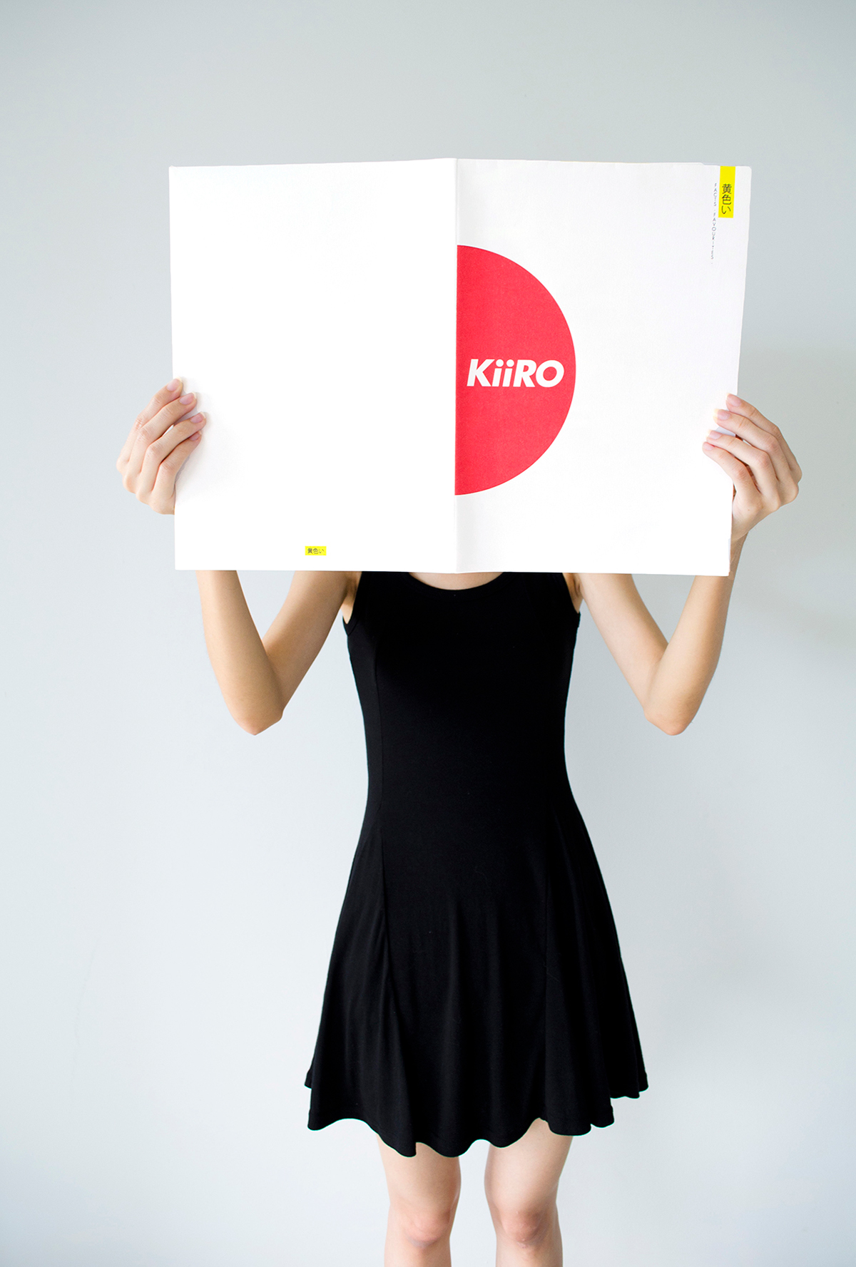
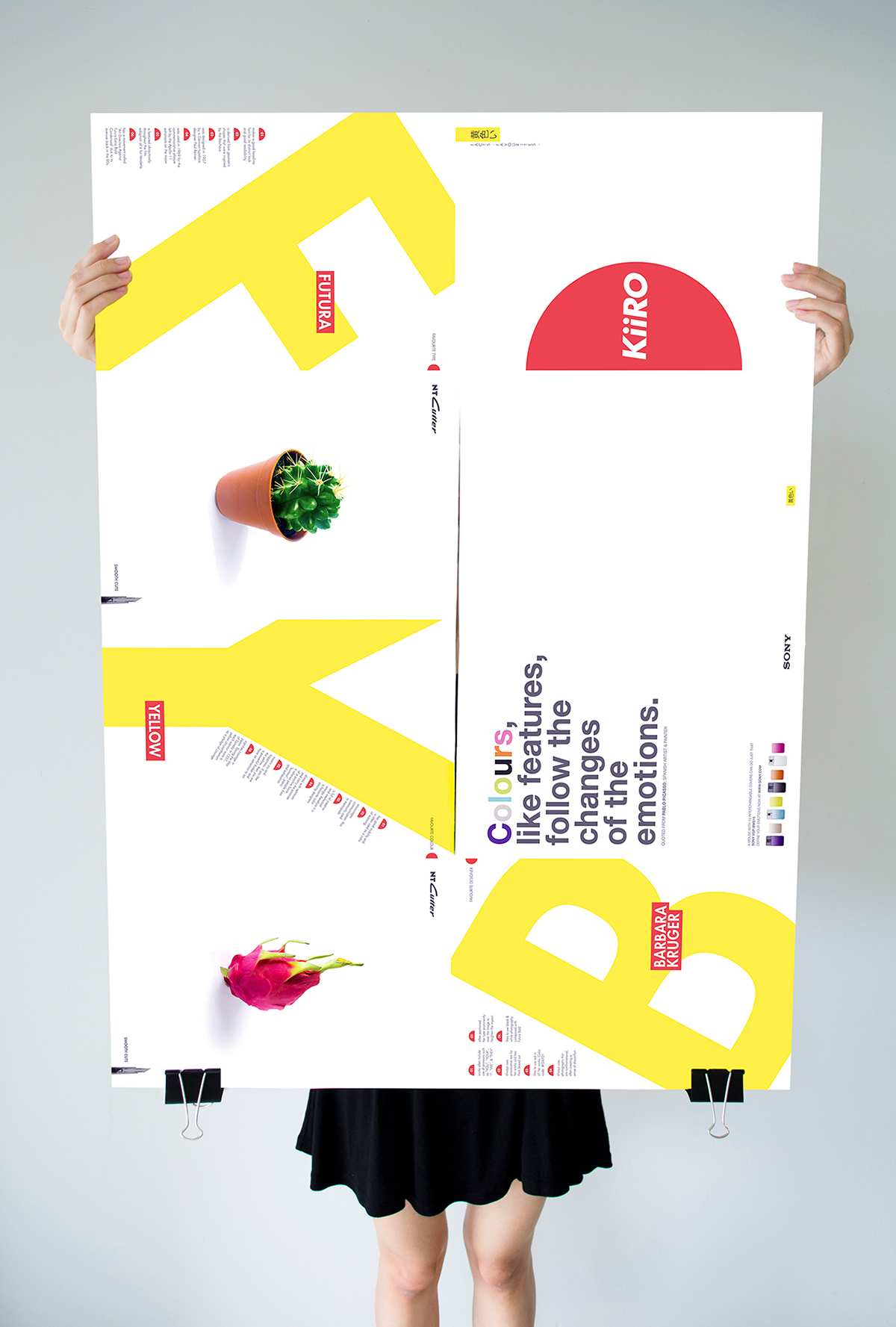
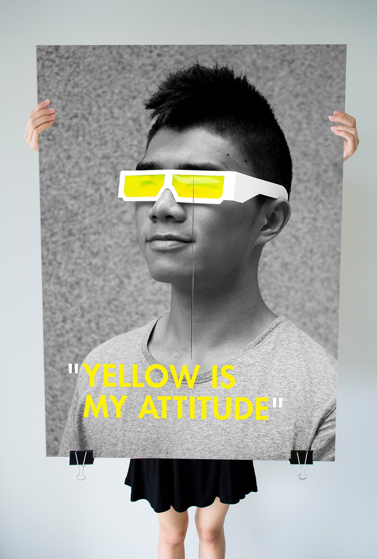
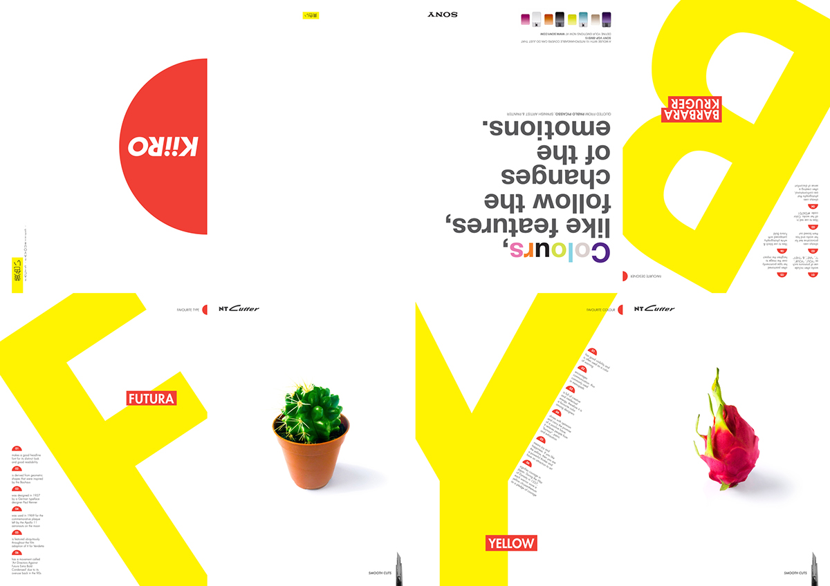
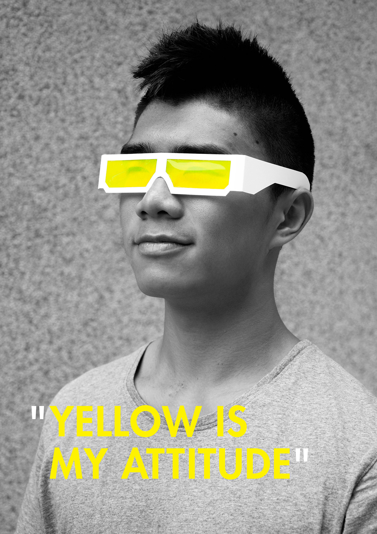
This is a design publication of my working partner, Ken. Japanese minimalist style is being incorporated into the design publication along with the influence of many Japanese visual elements. As Ken is a half-japanese, therefore a half red circle is used to represent his mixed heritage. The design is kept with only a minimum of two colours: yellow and red to retain the simplicity. Yellow is the secondary colour as it reflects Ken’s cheerful and positive personality. As for the font, Futura is chose as the thick strokes protray Ken as a bold and confident character. The design publication is named Kiiro; yellow in Japanese.
Size: A1 (8 ppt front, 8ppt back)
Year: 2011