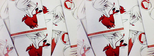
This magazine was one ofthe first things i posted in here and at that time i was so excited to addprojects like crazy that i didnt make a presentation that could justify all thework that me and my friends have to make this project happend.
I was just going to update the first project but there are so many changes andnew stuff add that i decide to create a brand new and just unplublish the oldone.
Now i make a new presentation, with a lot more details and the completemagazine and i hope everyone enjoy it.
Id like to thank everyone who appreciate the first encarnation of this projectand a special mention to John Mark Herskind, Mai Saraiva, Rodrigo Nectar, TomThanachart and Guilherme Krolow for the kind comments they give. :-)
- the atomic ghost


DESIGN (+) is part of my graduation work in the SENAIGraphic Arts School. Its a magazine wich the main theme is the work of designers of my city butthe mag have the intention to talk about the work of professionals of othercorners of the planet as well. As long is it good, would be there. Also talkabout pop culture and everything else related to design, creativity andinspiration.
Our intention was to create a free distribution printed magazine and alsohaving an on-line distribution, like all the PDF mags that exists out there,trying to reach as many people as possible through online and offline midiasand counting with the participation of colaborators and readers to makesomething that could really reflect the expectations of our audience.
Our intention was to create a free distribution printed magazine and alsohaving an on-line distribution, like all the PDF mags that exists out there,trying to reach as many people as possible through online and offline midiasand counting with the participation of colaborators and readers to makesomething that could really reflect the expectations of our audience.

The editorial content was influencedby online and offline pop culture and design magazines from Brazil (ZUPI, MAISSOMA, COMPUTER ARTS BR) and all around the globe like NEWWEBPICK, JUXTAPOZ,COMPUTER ARTS UK, etc.
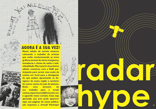
The layout is simple and clean, keeping thereading pleasant and to valorize the art. Thepages layout dont want to call more attention than the art, all the lay out wasprojected to make the artists and they work be the most important thing of themagazine.
The layout is simple and clean, keeping thereading pleasant and to valorize the art. Thepages layout dont want to call more attention than the art, all the lay out wasprojected to make the artists and they work be the most important thing of themagazine.


The logo was created to bea powerful icon, an identity that could change some of his characteristics inevery issue to be in harmony with the cover art by changing the colors oradding textures but, at same time, keeping a format familiar and recogniziblefor the reader.
The inspiration was the MTV logo: consistent enough in his design to changesome of his characteristics and still be a reconizible identity. Mutant toreflect the dinamic times we live and strong to reflect a consistency, some kind of order, a familiar feeling thateveryone needs in his life.
Apply in the magazine the logo would have all the information"orbiting" around him, giving to the reader all the information hewants to know in the instant he saw it on the web or the newsstand. The price,month, edition number, website adress and even the magazine slogan("everything is design") would be easily seen circling around thelogo.
At the bottom of the page, a line showing the other headlights of the edition,in a really clean aproach to valorize the cover´s art. These design layoutwould be repeated in every edition of the mag, what would help to create astrong identity for the readers. In a newspaper stand all the magazine coversare competing to get the reader attention and its important to have a layoutstrong enough to be recognizible and get notability.
We also have the intention to create in the future some on line edition inenglish for an international audience, so another intention was to make a logothat could represent the magazine for the people all over the world veryeasily. Thats why we choose the "D+"abbreviation to represent the magazines name.


There wasnt magazines enough to give for everyone whowatch the project presentation, so we created this flyer to distribute to allthe people present with the called “Explore the unknown” and an website adresswith an on-line magazine version to read or download in PDF format. The website still on in www.design-mais.blogspot.com.The intention with this flyer was create not only a promo material, but alsoa cool and misterious piece that the person wouldnt like to throw away later.We wanted to create a rock and roll band posters vibe and we use the radarimage of the section RADAR HYPE in the center of the art to have and element torelate with the magazine.


DESIGN (+) is the collective work of Rafael CastilhoMonteiro, Roana Kinue Santos Takao, Wagner Ferreira dos Santos and LudmyllaLeão Peres.


