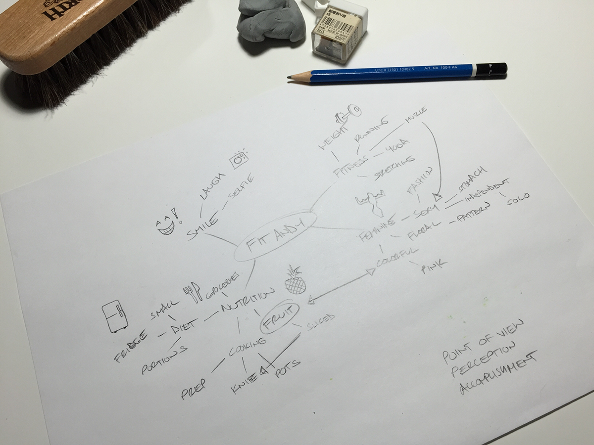
Andyy is a fitness and nutrionist based in LA. She apporached me for an identity that speaks to both worlds, but is leaning toward nutrition as she pursues here degree. With most projects, a simple word map is often my 1st step. This one was created while looking at her provided images as well as the media she has already generated on her instagram account (@fitandyy), and blog (fitandy.com).

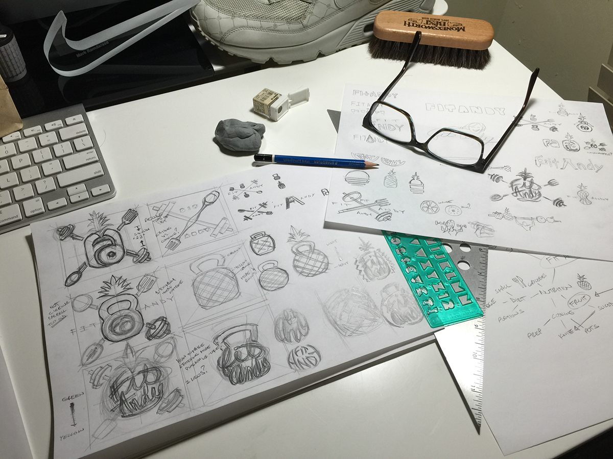
After completing my word map, I keep it close and repeat the ideation process. In the 2nd step I look to my word map for direction, but keep the client provided images close. This stage is about getting ALL ideas out of my head- the good, the bad, and sometimes a few funny ones, just to get them out and move on to the next. Usually I have 3-5 worthy directions I'll develop in my next step. For this project, it was 1) Pineapple 2) Barbell x Utensils and 3) 'fa' "ligature"

Instead of developing each idea further I selected 3. I love geometry and in more recent applications, many logos must fit well into a square and drafting a simple square with verticals and diagonals through it sets up my grid. All sketches were completed in columns from left to right. The right is reserved for small quicker refinements. At this stage I came back to the client I asked my client:"If you had to choose fitness or nutrition, which would your logo portray" her answered "Nutrition"But in my research of her brand and sketch exploration I kept finding myself wanting to merge the two. Of these solutions, the one I liked the most was the similarities I am portraying between a Kettlebell and Pineapple.

Further devloping my 1st of 3 ideas. I think I'll call this one "Pinebell" or "Kettlefruit." I broke out a few more tools like my Pentel Color Brush and was very pleased with the line quality. Quickly I relalized how important it was to keep an oval shape and stay away from the circle. Also, I was happy to take advantage of how the crossbars poke out of the oval further referencing a pineapple's skin texture. instead of simply drawing a jagged line around both words like parenthesis, I incorporated the letterforms. I'd like to develop this one a bit further, but it's time to work on the next.

Developing the 2nd of 3 ideas- the "skull and crossbones" idea a bit further. These sketches helped me narrow down my eating utensils to the knife and sifting spoon. I prefer these 2 becuase they feel more closely related to food preparation than act of eating itself. Also, they better drive the fact that Andyy is a nutritionist. This solution is presenting a few problems though, due to symmetry. I hope to figure them out, but FIT (3) vs ANDY (4) is a tough set of letters to kern. That lead me to writing it in cursive which feels more feminine and appropriate, but I need to stray from design details that will not reproduce well when the logo is shrunk to its smallest application.

I prefer to work in sets of 3 and have further developed the 3rd idea here. In the top row I deliberately took the two letterforms in different directions to get out of my comfort zone. This original idea to simplify the logo to a simple 'FA' came to mind in effort to create.a beautiful ligature. Though, I wasn't able to marry the 'f' and 'a' in a harmonious way, I found the capital 'FA' to be just as interesting if not more successful.

Starting to block things in with Photoshop. I love the texture of the brush and hope it reads well when I shrink it down.

Testing out some color theories

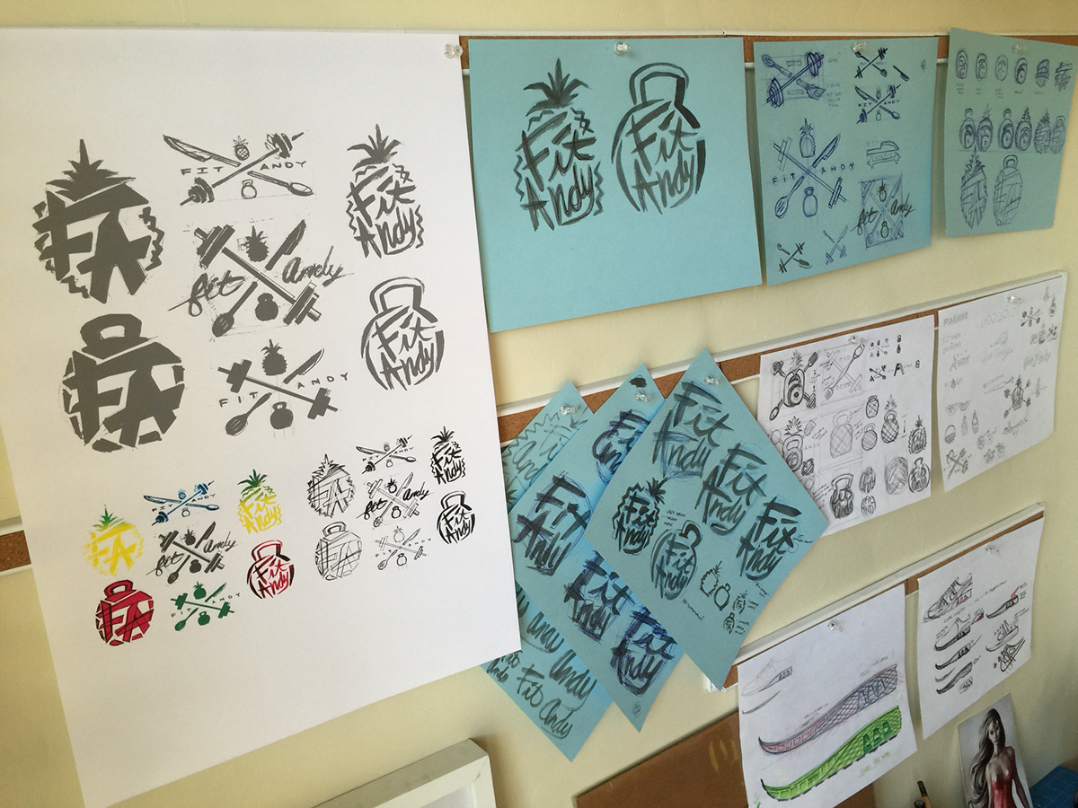
Pinning a few quick Photoshop mockups on the wall to get the 4 ft. experience. I usually take a day or 2 here to come back to the design after I've slept on it. The preliminary sketches are kept near to remind me where the idea cane from and in case I missed anything. This format also is great for getting feedback from others like my roommate who is also a designer.

I believe in investing a portion of every project I take directly into that project specifically. This can mean watercolor paper, gas to go take photos of something myself, purchasing a t-shirt for testing, or range of other things. For this project. It meant buying a pineapple. Google is great, but as a designer, I feel if we are lucky to live in a place that has access of something as simple as fresh watermelon you should take full advantage of it. After a few days on the wall I've decided to immmerse myself in the details to better understand a pineapple so that I can make a more authentic abstraction of it. Plus it was only $2.99 at the grocery store. So here I am studying it in hope of uncovering some details I can incorporate into the finalized design. One such discovery was the star like shape on each of the fruit's "scales" I feel it would make an excellent tittle (The dot that floats above a lower case 'i'.)

Further tweaking the lettering and shape of things with my brus pen

Being silly goes a long way and is always a great way for me to take a break from a long project. I hand drew the words "Fit Andy" 78 times tonight alone. Still trying to find the perfect one or find letter forms I can pick and Frankenstein from the lot

Back on the computer in Phototshop, I'm combining my favorite elements from the 9 sketches I felt were working best. From here I start warping the text and frankenstein -ing other parts to make it feel organic and that it was done effortlessly. I long wanted a gradient of green to yellow in the final design, but was happy to discover the Pentel Color Brush created one naturally from left to right as the ink brushed across my paper.The grey circle and square are guides. I don't intend to put the final design in circle, but must design the logo in a way that is conscious of how it will be used on various sites, profile pics such as google+, instagram profile pics, etc.

Really starting to like how the pineapple is abstracted, but reads well. I had to move the entire logo down a bit to keep it centered in the circle.

Happy with pineapple accents, I moved on to creating accents that would describe a kettle bell. Just like a beautiful painting is composed of thousands of strokes, I paid special attention to getting the right one for the kettle bell. I wanted a stroke that would not just describe the round shape of a kettlebell, but also reflect the feeling that it was bottom heavy. If you look my sheets of strokes the left page are strokes intended to be placed between the 'F' and 'A'. These strokes started off top heavy, but I quickly corrected the weight to be more even. For the full page of strokes I started the stroke light at the top and ended it heavy and aggresively to further develop the dry brush look. The dry brush evokes quick motion which is something I want views to feel when looking at the fitness version of the mark.


