
The new logo for Calebs Show: Rainfall Review! We wanted to keep the fresh colors that were visible in his avatar and create a very cheerfull and happy feel to his branding.

However, since Rainfall also likes to talk about a log of Japanese media, he wanted me to make his branding in Japanese as his main. That's why I bended his logo into a japense one aswell. Sweet!
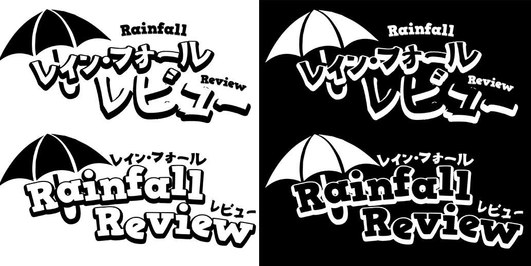
The Black and White version of the logos.

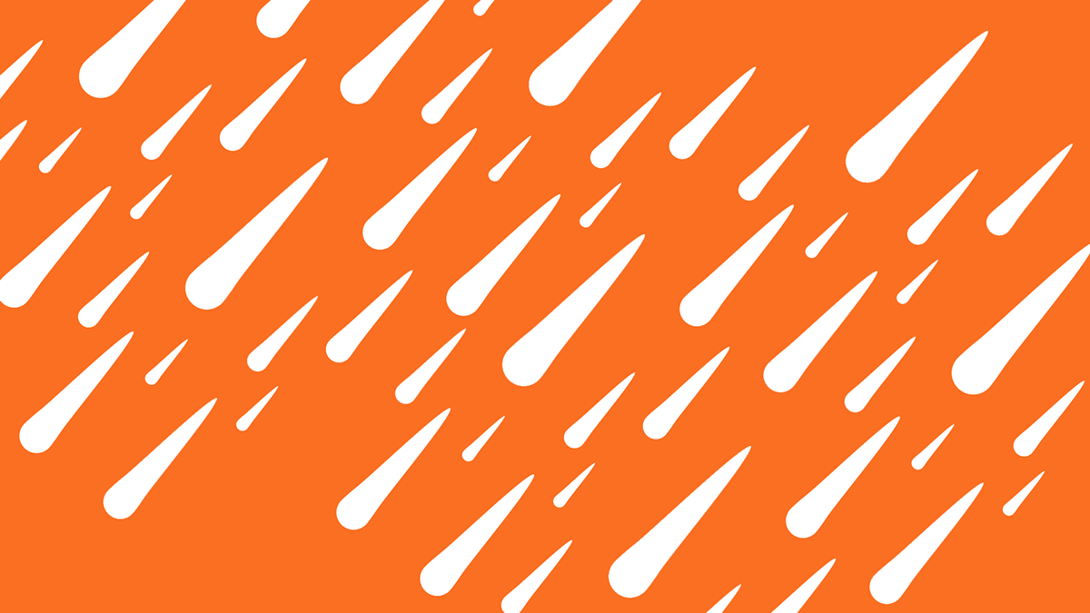


The general backgrounds for Caleb. I made raindrops falling diagonally so it would accentuate the busy logo.

The 16:9 aspect ratio. This border is done incase Caleb wants to show his branding through the footage.

The 4:3 aspect ratio. This is made so that Caleb can use videos that are not projected in 16:9.


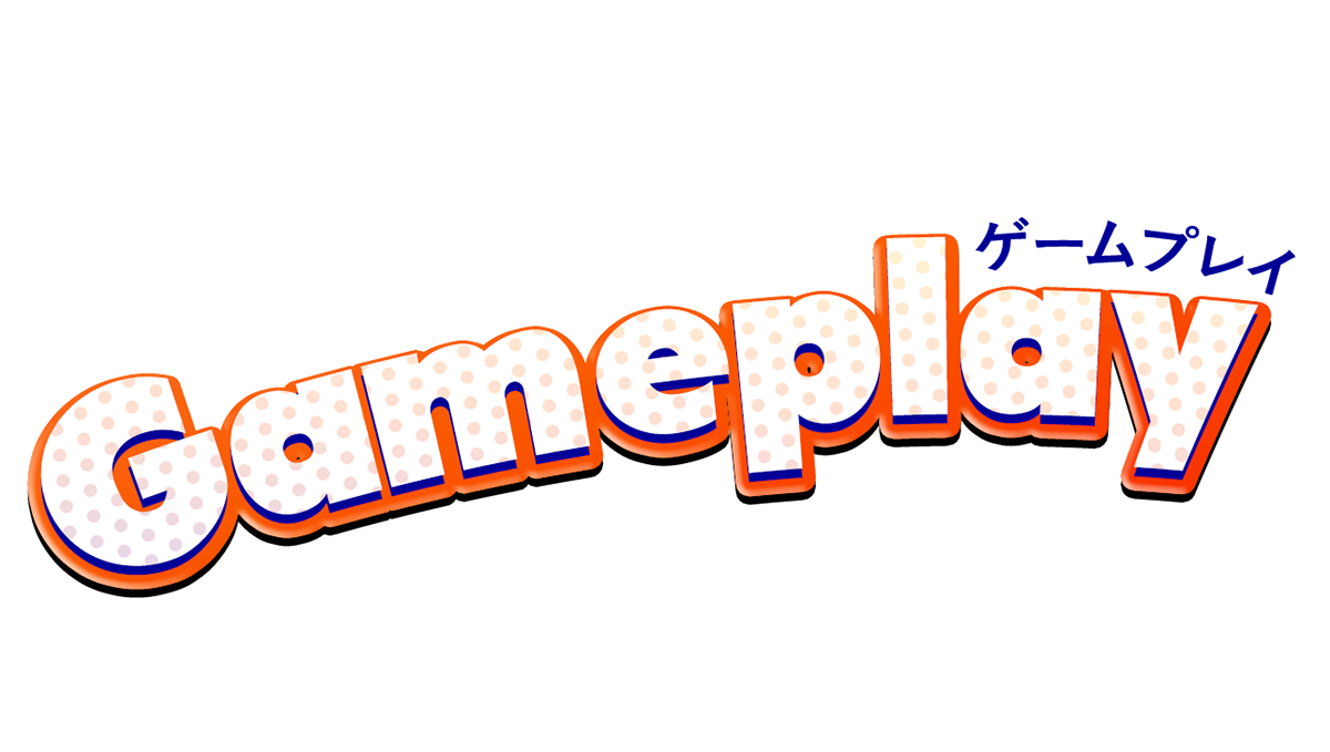
The Narrative, Gameplay and Presentation attribute. These are used for whenever Caleb starts about a new topic.

The End Title Card. To keep the diagonal theme to it, I thought it was a good idea to angle the title card aswell. I really like how this turned out!


The YouTube, Twitter and Facebook banner.

The new icon for Caleb. The icon art is made by Mangakaluna. Please check her work out!


The thumbnail designs for Caleb.

The Twitch banner for Caleb. I really like the magenta/ppurple colors to make it look very vibrant like the rest of his branding.


