I have rebranded my logo. What do you think of the old vs the new? This is the old logo. I originally had my face painting business in mind when creating it so I wanted it to look "kid friendly". But, after awhile I felt that it was too "clunky" and cluttered. I decided to revise and try something a little more simple with a stronger icon graphic.
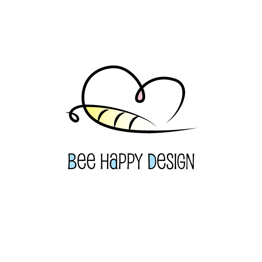
This is the first iteration of the new logo that I decided upon. I went more pastel with the colors to keep it looking fresh and light. I kept a more quirky font but this one, while having irregular shapes, also features smooth lines and curves and matches the icon I illustrated much better.
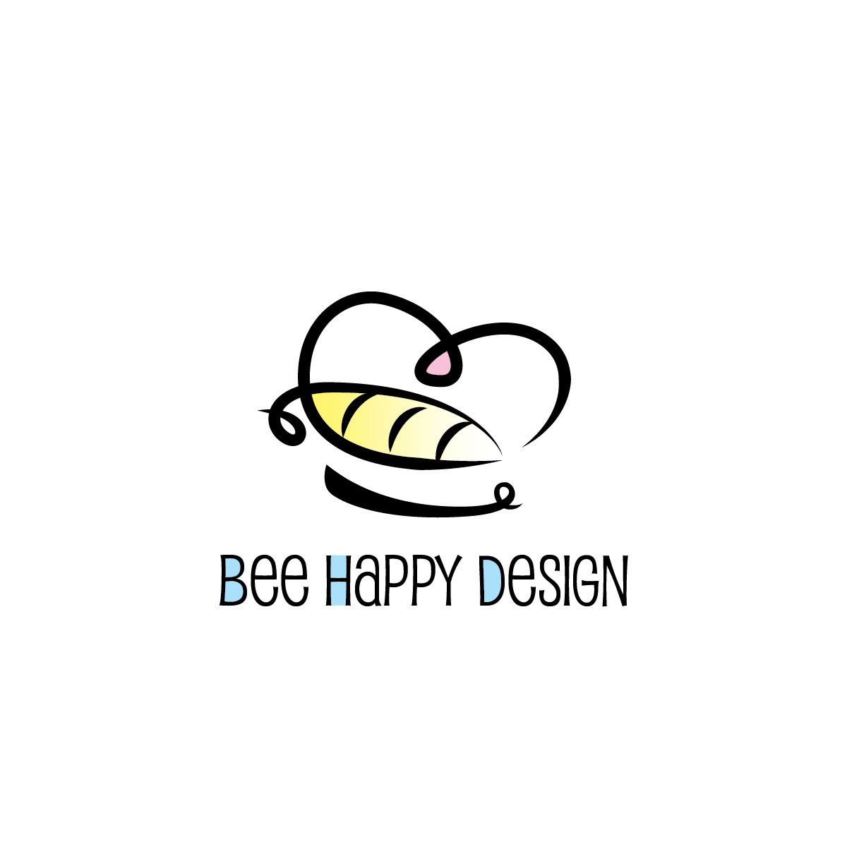
I had also been playing with the blue coloring and whether I should highlight the BHD or keep the a in Happy highlighted for balance. I decided to keep this one to emphasize BHD.
Another possibility - Old logo with type revised and incorporating the face icon. I thought I'd try my old logo style in this new format. It still wasn't right for me anymore.
New logo, new font. Again I was missing the smile element so I've added that back. I also want to highlight the BHD initials. I am still a bit undecided on the font - I like the old one but I think this new one fits the style best.

Squared off text with graphic. Seems to work better this way especially when fitting into profile images.

