"Great concepts, copy and content"
Hi, I'm Tino Ferreira. I write the calibre of copy that will complement your creativity. It's not about words; it's about ideas, and how best to share the "what's in it for me" with the audience. I am visually literate - an all-round marketing writer with experience at large and small ad agencies. Most recently, I worked as the creative director of Mustard Seed Marketing, a niche retail advertising agency specializing in the marketing of shopping centres.
●
I now run my own creative consultancy near Cape Town, South Africa, where I strategize, conceptualize, co-ordinate and implement online and offline projects for a number of ad agencies and direct advertisers.
●
Mail me: tino@brandformation.co.za
Check out my copywriting site: www.brandformation.co.za
and my seo site: www.befoundseo.co.za
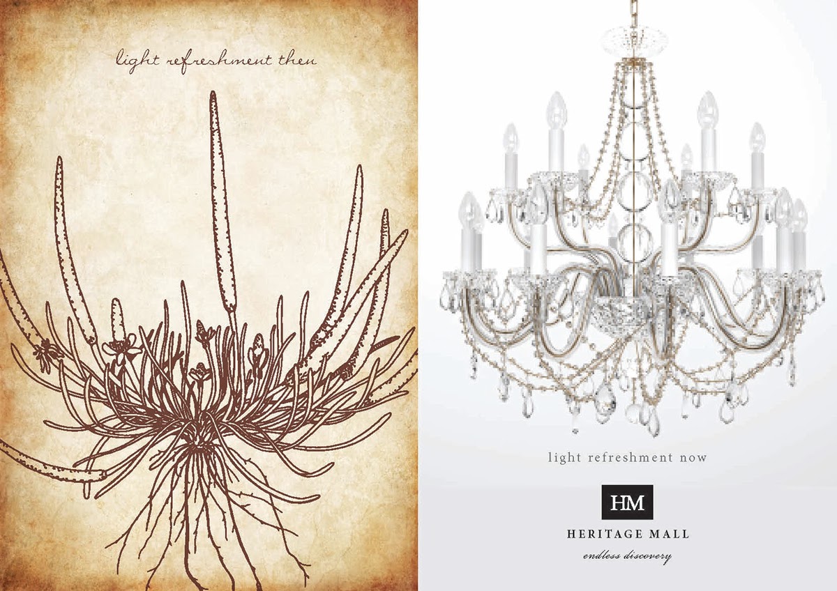
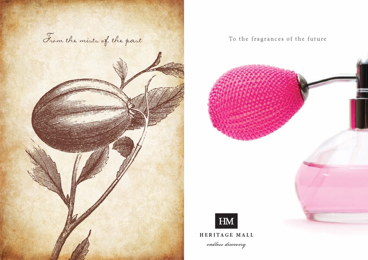
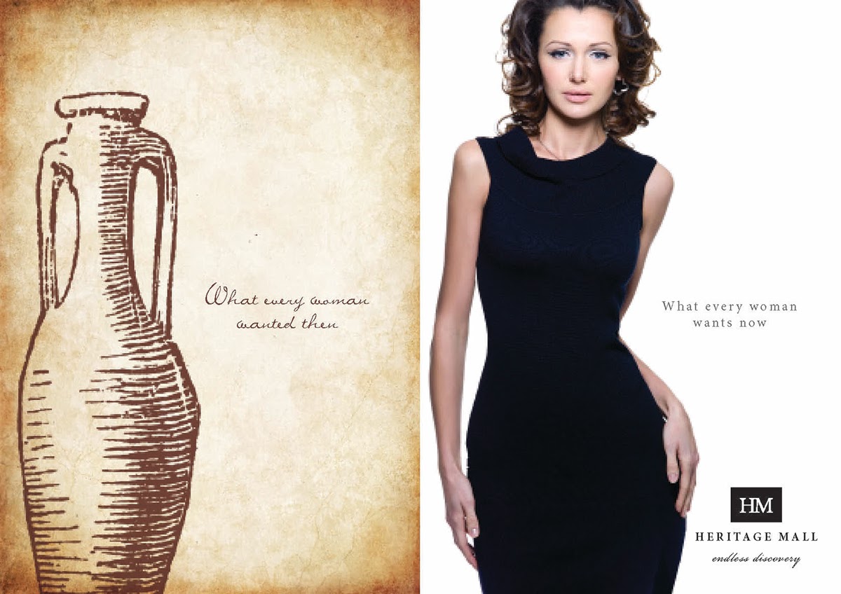
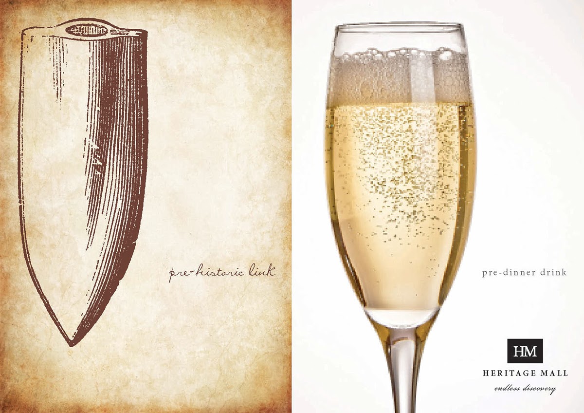
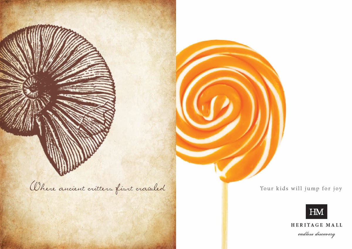
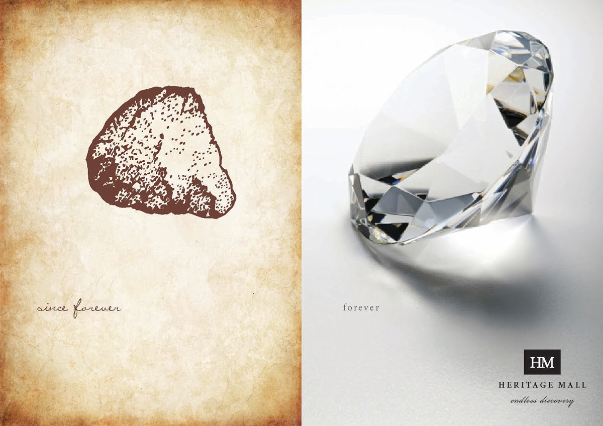
This and the following six images: Pre-launch campaign proposed for Heritage Mall, a regional centre near The Cradle of Humankind. Cumulatively, the ads suggest a wide range of categories and create expectations of the class of merchandise that will be on offer.
Spec work. Tino Ferreira - creative director & copywriter. Libre van den Bergh - art director.
Spec work. Tino Ferreira - creative director & copywriter. Libre van den Bergh - art director.

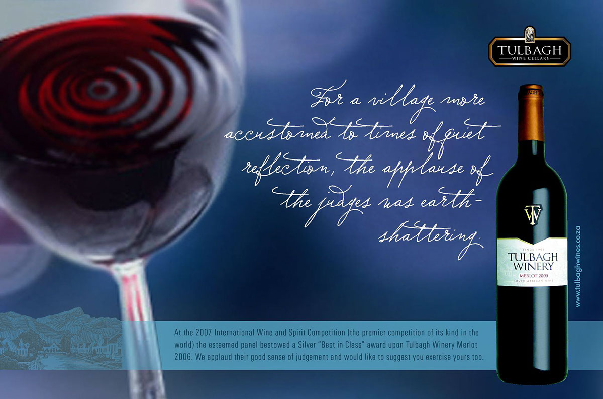
A major earthquake damaged many of the historic buildings in the village of Tulbagh about 30 years ago. This magazine ad taps into the collective consciousness with a subtle reference to that earth-shattering event.
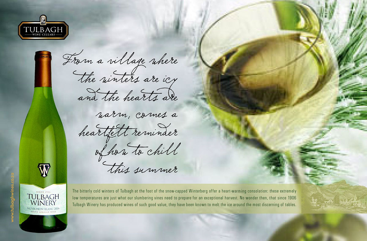
It gets bitterly cold in this village in winter. This is a summer ad. The strategy is to sell the heritage and home town of the brand; to give the brand a likeable persona by relating it to the homespun folks and the village ways of the town called Tulbagh.
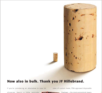
The visual gag is shorthand for effectively communicating a logistics company's introduction of wine transport in bulk bag shipping containers.

A trade magazine ad for a wholesale nursery.

The analogy of an ant nest to demonstrate seamless global co-operation in the transportation of precious cargo has been very successful in communicating this logistics company’s forte. The reverse of these post cards expanded upon the story.


One in a series of ads I came up with for the agency, Citigate. The mandatory zebra was placed in a relevant visual context to flag down the subject of each ad.

Plant extracts and essential oils are used in cosmetics, foods and medical products. The copy in this brochure steers clear of technospeak, and the resultant accessibility has also been achieved on the company’s website.


B2B magazine ad.
Relevant and unexpected. The announcement of a beverage logistics company’s more streamlined entry facility into the USA. No more bottlenecks.
Relevant and unexpected. The announcement of a beverage logistics company’s more streamlined entry facility into the USA. No more bottlenecks.

The copy in this brochure for a luxury lodge exploits the contrasts between the destination and the mundane, back home. The page shown above faces a pic of the watering hole in the bush; the page below faces a pic of elephants crossing the path of a Jeep. Agency: Wanted


In this brochure for a luxury lodge, the natural attributes of the destination are contrasted with the humdrum of city life. Urban references acquire new meaning.

A former parsonage has been converted into a restaurant and luxury guest house. The brochure (pages shown above and below), point of sale material and print ads explored this heritage in a subtly humorous way.


A former parsonage has been converted into a restaurant and luxury guest house. The brochure's intro page is shown above.

A brochure, POS material and press ads lured diners and overnight guests to the upmarket destinatiion.

A high-involvement ad providing lots of reasons for considering an office lease at this creative hub in Cape Town.

This postcard shopper assistant (front and reverse shown) was handed to motorists at traffic lights and also to customers entering the mall. Actual fabric swatches were attached to the card. It was part of The Summer Set promotion at Somerset Mall, which won a South African Council of Shopping Centres "Footprint" award.


This image and the one below: From a brochure to promote The Summer Set, a summer fashion activation at Somerset Mall, near Cape Town.
Tino Ferreira - creative director, Isabel Jonker - copywriter, Libre van den Bergh - art director
Tino Ferreira - creative director, Isabel Jonker - copywriter, Libre van den Bergh - art director


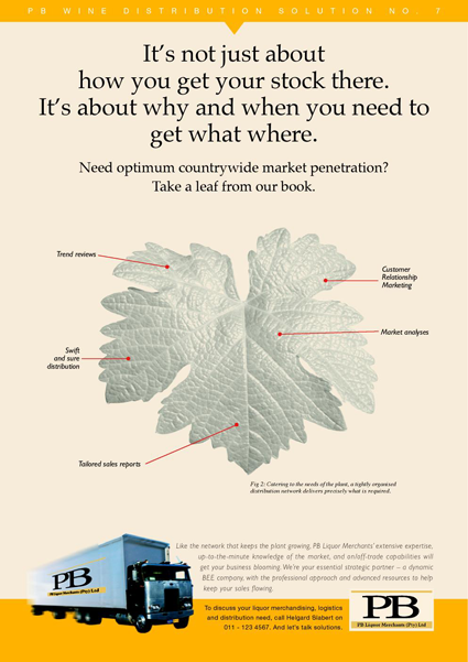
A trade magazine campaign to launch a liquor distribution and logistics company.
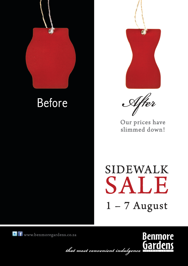
The sidewalk sales at this upmarket shopping centre carry mostly fashion. A "slimmer" swing tag was therefore an appropriate symbol to dramatise the price reductions. Tino Ferreira - creative director & copywriter. Libre van den Bergh - art director.

The parking area was in shambles during the centre's refurbishment. This billboard used the brand's "before/after" concept to placate customers.

The brand's humour appeals to its sophisticated audience of well-heeled Sandtonians.

A fun brand to work on, and a fun personality for shoppers to engage with.

Consistently serving up surprising semantic twists, the advertising scores high in likeability.

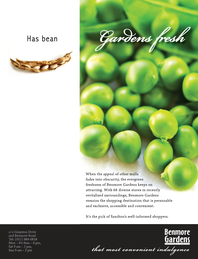
The concept of contrasting two extremes worked well to demonstrate the range of products on offer at the centre.
Taking a dig at the more established and much larger Sandton City up the road, this cheeky ad positioned Benmore Gardens as offering an easier, more pleasant shopping experience.
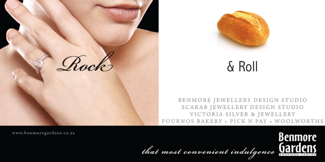
Different pairs of shopping categories were featured in a series of billboards to remind shoppers of the surprisingly extensive retail mix.

A series of posters to up-point the qualities of heritage and time (as in maturity) in the wines from the Valley of Wine and Roses.
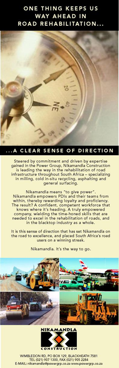
A trade magazine ad for an empowerment company in the road making industry.
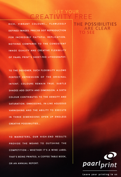
A series of brochures aimed at educating ad agency production staff and print buyers on the advantages of each type of printing offered by Paarl Print - from digital to gravure.

A spread from a copy-intensive book that discusses the government’s ambitious public transport improvement programme. It uses deliberately unbureaucratic language, directed at a broad-ranging audience, from transport users to investors.

Recruitment advertising needn't be boring. These newspaper ads use the idiom of each industry to sell the benefits of a particular career change.

Durability is the USP of the formulation of this industrial flooring system.
The collateral material shows and describes the many uses of these hard-wearing floors.
The collateral material shows and describes the many uses of these hard-wearing floors.


A concept for a corporate ad for Power Construction.

A billboard along the freeway to this regional centre positions it as the place to go for fashion. The line "all yours" was coined to emphasise the immense variety and to suggest pleasant service.
Tino Ferreira - creative director & copywriter. Libre van den Bergh - art director.
Tino Ferreira - creative director & copywriter. Libre van den Bergh - art director.

Pages from a sales manual for Bulgari staff worldwide, providing product descriptions and selling tips for merchandising the new season’s offerings. My English copy was translated into five languages. Client: Bulgari, Rome. For Spring/Summer 2012, Fall/Winter 2012 and again for Fall/Winter 2013 I wrote scripts for videos performing the same function, on the company's intranet.


I have produced many newsletters, and would love to do more. For some publications, I take care of everything - from writing and photography, to layout and production.

A quarterly newsletter for tenants at Growthpoint Properties shopping centres, for which I wrote and edited the content. The magazine style newsletter provides sales and merchandising tips, industry news and inspiring success stories. I wrote, edited and shot most of the the pics for another regular Growthpoint publication, Talking Point, aimed at tenants of their commercial properties.

Everything is superlative at this newly relaunced mall. Words fail to describe the experiences, so neologisms like "delectivated" had to be coined. The over the top visuals dramatise the extreme pleasures of the mall. Spec work.Tino Ferreira - creative director & copywriter. Libre van den Bergh - art director.

Again , the larger than life pleasures of the mall are illustrated. Spec work. Tino Ferreira - creative director & copywriter. Libre van den Bergh - art director.

These three ads. Pre-launch campaign for a luxury brands mall. Spec work. Tino Ferreira - creative director & copywriter. Libre van den Bergh - art director.


A press ad, encouraging day visitors to experience the offerings of the estate.

A third ad in the campaign invites guests to experience the restaurants on the estate.


