


Rebranding
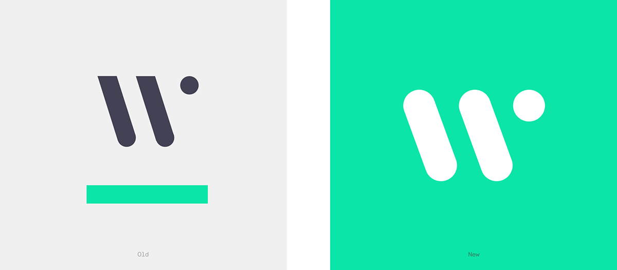
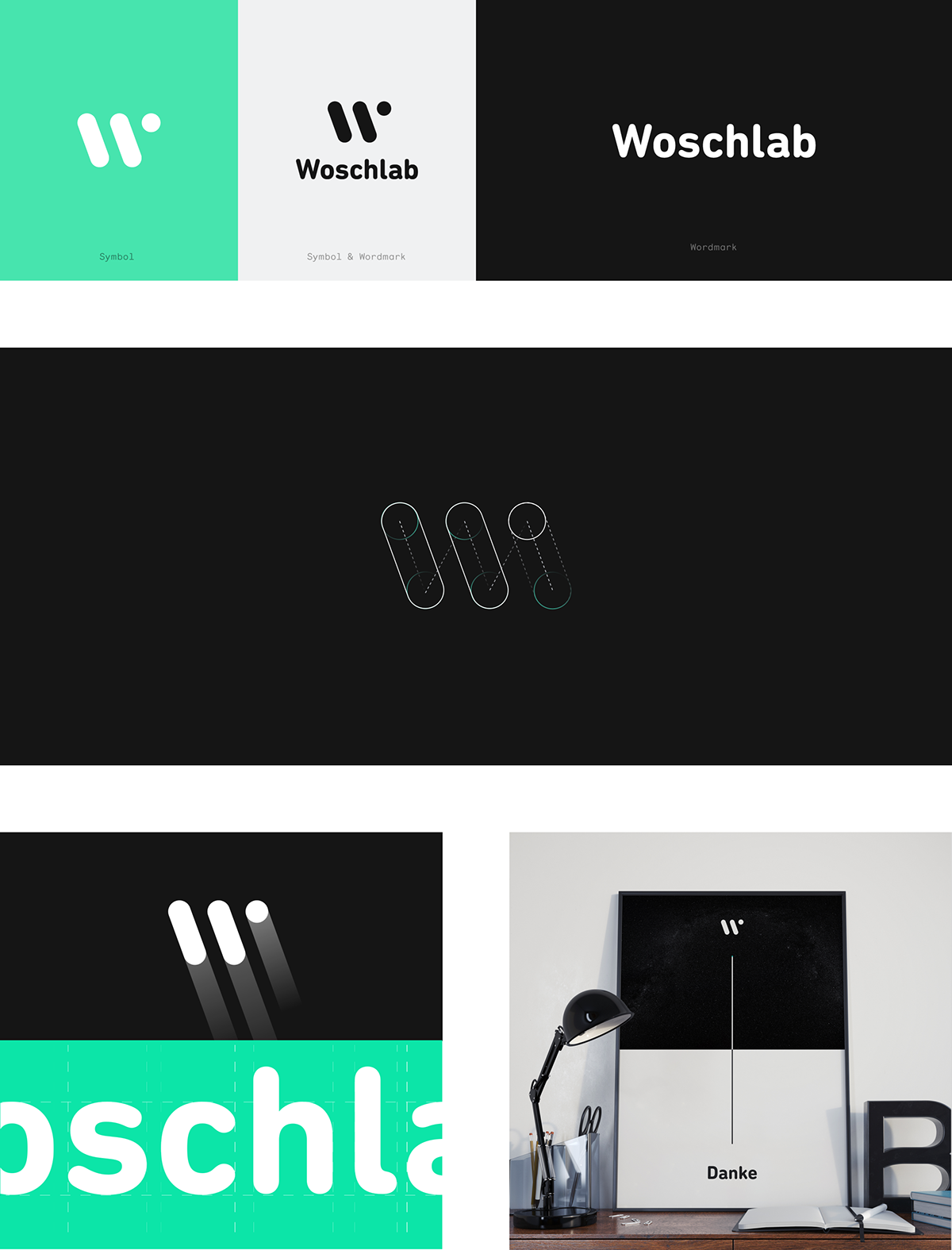
In company where the future leads the way, we had look back into the past to rethink their logo and make it prepared for the present. We worked in the two main assets in Woschalb’s identity, their symbol and their wordmark. These assets are the most immediate representation of the company, their people, and their brand to the world. The use of the symbol & wordmark together should be avoided and used only when absolutely necessary. The Woschlab symbol requires a certain amount of space around it to maximise its visual presence. This safety area around it prevents any element from interfering with the symbol’s integrity.
Brand Colours
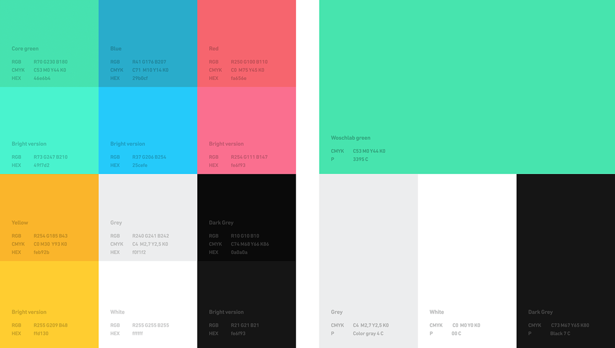
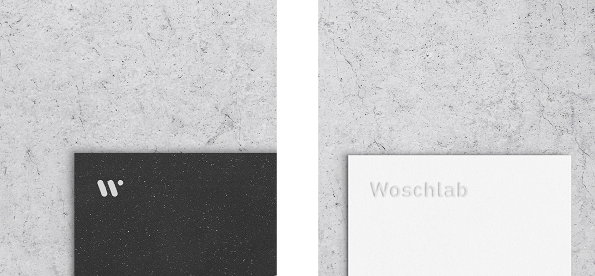
The symbol & wordmark is always used in neutral tones, black or white. The brand colours play a fundamental role in creating brand recognition. The Woschlab palette is made from a diversified color scheme with bright colours to represent the possible universes and various success cases. The always black or white Woschlab symbol & wordmark is the solid and professional glue that holds everything together. Print is only one of the universes for Woschlab and, in there, the colour palette has been drastically reduced to focus the brand and, at the same time, simplify the production process. For print, the Woschlab brand is only neutral notes with a green acting as accent color.
Typography
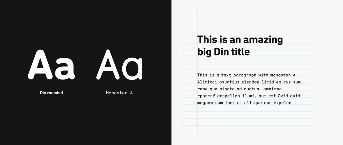
Just like with the Woschlab logo, a consistent and correct use of our corporate fonts, DIN Rounded and Monosten, ensures that Woschlab brand doesn’t lose identity when applied to the most diverse media and materials. Generally speaking, the “Bold" weight of the DIN Rounded family and the “A” weight of the Monosten family are the one that must be used in our corporate communication elements at all times. For the body copy and small texts we suggest the use of the Monosten A, while for headlines and small titles we suggest the use of the DIN Rounded Bold.
Visual Universe
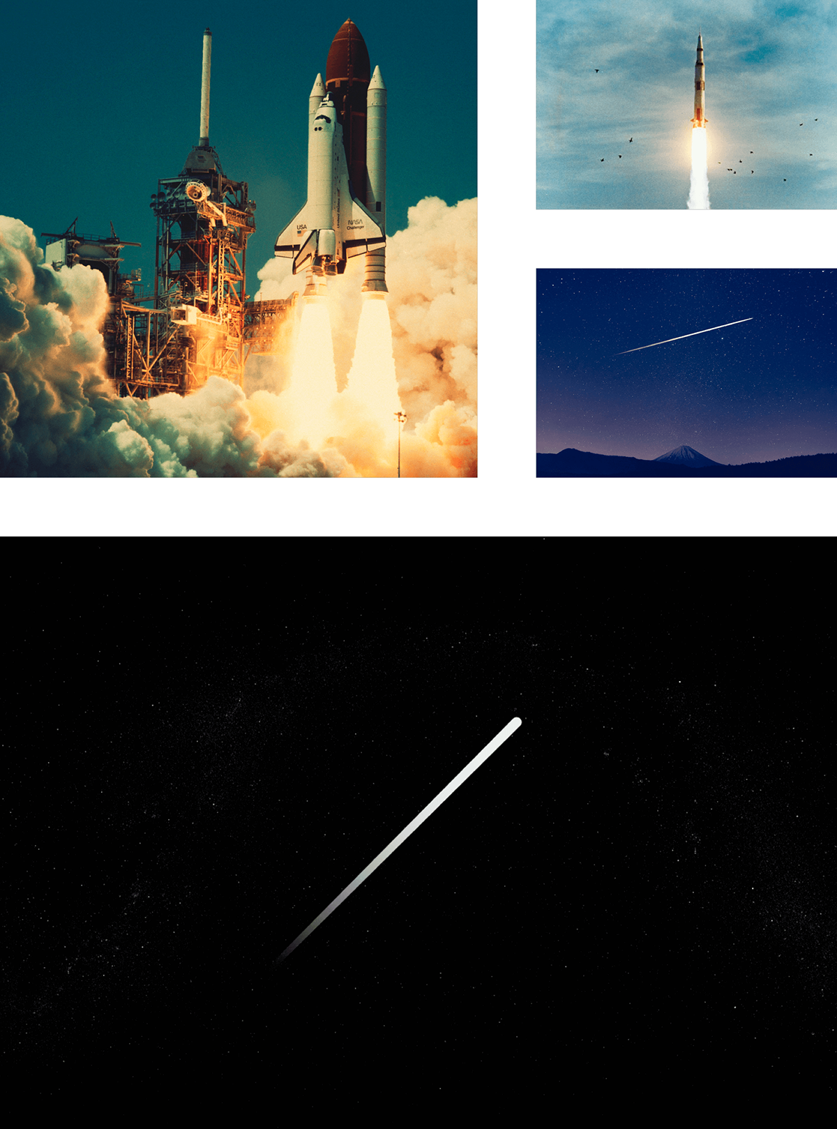
The serenity of space and the deepness of the universe both give the identity a profound overall look and a tremendous sense of greatness.The image of the universe is constantly used all over Woschlab’s branding. The Woschlab rocket was developed as an element capable of transmitting the brand values, vision and mission. As an incubator, Woschlab has the ability and skills to elevate any idea or company, breaking the boundaries of our world, reaching the universe. It is essential that the rocket has a strong identity in itself.
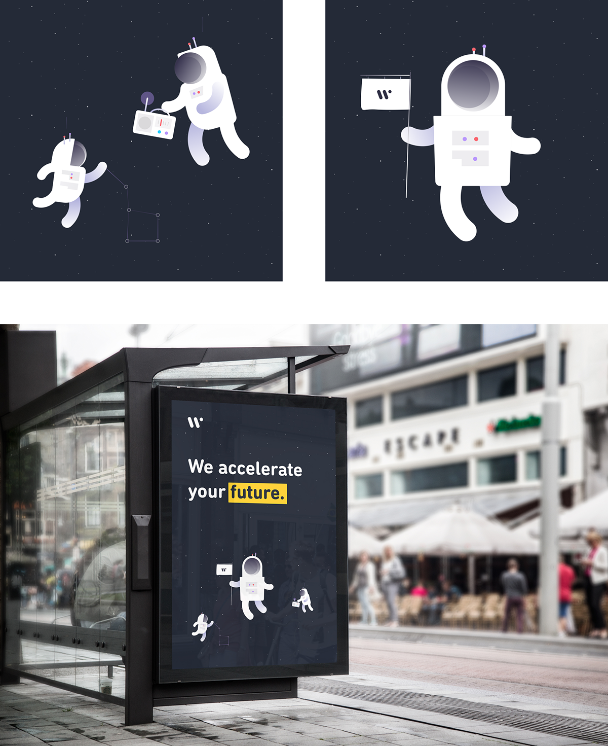
Besides the rocket, as an aid to the about section of their website, three astronauts were created to identify each of the key team members of the Woschlab team. A friendlier approach to the vast greatness of space that is used only as a digital solution.
Production
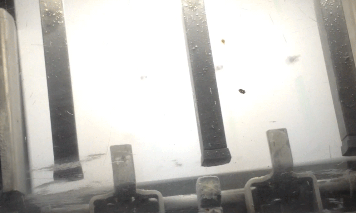
There is no greater sense of accomplishment than having your designs being printed in front of you. The machines rumble as you try to get the final print to be perfect.

Stationery
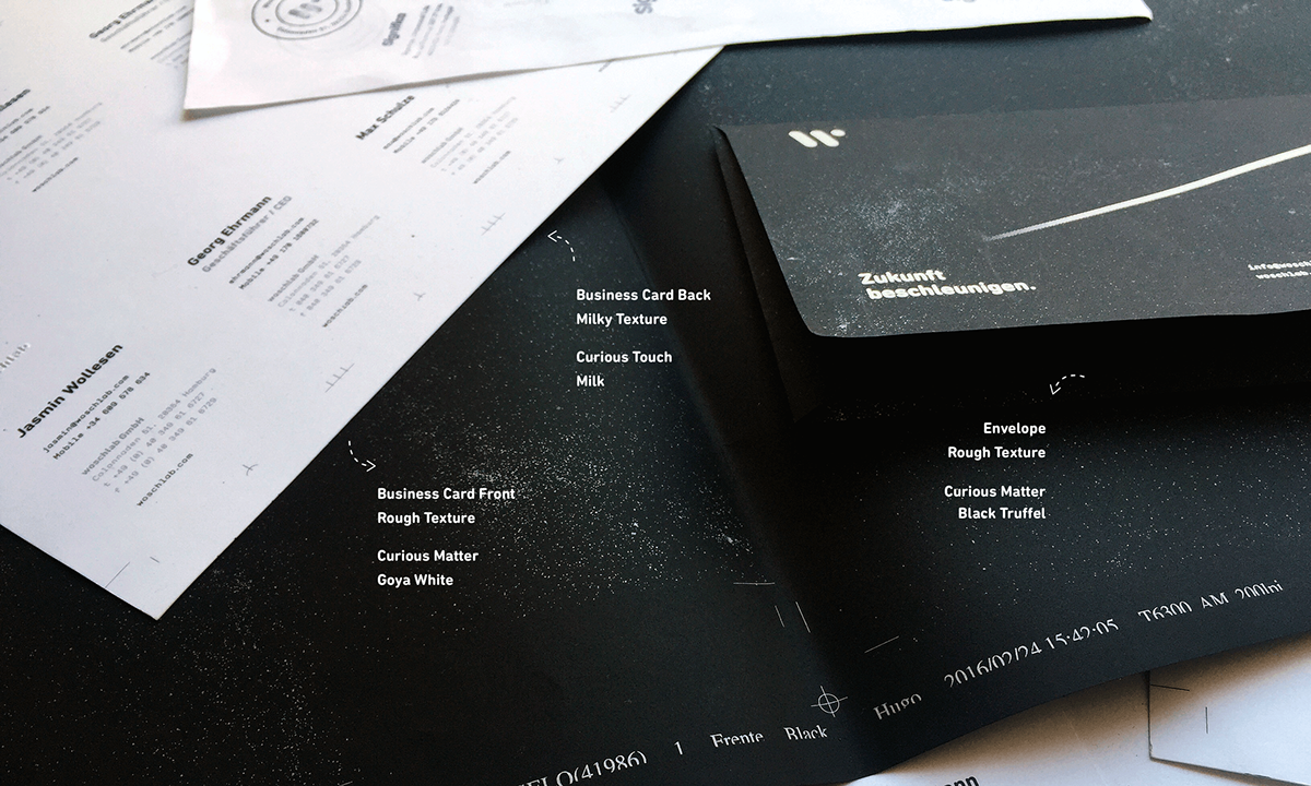
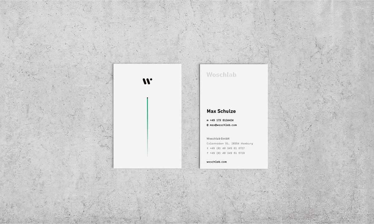
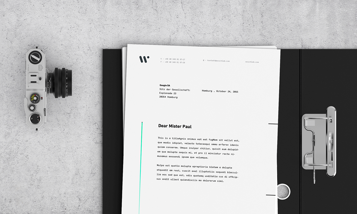
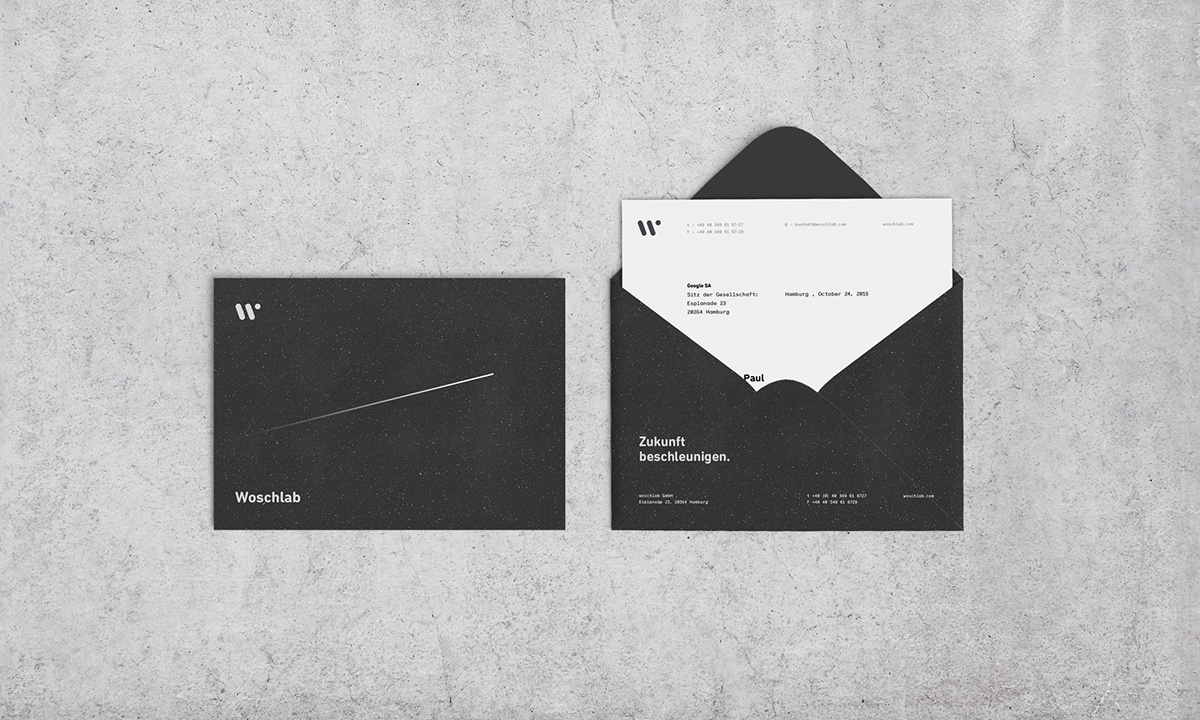
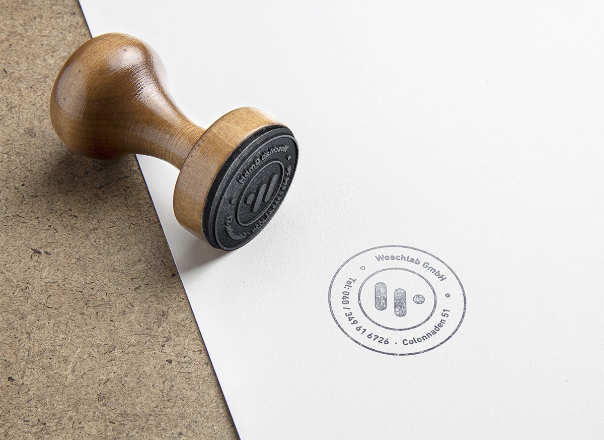
The business card is the face of the company. As such they were thought to make a great first impression, both visually and physically. A special focus is put on the physical experience, allowing the recipient to sense the universe. Specially the touch. On the front one very textured grainy paper and on the back a tremendously soft paper. It’s an amazing contrast that merges the “Milky way” with the “Sparkling” texture of the universe. The letterhead is the physical voice of the company and as such it is intended to be very simple and very easy to read. The typography was carefully selected to provide a pleasant reading experience without sacrificing any of the other elements. The envelope follows the universe context as it’s fully covered with the universe pattern. The black grainy textured paper covered with the universe pattern transmits a mystical sense to the recipient. The universe lays in the recipients hands.

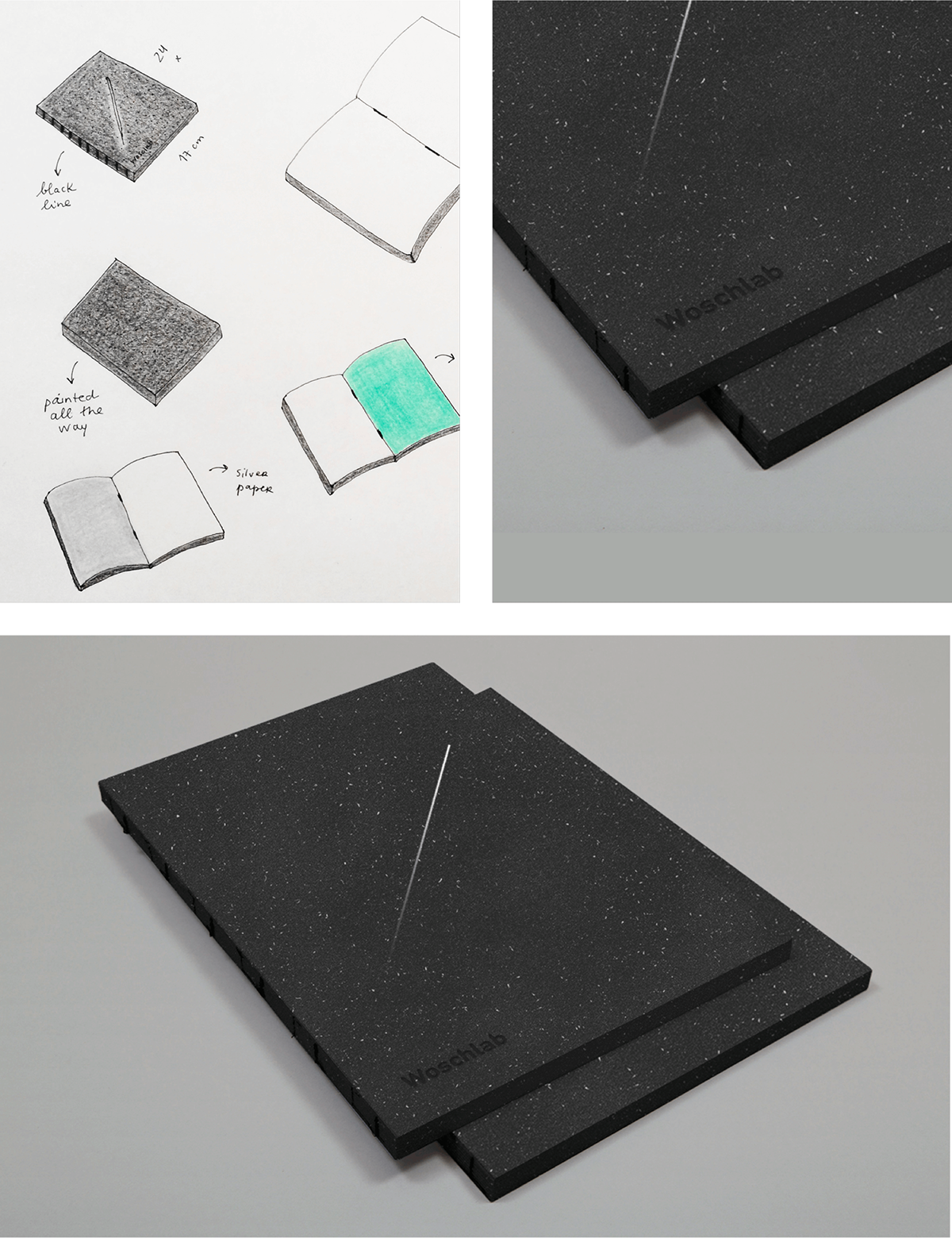
Notebook
Involve the user, make him fall in love with your brand and drive him away from the conformity routine. Instead of thinking in a static object, we chose to represent the brand as it deserves, through an object that seeks to be moving, constantly connecting and making people feel something.
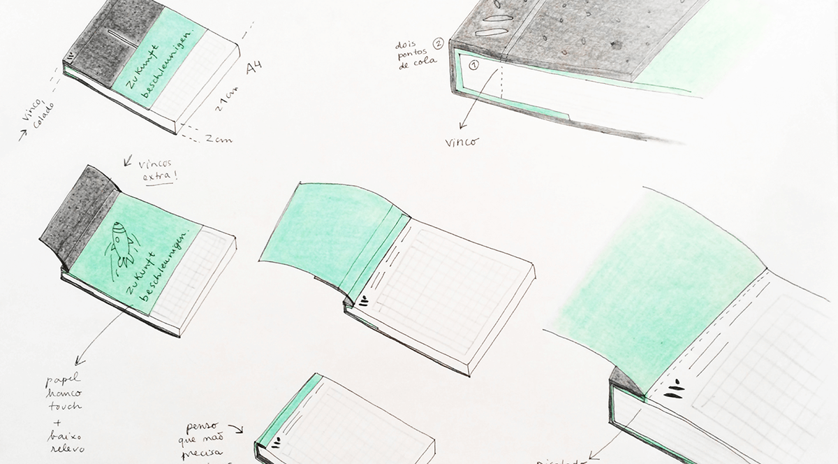
The writing notepad, an object thought to be used over the deskspace, is a pratical object that not only combines the graphical symbols of the brand, but also the functionality. The writing notepad consists in a 200 pages block that was thought and designed to be always at your desk. It is a very pratical object, yet heavy, allowing to rip off pages in order to store them.
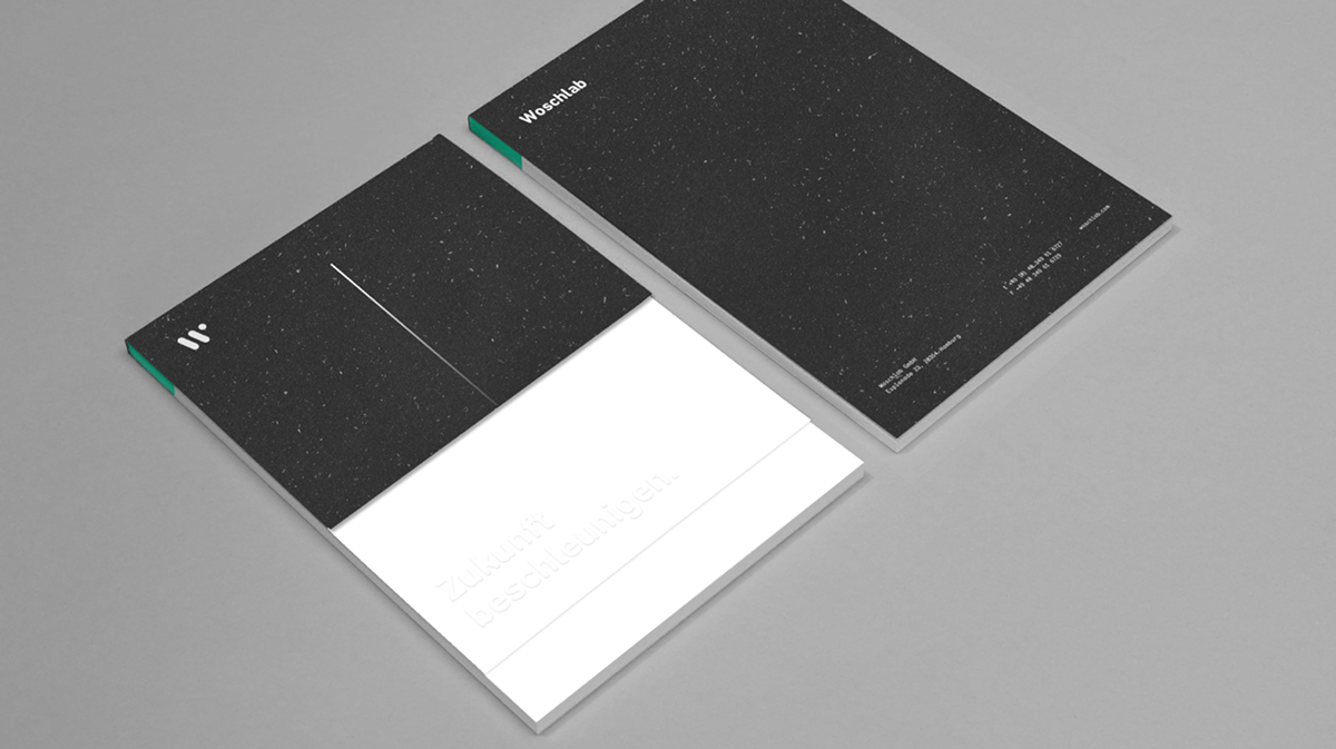
The Black Hole measures 17x24cm and has a total of 160 pages, making it the perfect object to carry around. It’s a physical representation of the whole Woschlab brand that aims to bring the user on a journey that makes him feel the brand values, breathe it’s spirit and perhaps inspire the day-to-day work.
Thank you for watching :)
Visit us on significa.pt or send us an enquiry at hello@significa.pt
Designed by Significa in the heart of Porto.
Designed by Significa in the heart of Porto.


