Lunch Money Buddy

Lunch Money Buddy (LMB) is a mobile application that allows parents and guardians to manage their children's school lunch purchases. LMB would be available for both iOS and Android, however for design purposes we focused on the Android design using Material Design.
Application Specifications
Download and sign up
The parent can download the app from the Android or Apple app stores and sign up for an account using whatever email and password they choose, as well as a school-supplied access code. (Make up an 8 digit number for the access code.) When the parent signs up, they should see their school-attending child or children in the app.
The parent can download the app from the Android or Apple app stores and sign up for an account using whatever email and password they choose, as well as a school-supplied access code. (Make up an 8 digit number for the access code.) When the parent signs up, they should see their school-attending child or children in the app.
Fund the account
The parent can fund the account so that their children don’t have to bring cash to school. At a minimum, the parent should be able to:
The parent can fund the account so that their children don’t have to bring cash to school. At a minimum, the parent should be able to:
• Add one or more payment methods.
• Add funds.
• Select a primary payment method.
• Change a payment method.
• Delete a payment method.
• Select whether they’d like balance auto-replenishment or not.
• Turn auto-replenishment on/off.
View account balance
The parent can view their account balance.
View school lunch menu by child
The parent can view the upcoming menu of school lunches for any school at which they have children attending.
View subsidy status
If they participate in a school lunch subsidy program, the parent can view the status of their school lunch subsidy program account.
Favorite a lunch
The parent can “favorite” an upcoming lunch for their child or children. The evening before the favorite lunch will be served, the parent will be alerted.
Close account
The parent can close their Lunch Money Buddy account, which will delete all payment types and auto-replenishment orders.
Problem
Lunch Money Buddy (LMB) is not an existing app, and a concept that needed to be worked out into a proof of concept that was interactive through a prototype. I was provided the above application specifications, and a couple of personas of who their target user are and how they would use such an application to benefit them.

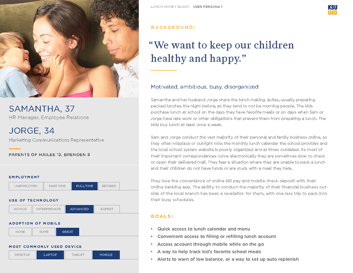
Persona for married parents Samantha and Jorge who have multiple children to manage.
Actions
User Journeys are the first tool I used in understanding the personas and their possible paths and interactions when using the application. Understanding the user journey empowered me to get a better sense of pain points, emotions, and application flow when the users try to complete different tasks.

One of several user journeys created to understand user paths and emotions. This was created using Sketch, and the post-it note look was used to focus on the journey instead of visuals.
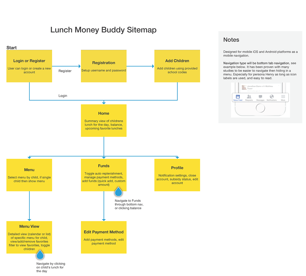
Developing the user journey gave me insight into how the application should flow, and what needed to be linked together to make an application that flowed easily. Using that information I developed a sitemap to figure out what screens needed to exist, and how they would link together. When I looked at the data I had, I realized this application didn't need a lot of screens to accomplish the tasks it needed. I also felt by keeping the screens to a minimum would make it easy for personas that had a difficult time with technology have an easier time.

Sitemap used to show screens and flow. Sketch was used to create this assest.
With the baseline of understanding in place, it was time to create Wireframes to give visuals to the sitemap and user journeys. The wireframe served the purpose of designing data hierarchy, link points, and possible interactions to view any potential problems or pain points and iterate on them quickly.

The lunch menu is a big part of the application and one of the most challenging to think about when seperating a calendar that gives info vs a scheduling calendar and what features are needed, and which are not. Axure was used to create the wireframes.
I discussed the wireframes with some others in the program and made changes based on feedback. The final part was to turn these wireframes into interactive prototypes. Since I created a lot of annotations about the interactions in the wireframes, the process wasn't difficult and allowed me to see the interactions as if it were a developed application.

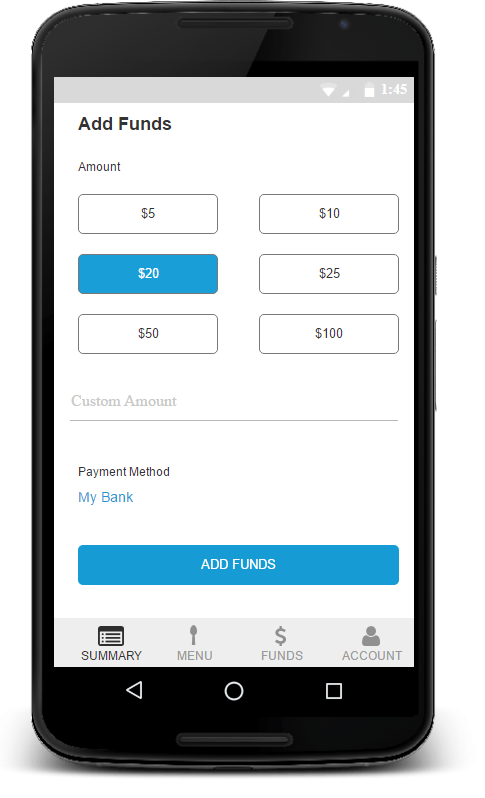
This interaction allowed a user to use quick add amounts, or a custom amount to their account quickly. The prototype was developed in Axure.
Results
The results of the work was an interactive prototype that after a few iterations was ready to be developed. The whole process brought understanding of who the users are, their goals, and how the application could be designed to meet those goals and business goals.
The next step from here would be user testing to make sure our design decisions are correct, and make any discoveries from real users touching the application.
Lessons Learned
There were many things learned over the course of this excercise. I will highlight the major things I learned while making this prototype.
Business Model
This was a topic of conversation a lot among students in the program. Many designed their applications differently, which is to be expected, but with different business models in mind. Most designed the application in a peer to peer model with the application going directly to the school, and no middleman. The real value I saw from the application was in the middle where LMB would sync data between the schools and parents to reduce manual input. They would supply technical support, and payment processing. The thing I learned was, when you have a concept like this you need to discuss the possible business models or everyone has a different understanding of how it would work and the application designs vary greatly.
Axure
I have a good foundation of Axure, but this application allowed me to explore deeper into the power Axure really has and develop some neat animations such as the search floating action button on the lunch menu page. Every project makes me stronger in Axure, and this was no exception.
Feedback
Just like when going through user data to pull out what is valuable, what is misleading, or what is a symptom to a bigger problem, you have to do the same with feedback. Feedback is definetely welcome, but you have to understand who has the correct feedback to not lead you astray. For example. on the lunch menu the original design used the calendar icon with today's date, like with Google Calendar, so a user could click to go to today. Some really liked it, and some didn't understand. The problem was some were used to Android and Google Calendar, and some where iPhone users who hadn't seen this pattern. Learning how to better digest feedback to pull out the most valuable, is a skill that is alwasy being learned.

