

For my Typography class, we rebraned the Seattle International Film Festival (SIFF). The requirement was to create a logo that was rooted in typographical design and not an illustration. I also had to come up with taglines that went on the billboard, poster, and festival pass.

When thinking of a logo I tried to keep in mind that the logo would need to work in black and white. I made all the letters black except the F that stands for Film, which was white with a black outline.
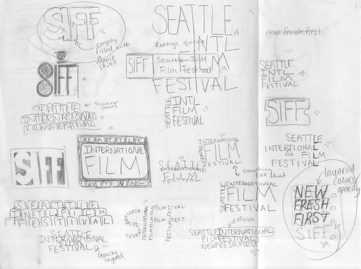

I chose to use Gill Sans as my typeface because of it’s humanist qualities, that handmade feel. I felt that the Bold Gill Sans S was too heavily contrasted to fit with the even weighted I and Fs, so I began tweaking it. I tried replacing the S with a different typeface, I combined Gill Sans Bold with the spine from Futura, I tried manually fixing the S myself and ended up tracing and retracing the S until I found an S that worked, scanned it in and combined it with my modified S to get an S that had the same geometric balance as the I and Fs while still retaining a humanist flair.


I took the singled out F and created an abstract design by connecting two Fs and placing film stills from that year's festival in them. This film emphasis is what I used in my billboard, pass and even repeated in my tag lines which all began with Fs.

(This was an assignment an not a rebrand shown to the festival.)


