상업 - 인쇄/그래픽/일러스트레이션
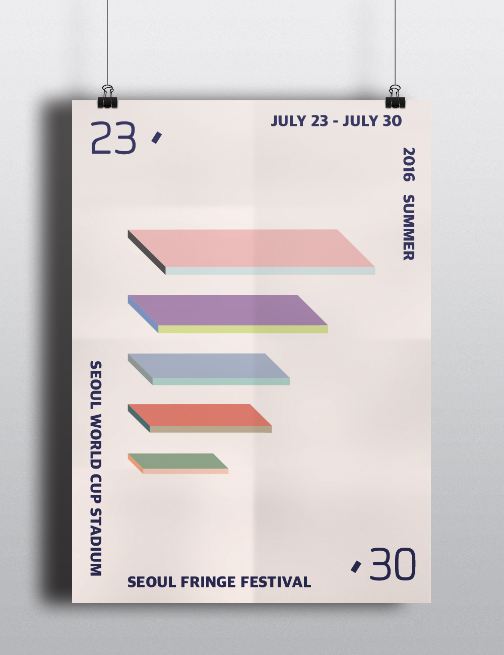
This is a project about redesigning Seoul Fringe Festival. The shape of logo symbolizes for those who do not act on the main stage, this logo implicitly express the people working on the stage. Also, this logo indicate the shape of the stage lighting. Depending on the perspective of people watching can be interpreted differently. So the logo itself can be used flexibly.
Brand Concept:
Brand concept is to give energy to the artists, even for a short time. Colorful colors that reflect the personality of the various arts and culture in order to provide a space where you can feel the new arts and to heal your heart. Like the brand slogan, 'Meet a Person into art' people in their daily communication and a moment to meet artists to blemish on arts and culture, and to help ensure you have a chance to soothe your weary heart in it.