
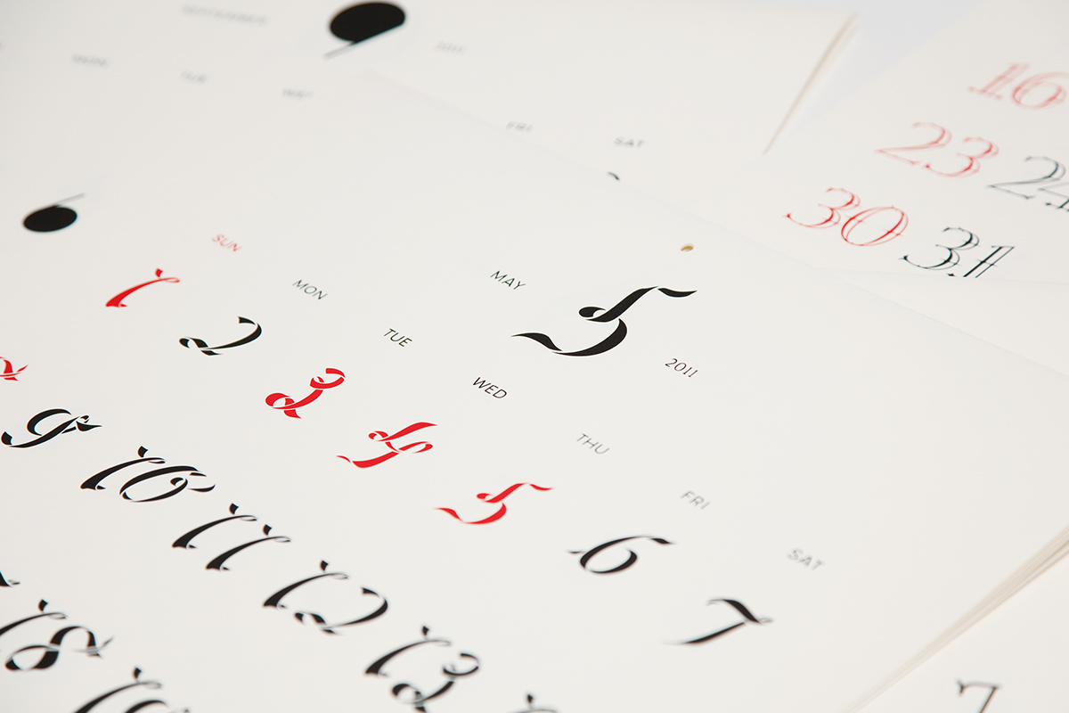
A calendar is one of the most familiar pieces of print on our walls / desks. I have always felt disharmony with it. There is an image of flowers or a illustrations on the top and numerals of dates at the bottom in general. People hang it like a picture to decorate a room. However, decoration is not the proper use of calendars but information of dates and seasons. My aim was to design the new calendar to simplify the disharmony between pictures and numerals. I took typographic way by designing 12 new fonts which reflect images of Japanese seasonal words.
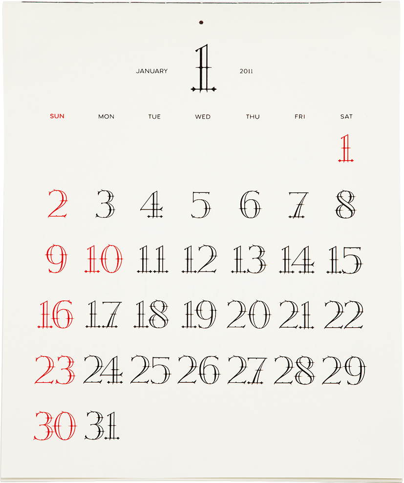
January / Thorn
Only thorns left on stems
Only thorns left on stems

February / Snow
Snow is getting melted
Snow is getting melted

March / Seed
Sowing the fields with seeds
Sowing the fields with seeds

April / Flower
Flowers bloom

May / Wind
Feeling the balmy breeze

June / Rain
Rainy season has come
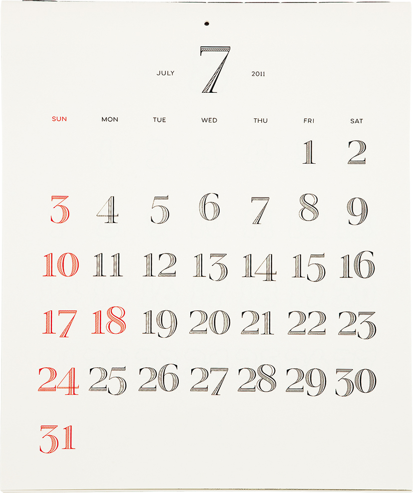
July / Shadow
Shadow is getting longer and longer

August / Cloud
Cumulonimbuses appear

September / Moon
Viewing the harvest moon

October / Ivy
Leaves of ivy turn red or yellow

November / Twig
Leaves are all off from trees

December / Ice
Ice forms on puddles

Jour Sans
A new sans serif for the calendar
A new sans serif for the calendar
Jour sans = everyday sans
New sans serif for displaying days of a week and names of months. It is intened to have a humanistic friendly impression for the calendar; an item people see every day.
Features
The terminals are undisposed and the tales are cut to signify its hand drawn like mood. The x-height is set quite high and bowls are rounded to make the font friendly.


