
How to draw а bottle:
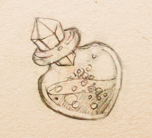
The process often starts with a pencil sketch. The sketch provided within this tutorial is courtesy of my colleague Alina. Many thanks to her. =)
First off, I create a dark background so that all glass glares are effectively visible.

Then I create the future shape of the bottle. Tip: Try to incorporate a minimum number of anchor points when you are drawing the shape. This shall come in handy when you are further editing, and the anchor point will look sleeker. In general, place an anchor point only where it is indispensable. Delete the rest. This also applies to the results that you obtain after working with Pathfinder tool.
And, although I then put the bottle on its side, its basic form must be more consistently built up strictly vertically, mirroring one of the sides to achieve symmetry. In the process of creating the shapes, I have repeatedly cut off half, mirrored it, obtained the full part, moved the anchor points to more or less achieve the shapes that I want, then again cut, again mirrored, and again moved the anchor points. (I know, as the result it looks clean, there was A LOT of rough work beforehand.)

So, at the first stage, I created the shape that I want, marked out some faces, mapped out the thickness of the walls of the bottle. (Please note that the thickness is not the same everywhere. Most glass products that I have held in my hands have a thicker bottom). I also thought about the fact that the faceted stopper somewhere somehow has to have a rounded edge, so that it can tightly close the container. (I will later on think about how the faces will be joined with the rounded edge, when I will be putting the cork in the neck).
I selected the color and saturation-fill to be very close, only making them to be distinguishable. Later, they will all the same all be repainted.
The next step – I carefully study a bunch of references:

Personal experience + studying refs give approximately the following conclusions:
-The glass is made from a very smooth material, so there will be few halftones, the glares will be very clear, with gradients.
-There will be strong reflections seen on everything around.
-It is more effective to look at the glass under lateral illumination on both sides: because of the fact that on the one hand, the light is brighter, and on the other – dimmer.
-The brightly-visible parts of the glass are only the faces. Glass is thoroughly transparent. Even if when we are considering the thickness of the glass (glass stem, bottom of the whiskey glass), it is still transparent.
Yes, some of this is obvious. “Crystal clear, thank you, Cap.” But when you are drawing, you have to understand – where is it clear, where is it not and why…
I proceed and start creating the volume. And the volume is seen only in the presence of light. I put two light sources for myself in my head: 1 – bright, a little yellow, top right, and a little in the front, 2 – dim, purple, left bottom, on the side. You may have heard that pure black, gray, white colors are rarely found in nature. Therefore, it is necessary to add color in gray tones as well. And if you’re dealing with a cartoon, game graphics, you need to add a LOT of color to make it look rich and bright. Therefore, both of my light sources are in color. Plus, I play on the contrast, taking the opposite colors: purple and yellow.
Also worth mentioning: I have placed both my light sources abstractly outside the picture. So I can afford one common direction for all rays coming from one source:

I prefer working with solid colors. This is longer than the gradient, but is much more manageable. The gradient makes it impossible to build a shape that is more complex than just a face, or a sphere. I want to get a shape that is a little flattened at the front and at the rear, shaped like a heart. In places where the glass is rounded smoothly, I create long stretch marks. Where I have a cool side the boundaries of the shapes come very close to each other.
Keeping in mind the direction of the light, I know that the brightest place is where the light hits the surface at right angles. The larger the surface that is turned away from the light, the less light that will be there. I remember that the light falls not only on the external part of the glass, but passing through the glass, gets on the opposite wall from the inside.
First, I draw a yellow light source:

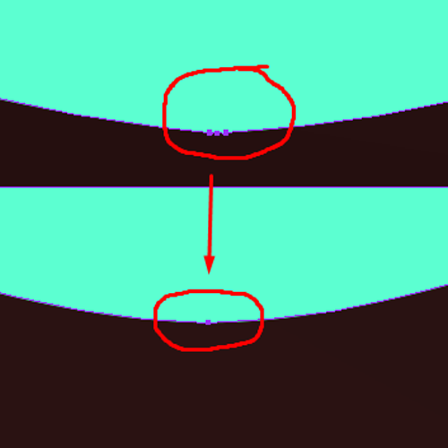
(Small specks on the bottom – glass defects, scratches, bubbles. With them, the magic bottle looks more alive.)
Then a contrasting purple:

(I do not mess around with the inner nozzle, because later, the stopper will close everything. Note that on the upper wall from the inside shines purple, and the bottom – yellow.)
As a reminder: the glass reflects EVERYTHING. Therefore, in places where it does not reflect the light sources, it reflects the environment. I add abstract small details around the bottle. Later, bottle cork reflections and its contents will be added to these reflections.

Now it is time to work on the stopper. I have it somewhat transformed. I want to make it obvious that it is sticking out from both sides. I prune away the unnecessary parts of the stopper.

With the shape of the stopper, I decided now it is time to deal in creating the shape of the volume: the same lights shine on the tube, on the same angles. But in this case, I am not dealing with the rounded sides of the flask, but with flat edges.
When I paint, I try to watch and think: where does the light fall? What happens with the light as it passes through the material? Where is the shade going to be?
The face that is going to be the brightest is the one that is aligned the most to the light source.
The brightest face is going to be the opposite back face, because it is the same light, but has passed through the colored glass. (The degree of brightness will of course depend on how transparent this material is.)
A shade is a place receiving no light. Part of the light was reflected (ie, did not pass through the glass), therefore, the shade will lie directly under the lit face.
The next step is I draw the reflections in the stopper glass and its drop shade:

And yes, I like to add small dots and spots. This makes the material more alive.
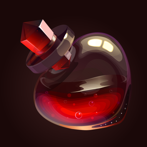
As a result, I obtained this bottle:

When the bottle was ready, I added the liquid.
Frankly speaking: the liquid had to tinker. Using my wit, I dropped the same light onto the surface. But I lit the whole boundary, and I it looked very foreign. No way did I want to fit into the overall picture:

And then I decided to cheat a little: This is a fluid, right? You never know how it will splash, right? Maybe at such an angle, no rays can ever shine on it? I left only a reflection of the glistening, and I was through:
As a finishing touch, I added different small glares, glows, then corrected the composition by increasing and placing the bottle in the center of the picture. The work can be considered complete.

At the end, I would like to make several remarks that are important to me:
-I have no artistic education. My knowledge is comprised of information that I got from the internet, my own observations, lots of experiments and practice.
-Each distinct stage covers a LOT of rough work. When I tried something, and something did not work out properly, I remodeled, compared it to a somewhat similar copy – which is the better one? And a ton of moved Bezier curves. In total, with in-between breaks for tea, a bottle like took me 3 days to draw.
- I can and am fond of using my tablet, but in this particular work, I used the tablet only for placing explanatory inscriptions in the pictures. I drew everything else with the mouse.
Thank you very much for your interest in my lesson.
Chuchilko.


